About Layout Scale
Tired of struggling with breakpoints and layout bugs?
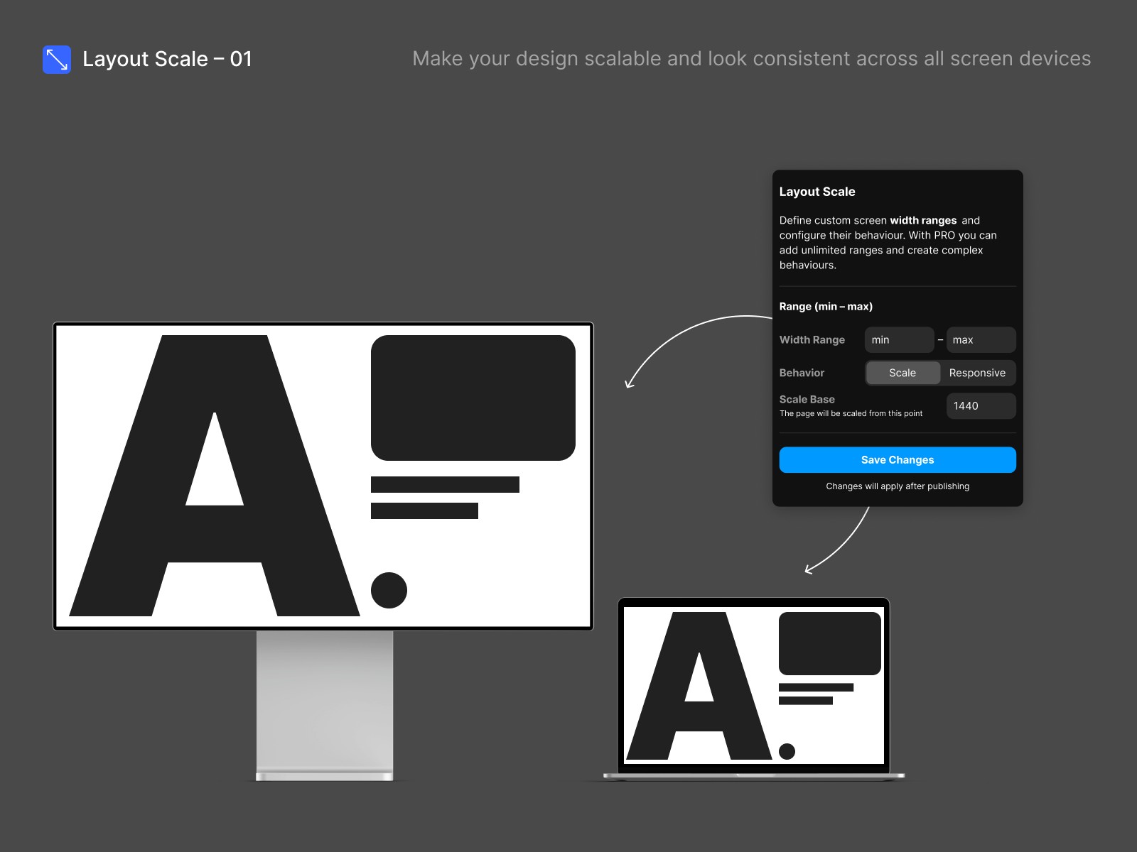
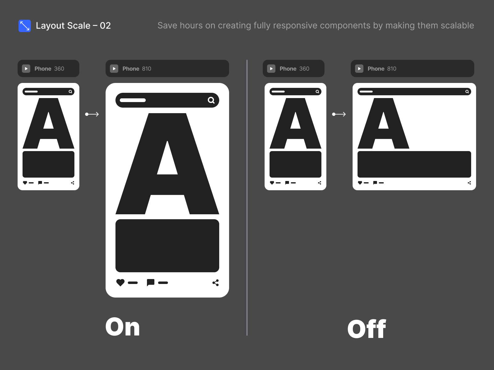
Scale Layout – the easiest way to make your sites perfectly scalable and visually flawless on mobile, ultra-wide, or any screen size with just a few clicks.
Why creators love Scale Layout:
One layout – all screens. Design once, and your content always looks sharp, balanced, and beautiful everywhere.
No more tedious breakpoints. Automatically adapt to every device without endless tweaks.
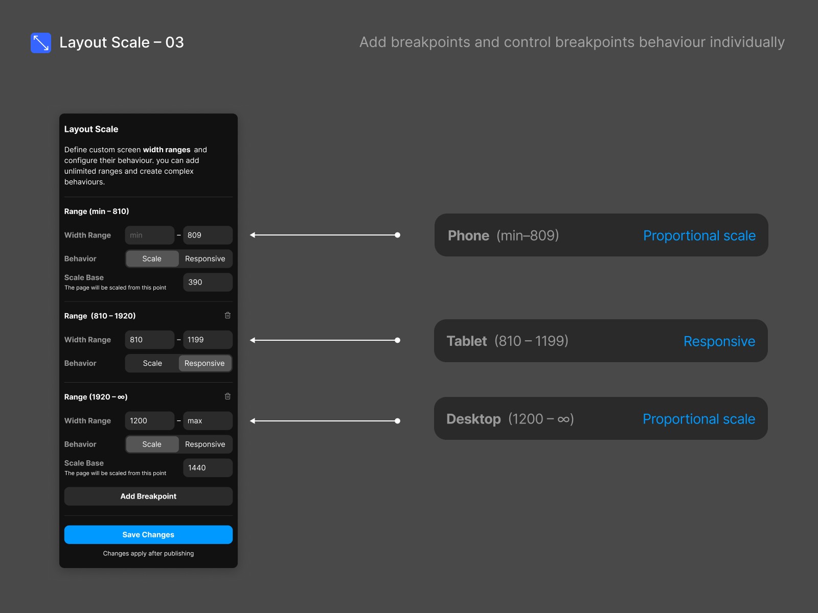
Total control when you need it. With Pro, set precise scaling rules for different screen types (mobile, wide desktop, anything).
Instant browser preview. See the real magic – your actual site, scaling just as users see it.
How it works (in three simple steps):
Add your breakpoints – Match your project or add more for super-smooth transitions.
Set your scaling rules – For each breakpoint, just pick your base width (“Scale Base”). Scale Layout takes care of the math.
Preview & publish – Save, publish, and admire your frictionless, scalable site in any browser.
Try Scale Layout now & experience the easiest path to perfect, scalable design.
Upgrade to Pro for advanced scaling & unlock responsive controls for any project.