
Dario Grigoletti
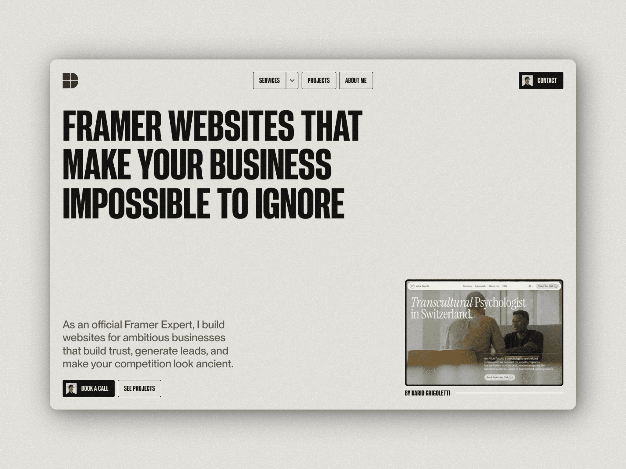
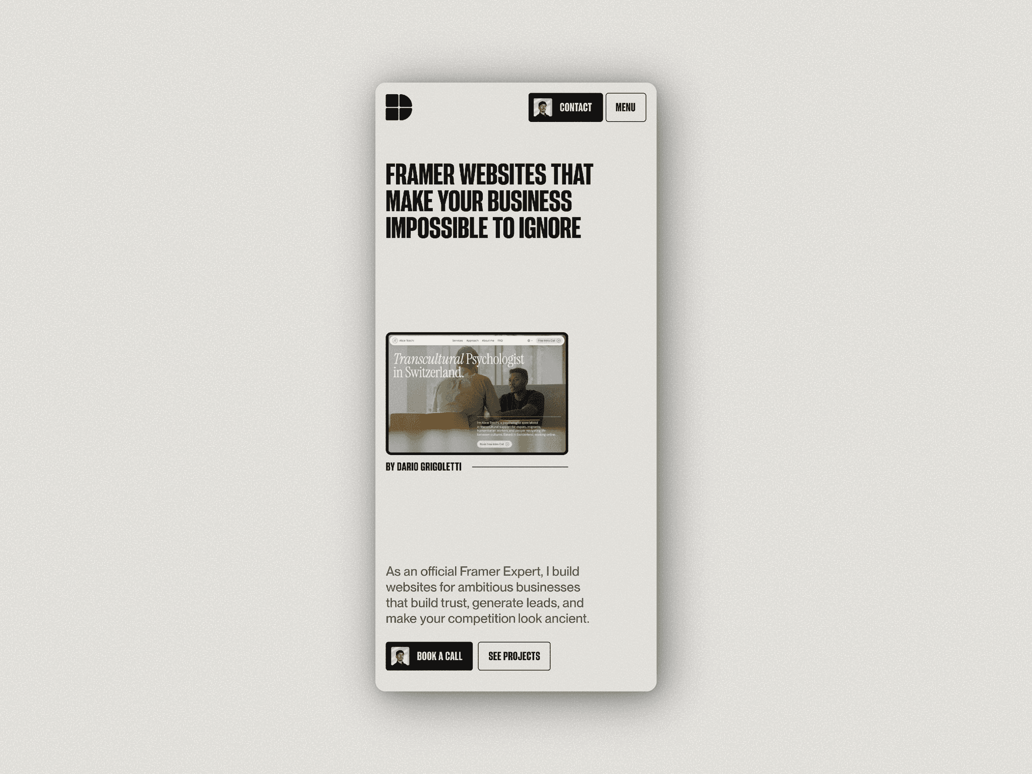
Pro ExpertWebsites that build trust, generate leads, and make your competition look ancient.
My own site got an Awwwards recognition 🏆 It's built to show what a website looks like when it actually has to perform.
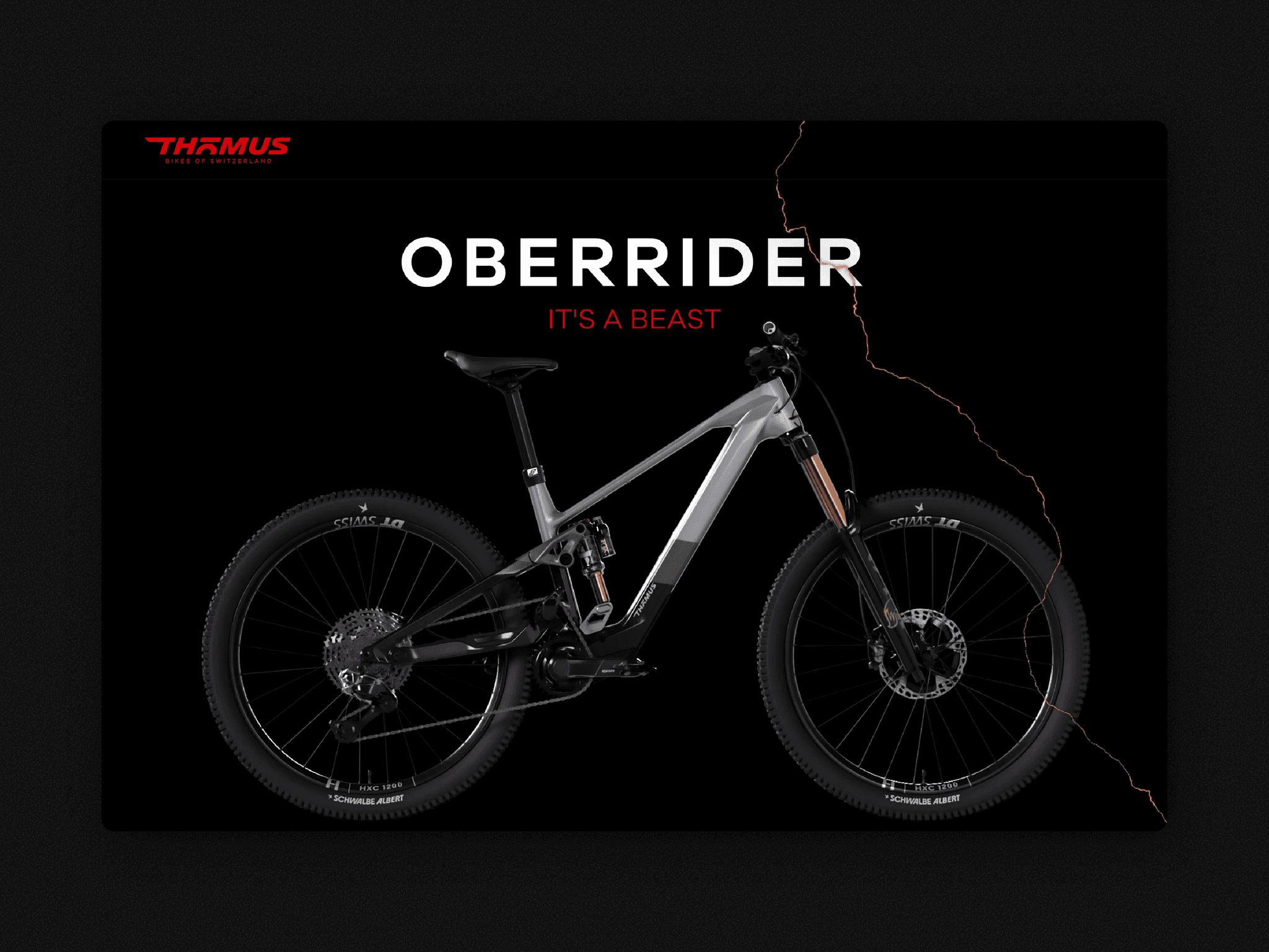
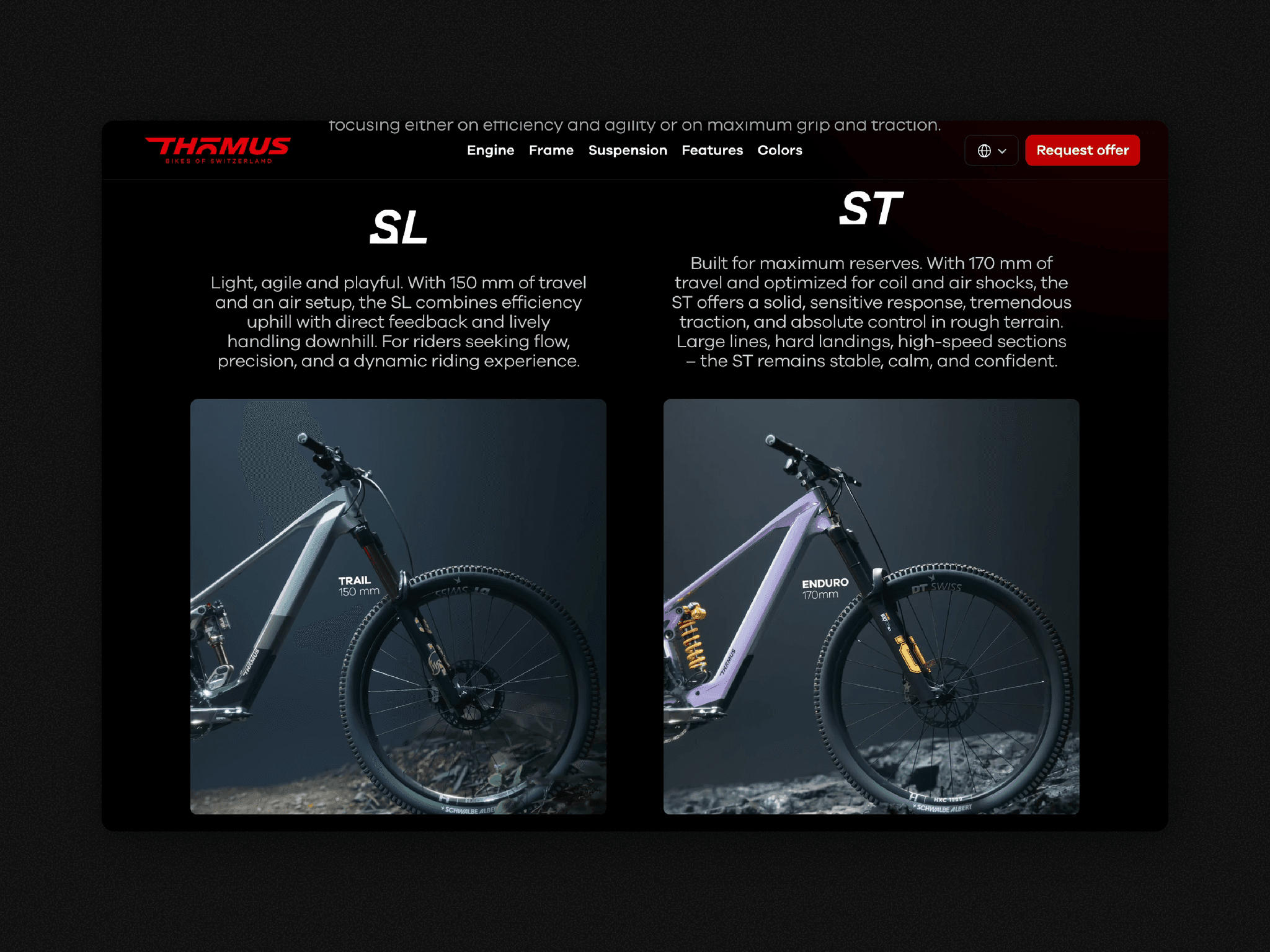
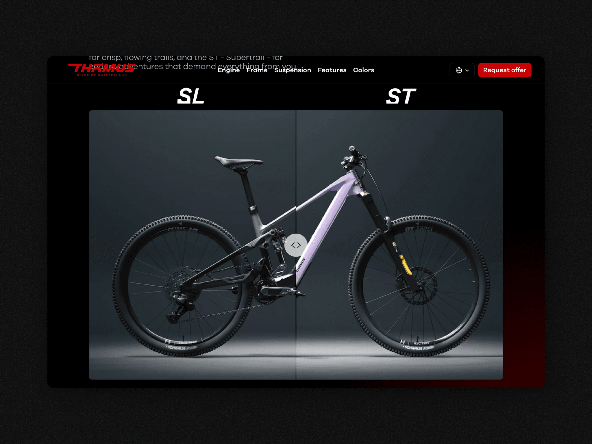
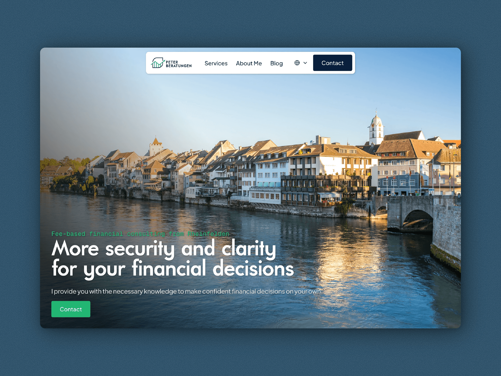
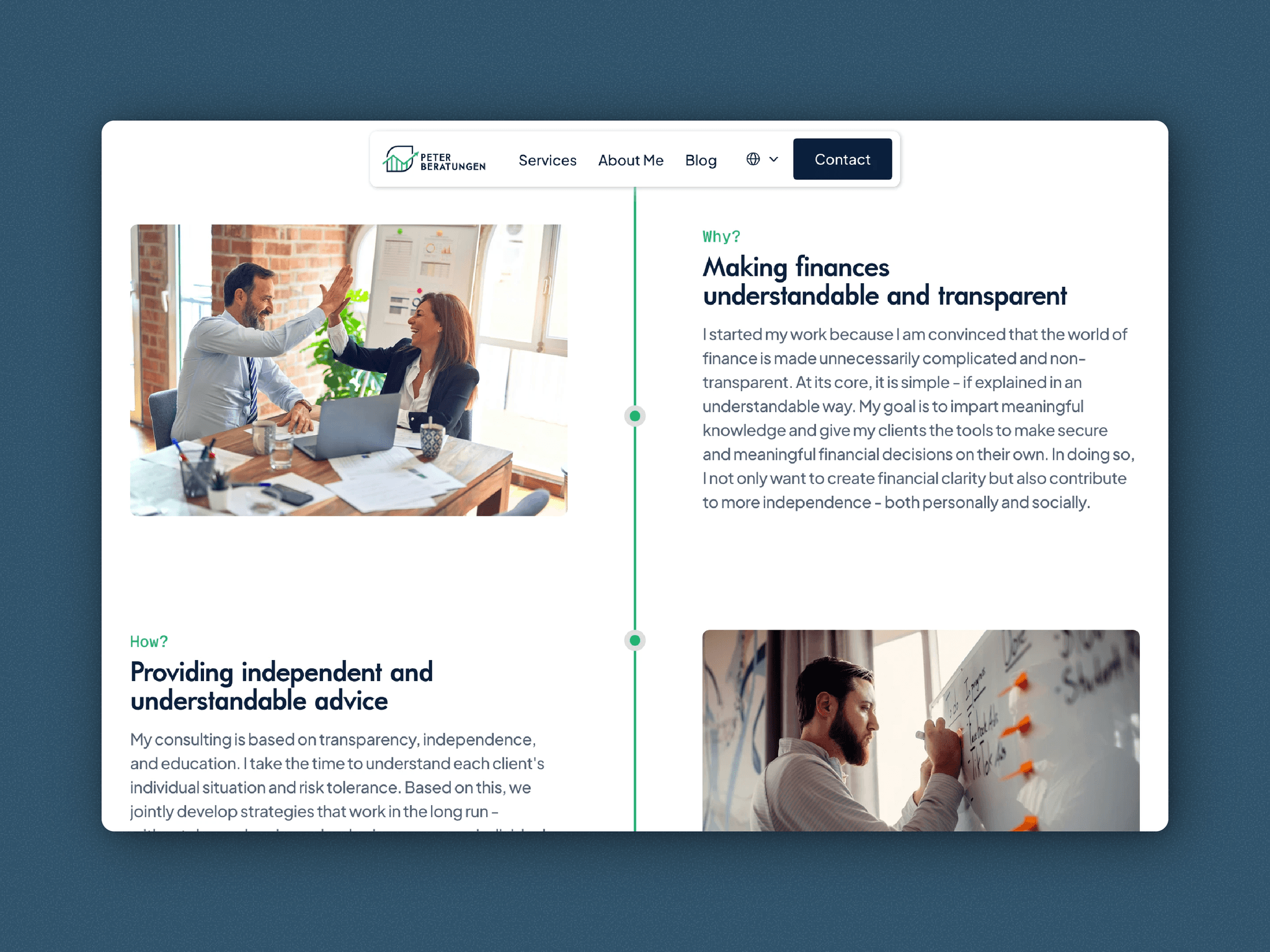
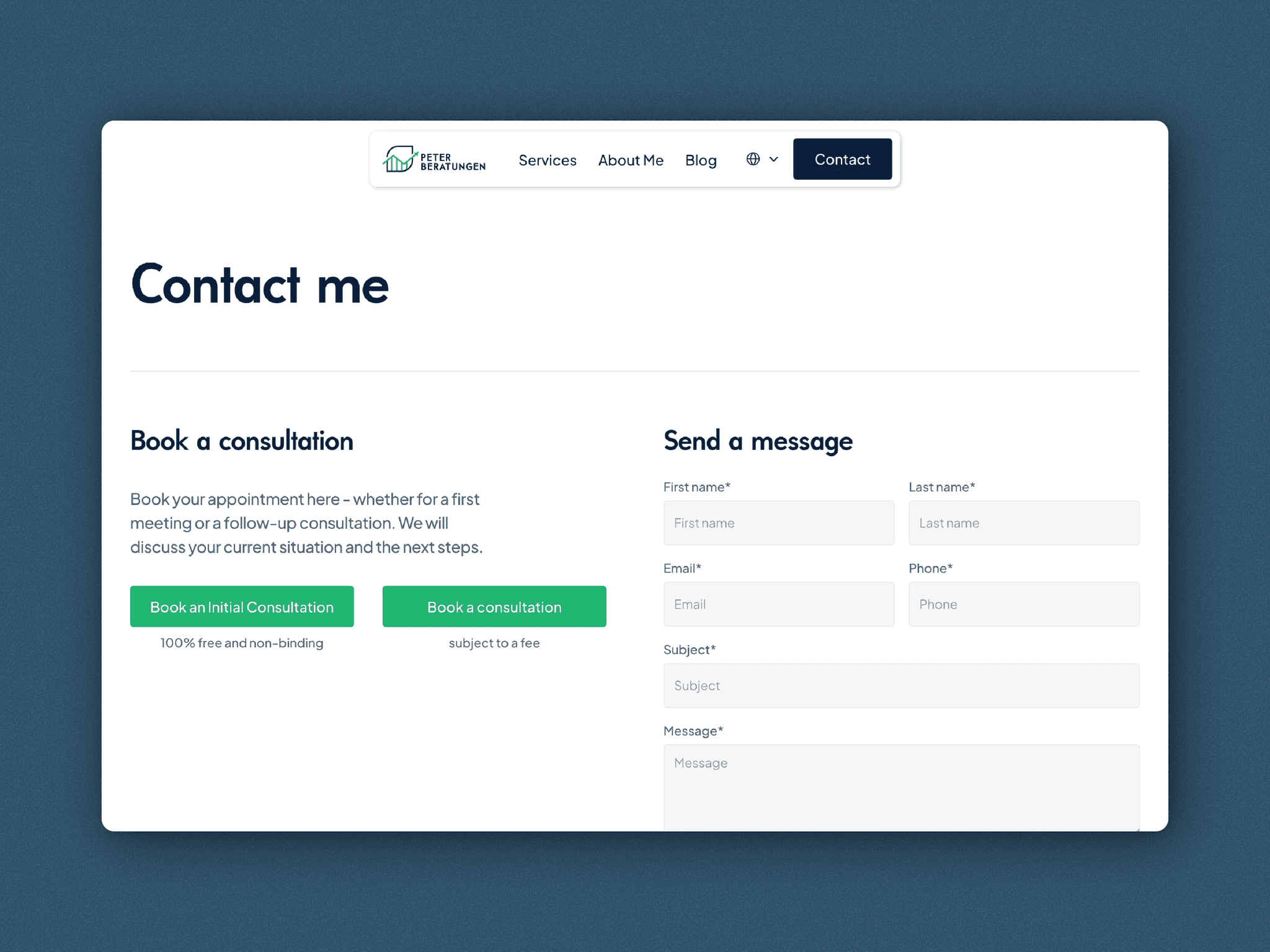
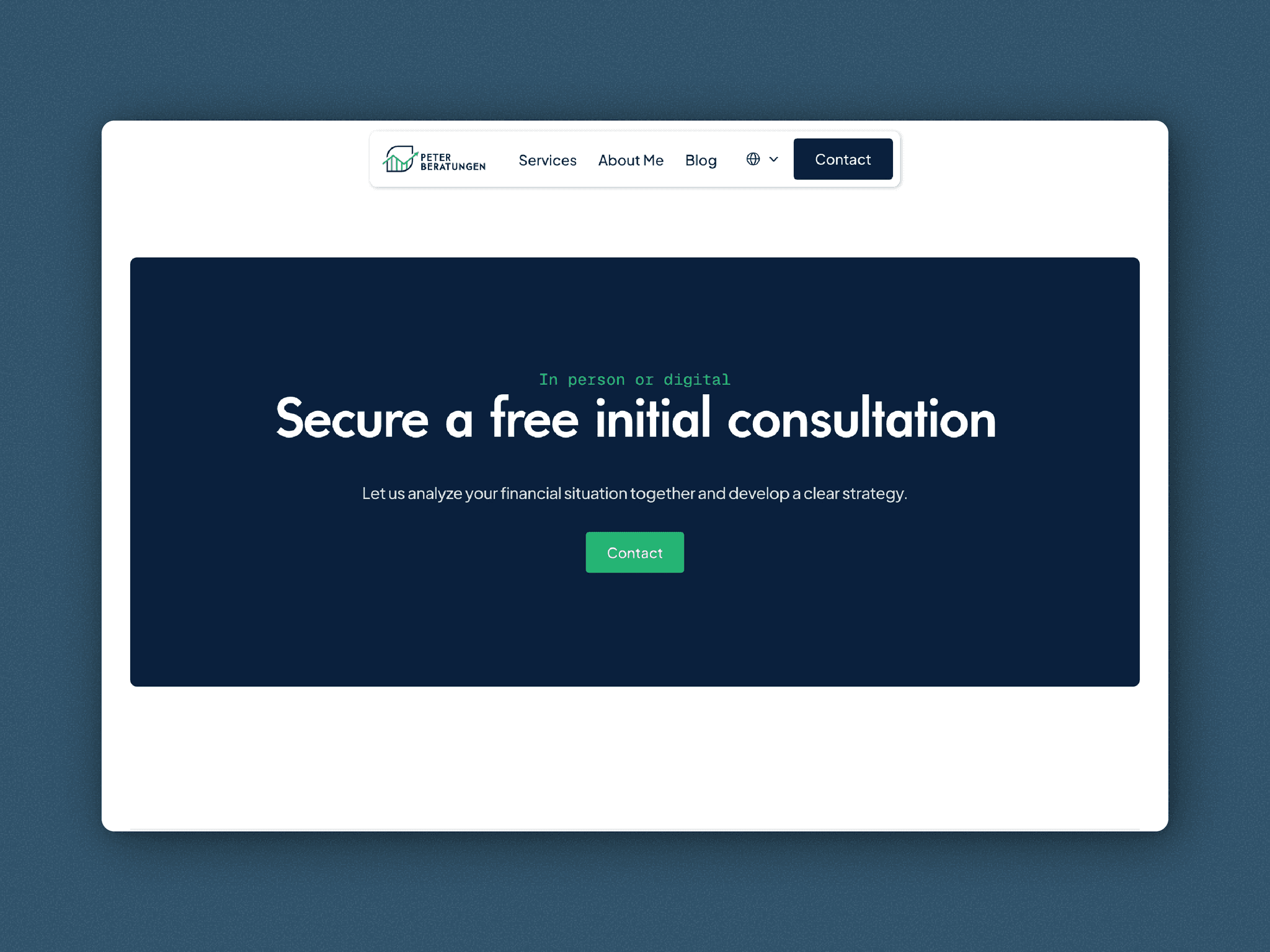
Independent financial advice now has a website to match 📈 It's clear and trustworthy, and a free first consultation is one click away.
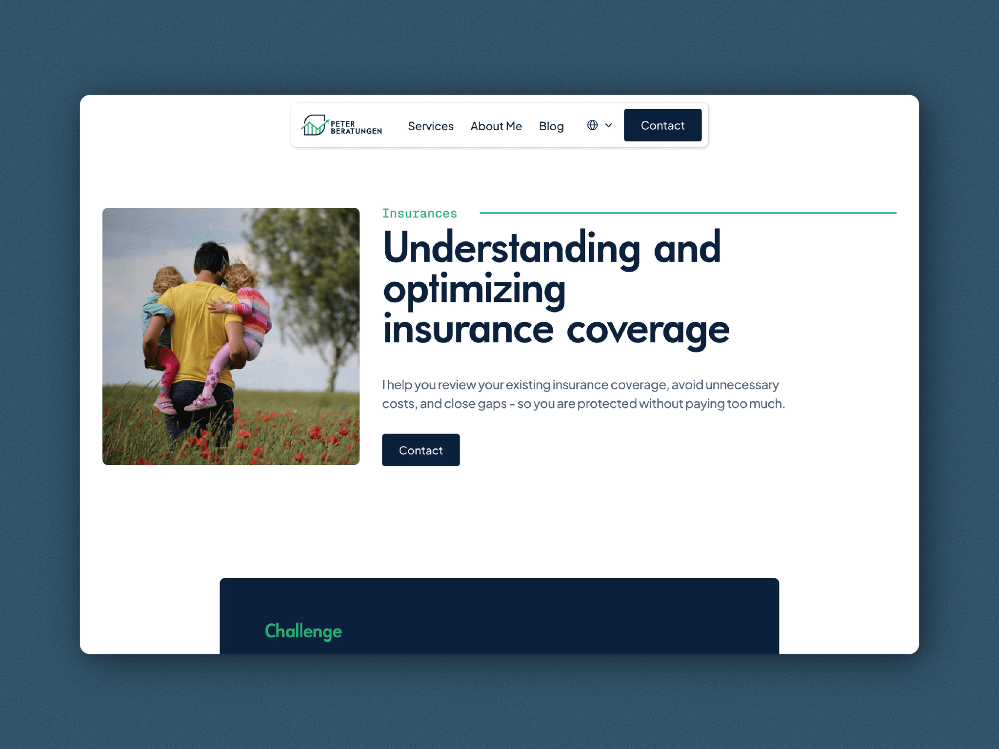
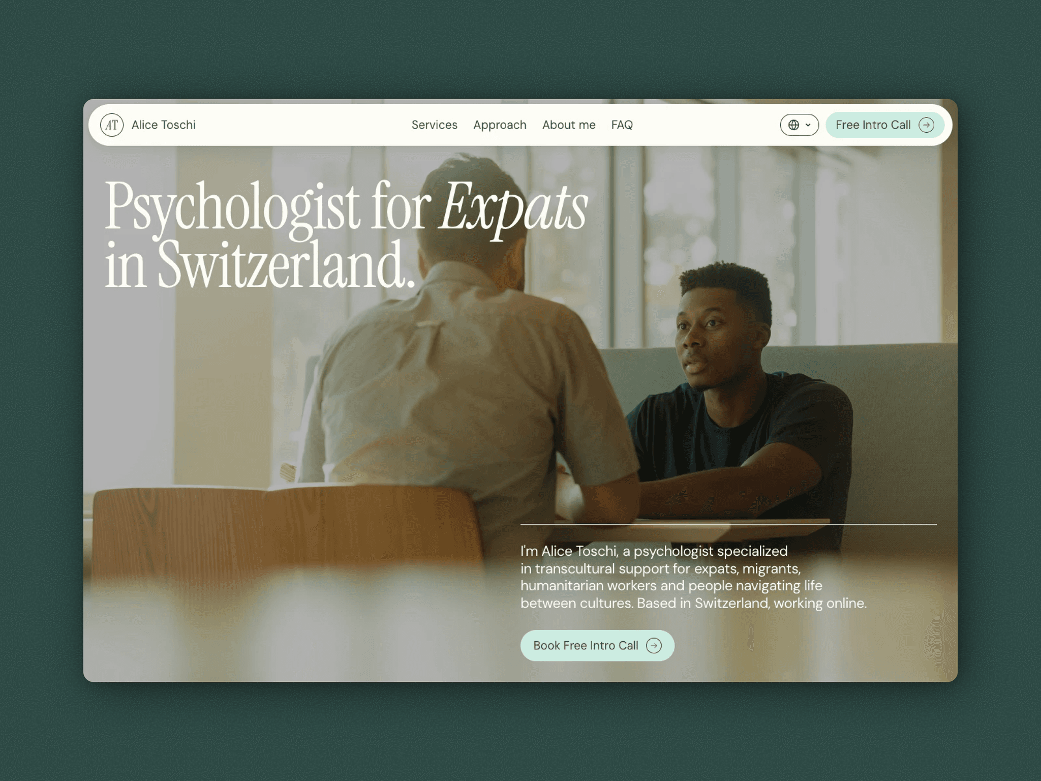
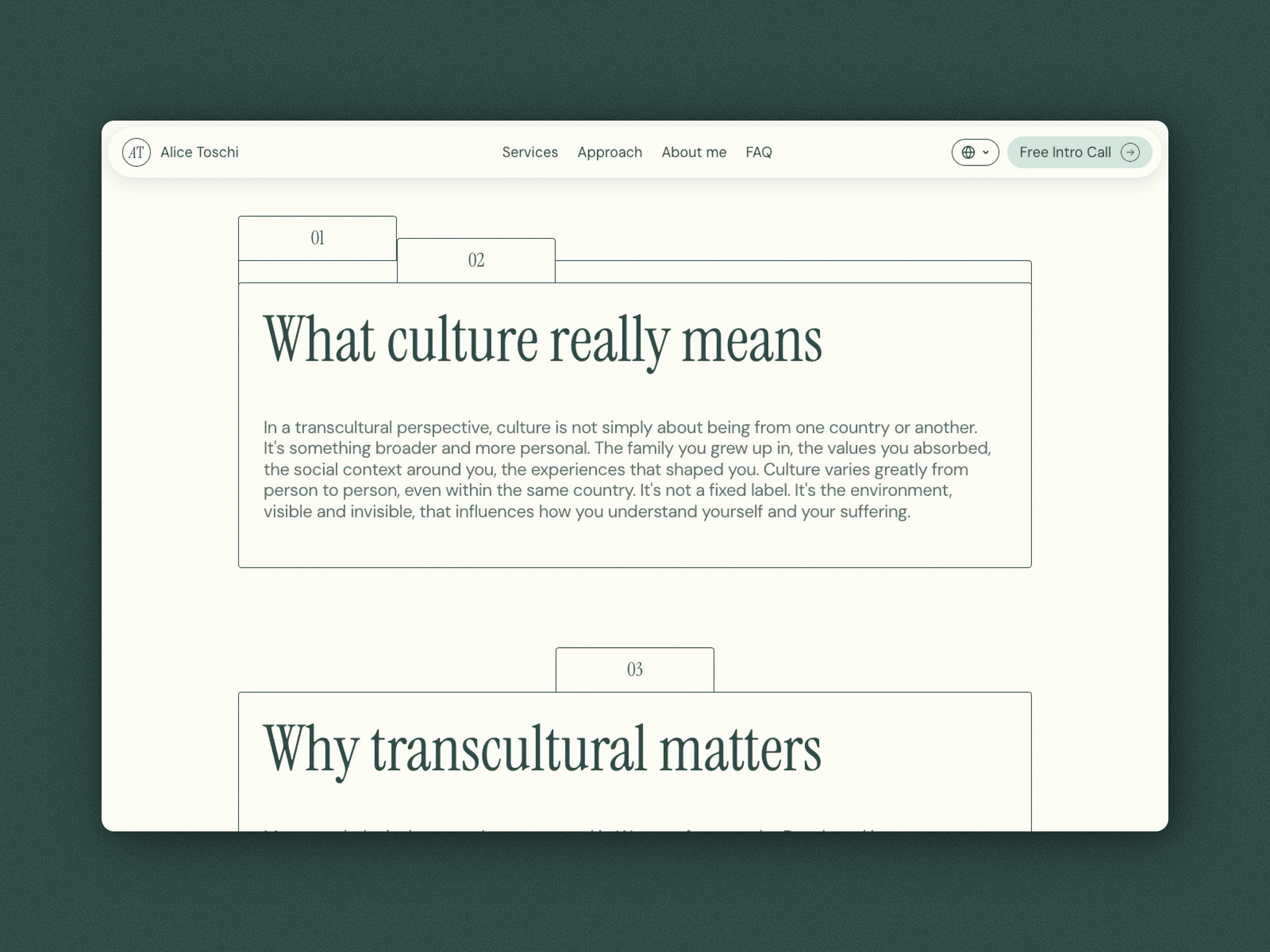
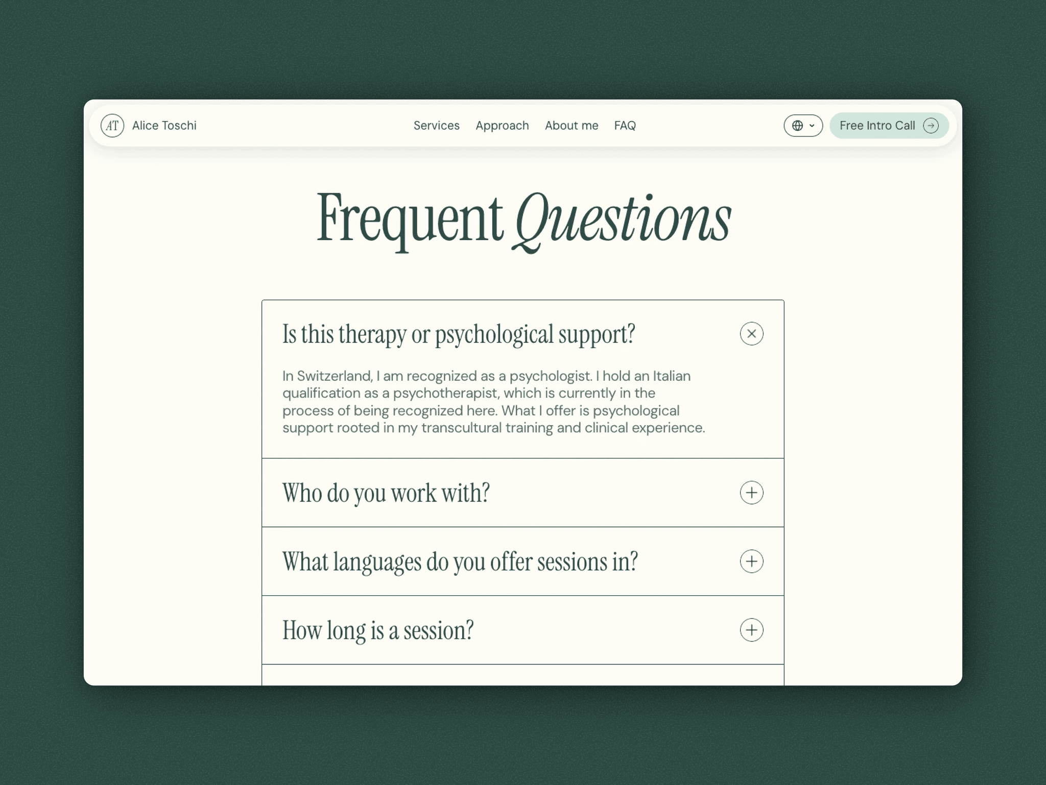
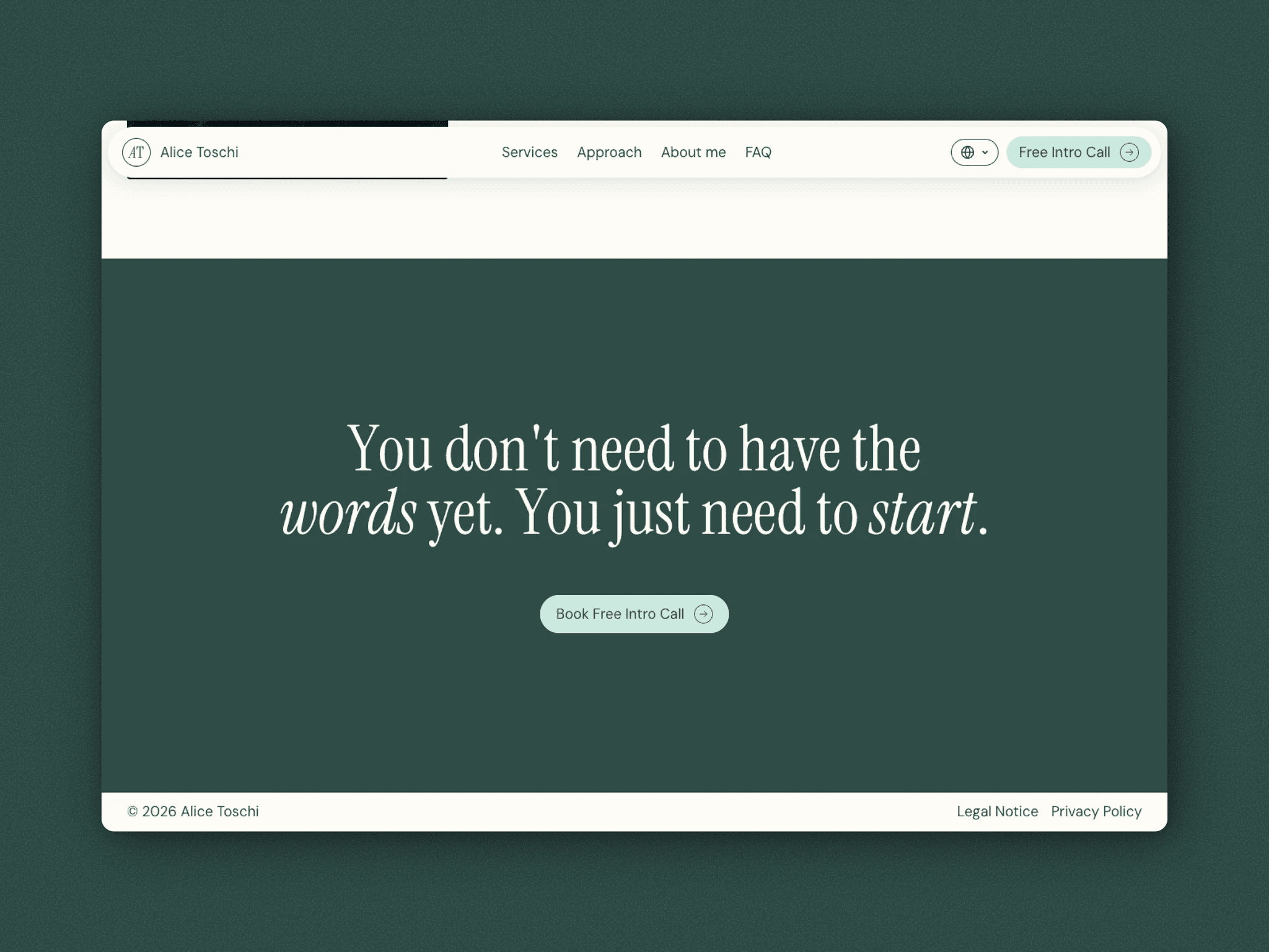
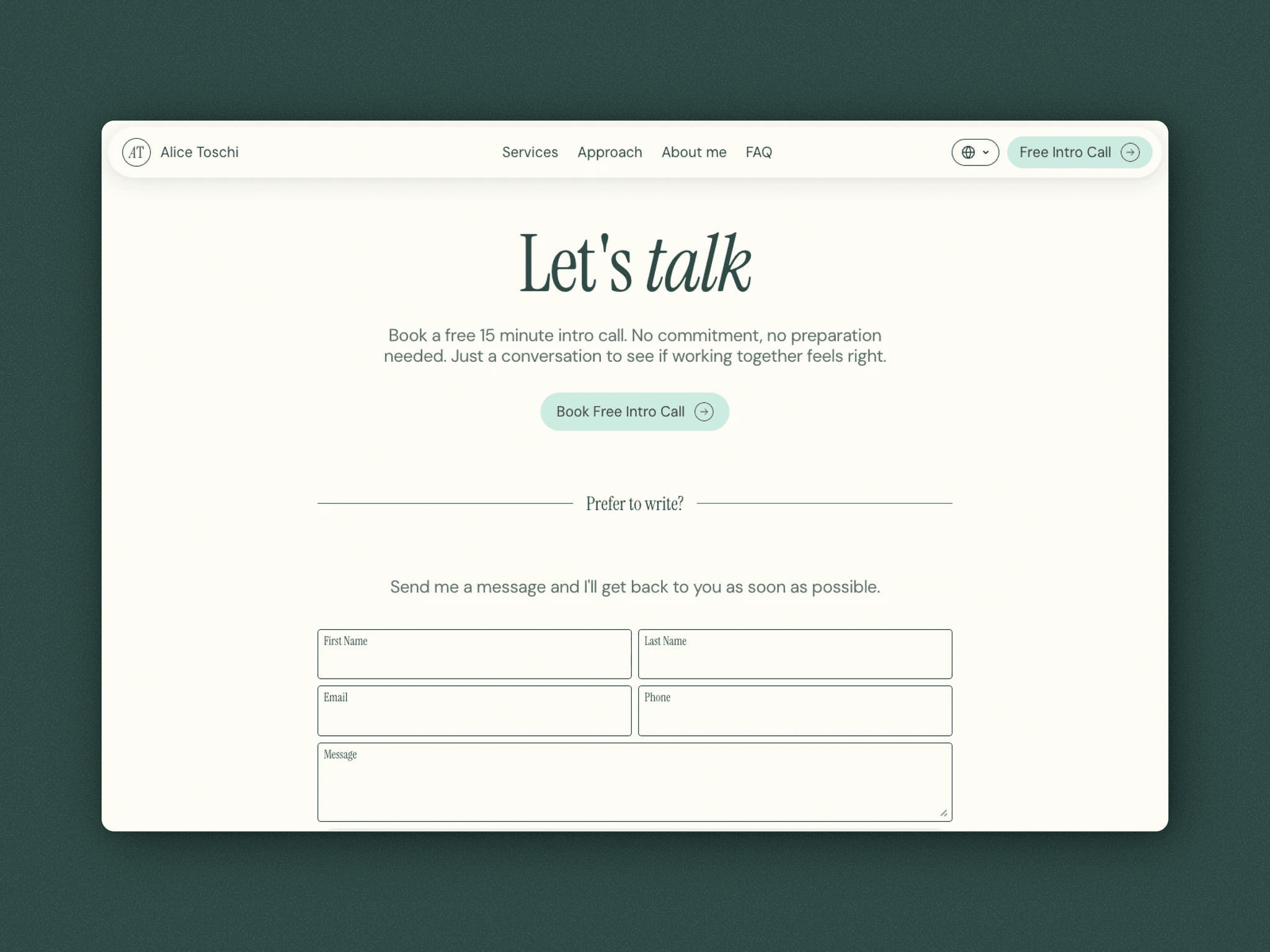
A calm, personal first website for a psychologist working with expats 🌿 Clients can book an intro call right on the site.
My first Awwwards recognition 👏🏼
A couple of weeks ago, I posted my personal website to Awwwards, just wanting to try out the platform after getting tons of inspiration from there.
Turns out my website was even good enough to get an Honorable Mention. Very happy about this outcome 🎉
Have you won any awards somewhere? If so: where?
My new Keyboard arrived 🦋
I have used the Worklouder Framer F1 since it's release for a bit over a week now and I must say that this was one of my best purchases in the last year.
Now keep in mind I'm not that deep into keyboards and I upgraded from an Apple Magic Keyboard. But this is actually a game changer. I find myself looking forward to typing stuff, isn't that weird (?)
Props to @Ben Fryc and @Framer for this amazing product!
What keyboard do you guys use?
(PS: How do people make taking these kinds of shots look so effortless? This took me way longer than I'm comfortable to admit 🫠)
Over the last couple of weeks, I posted a lot of individual parts about my Website. 🐝
Here's how my entire homepage looks.
Lots of times I have trouble cleanly separating different sections. In this case, I think I found a pretty clean way to differentiate them. Scroll Transforms helped a lot here.
How did you solve the separation of different sections?
(And what do you think, is it as clean as I think it is? 👀)
Business Cards 🪪
Me being a Web Designer, I thought that this would be an absolute piece of cake.
"Let me quickly create some business cards..."
Well I was wrong and I somehow don't like any of my designs. So i shelved business cards for now and moved on to other projects.
Here's some of my tries...
Do you guys have business cards? 🤔
Here in Switzerland every Site that uses Cookies, must have a Cookie Banner. 🍪
Unlike in the EU we don't have to let the visitors choose which ones they'd like to pick.
Given that it really isn't that central here, I tried to keep the Banner as unintrusive as possible while still keeping it on brand.
Do you have a Cookie Banner on your page?
This is how I decided to design my Hero-Visual 🏞
I didn't have any clean image or video so I decided to show some of my project in this slider.
Like this I still have some sort of visual without it having to be some unrelated imagery.
Follow me for more insights 🕺
Is it just me or do you guys also create all sorts of documents inside Framer? 📚
I create all of these documents inside Framer:
- Invoices
- Offers
- Contracts
- Onboarding Instructions
- Offboarding Instructions
- Maintenance Instructions
Like this I can be sure I have consistent branding over every touchpoint with my clients.
Where do you create your relevant documents?
Today's scenery: North Italian Vineyards 🍇
Only doing some light work today. Can't miss out on this amazing location and weather 😆
How's your workplace looking today?
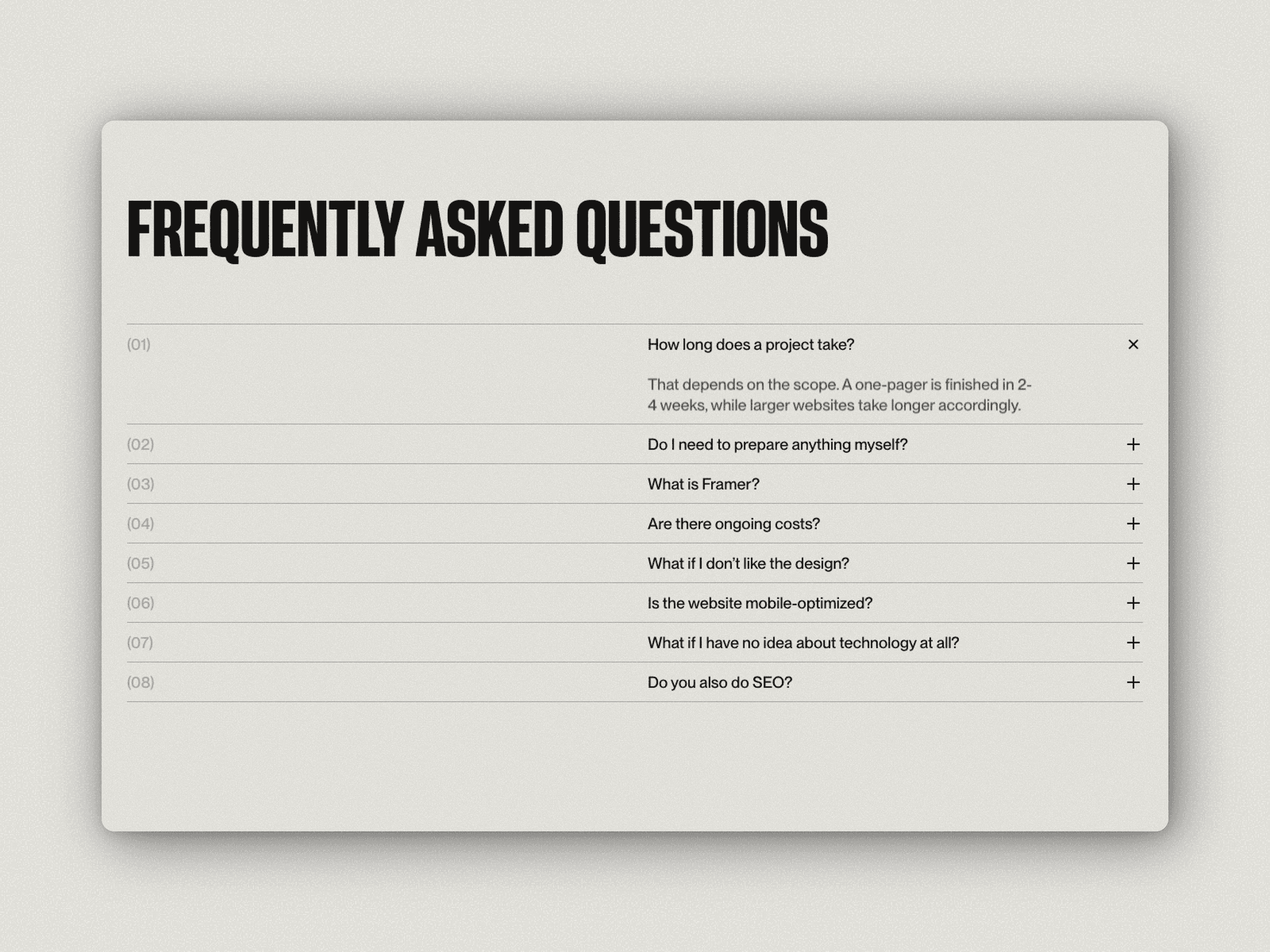
My take on a FAQ-Section 🧠
I like using this section to both pre-handle common objections and, of course, answer the most frequent questions.
Styling-wise, I tried being on brand by keeping it type-heavy and letting the design breathe with lots of whitespace.
What do you think?
Follow for more insights on why I do what I do.
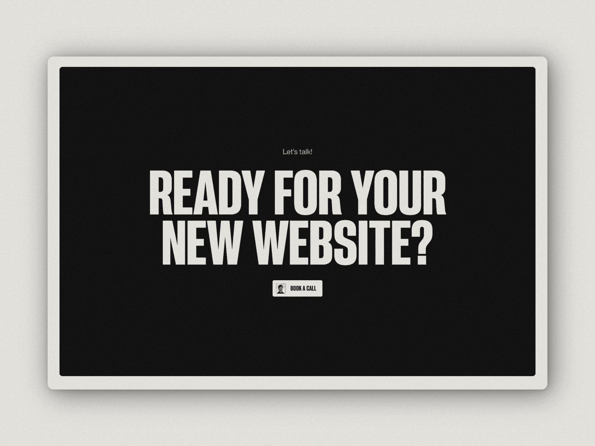
The end of almost every page: the CTA-Section 📈
I like adding a CTA-Section at the end of most pages, just to make sure visitors know how to take the next step if they are interested in doing so.
In my case, I want people to book a call with me. So still on brand I ask them directly to book a call with me.
What do you think about adding CTA Sections at the end?
404 👀
The page everyone hopes, their visitors never reach. But things happen and people may still end up here.
I tried to imitate a stamp being pressed onto the page while still staying on brand. This is what I ended up with.
What do you think?
Follow for more insights of how I create my projects.
The Start of my Services Index Page 🃏
I really like the "Card" Aesthetic, so I decided to show my 3 Main-Services as such.
How did you design your Services-Page?
Follow me for more insights 🐝
The About me Section for my Website 🪪
This Scroll-Animation adds some interaction and lets me smoothly change from a light to a dark section.
Follow me to get some more insights on how I create my websites.