Search
Search
The design tool with publishing powers
A true design canvas, not just a visual HTML editor.
A true design canvas, not just a visual HTML editor.


Icon Set
Search…

Benjamin


New in Framer
New in Framer
New in Framer
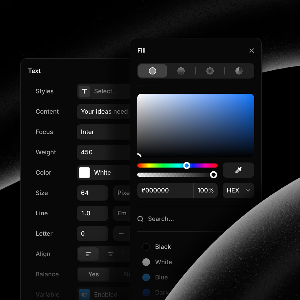
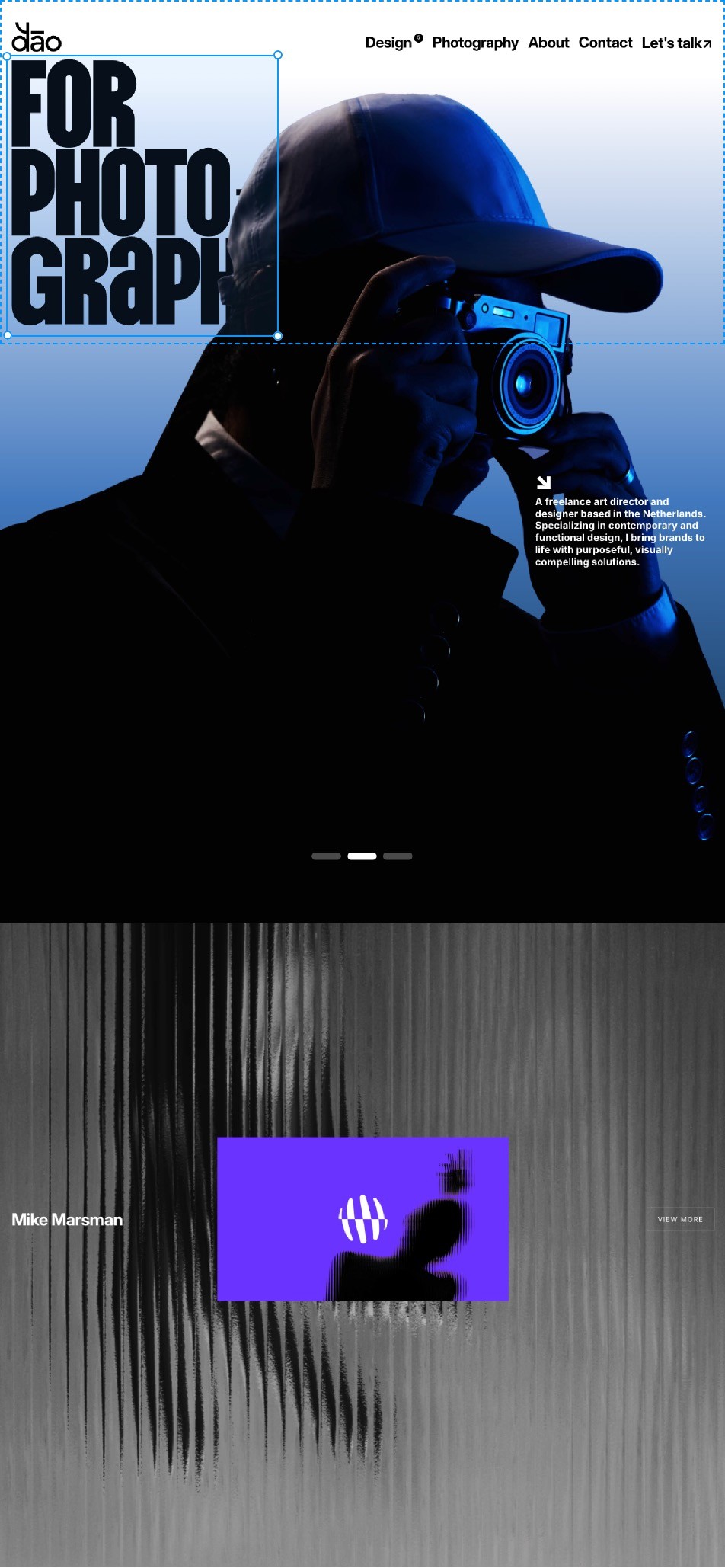
Framer gives you a Figma-like design tool experience.
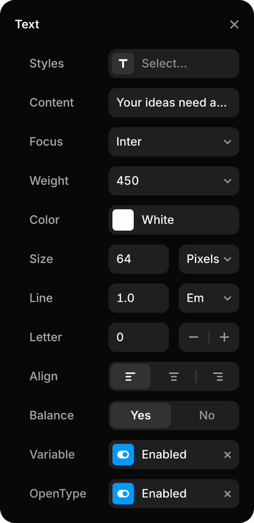
But instead of designing a picture of a website that you need to rebuild later, what you design is the real thing. With full support for vector editing, styling, and typography features you’d expect—and more.



100%



Desktop
·
1200
Breakpoint
Tablet
·
810


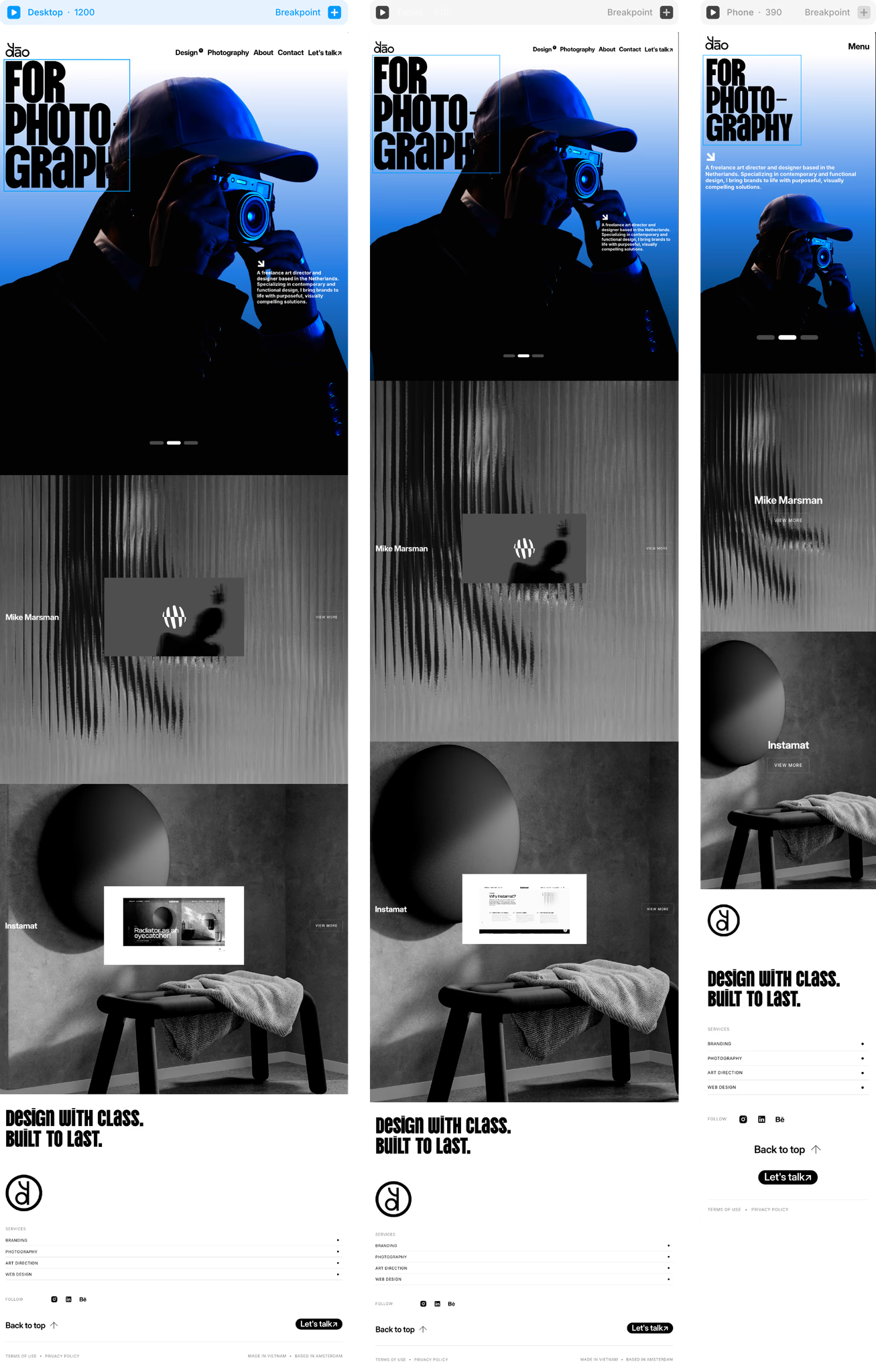
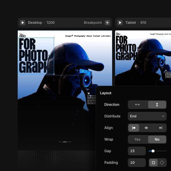
Design breakpoints side-by-side like you’re used to
Only this time, they’re real and connected—yet still on a freeform canvas. Perfect every screen size with Grids and Stacks, our intuitive Auto-Layout equivalent.
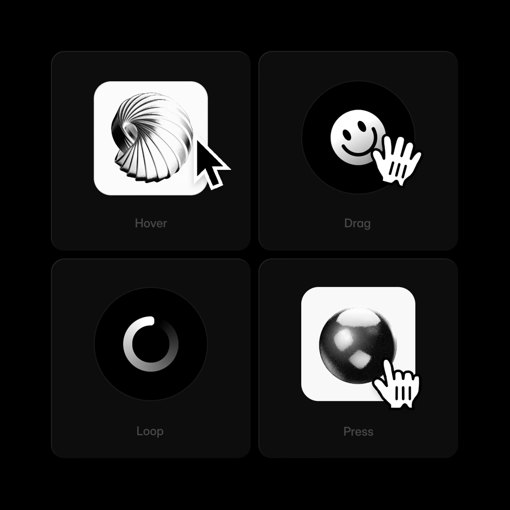
Make your designs move, without moving mountains.
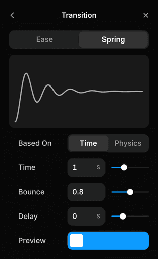
Add appear effects, text effects, parallax scrolling, scroll animations, looping animations, and much more in seconds. Combine them to rival award-winning sites.


Selected
projects
Scroll Transform
Trigger
Layer in View
From
Effect
To
Effect
Transition
Spring




Updates
36

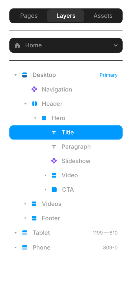
Search for your Pages, Layers, and Assets

July Update: Link Decoration

Font Drop 11

Workshop: Claude 4.0
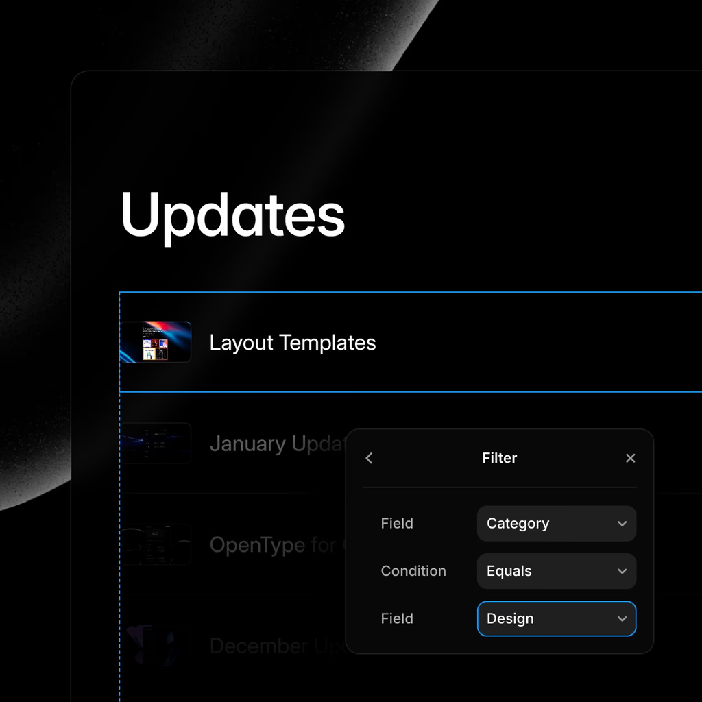
Design with the CMS
Fill your design with text, images, videos, and more from the CMS. Show or hide elements as needed, so your team or client can update the site without having to touch the design.
Everything you need to design, and more
Design Canvas
Design Canvas
Design Canvas
Layout Templates
Layout Templates
Layout Templates
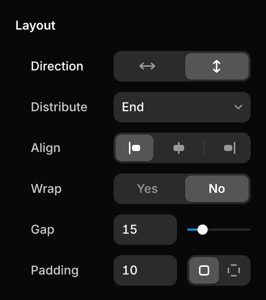
Auto Layout-like Stacks
Auto Layout-like Stacks
Auto Layout-like Stacks
AI Layouts
AI Layouts
AI Layouts
Effects and Filters
Effects and Filters
Effects and Filters
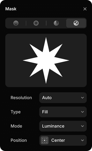
Advanced Masking
Advanced Masking
Advanced Masking
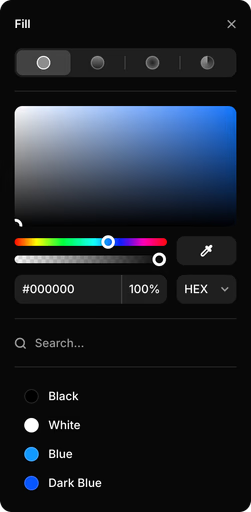
Vector Editing
Vector Editing
Vector Editing
Vector Sets
Vector Sets
Vector Sets
Figma Import Plugin
Figma Import Plugin
Figma Import Plugin
Side-by-side Breakpoints
Side-by-side Breakpoints
Side-by-side Breakpoints
No-code Animations
No-code Animations
No-code Animations
Components and Variants
Components and Variants
Components and Variants
Design with the CMS
Design with the CMS
Design with the CMS
Real-time Collaboration
Real-time Collaboration
Real-time Collaboration
Auto Image Optimization
Auto Image Optimization
Auto Image Optimization
Custom Form Builder
Custom Form Builder
Custom Form Builder
Project Color Styles
Project Color Styles
Project Color Styles
Huge Font Library
Huge Font Library
Huge Font Library
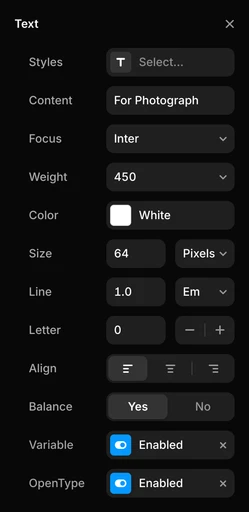
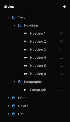
Project Text Styles
Project Text Styles
Project Text Styles
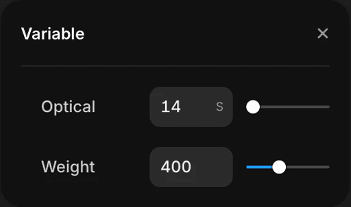
Variable Fonts
Variable Fonts
Variable Fonts
Scalable type
Scalable type
Scalable type
OpenType Features
OpenType Features
OpenType Features
Overlays and Modals
Overlays and Modals
Overlays and Modals
Easy Page Navigation
Easy Page Navigation
Easy Page Navigation
Instant Preview
Instant Preview
Instant Preview
Interactive Slideshows
Interactive Slideshows
Interactive Slideshows
Image Exporting
Image Exporting
Image Exporting
Custom Cursors
Custom Cursors
Custom Cursors
Plugin Ecosystem
Plugin Ecosystem
Plugin Ecosystem
Design for Light & Dark
Design for Light & Dark
Design for Light & Dark
Ruler and Guides
Ruler and Guides
Ruler and Guides
Design with Rich Media
Design with Rich Media
Design with Rich Media
Advanced AI Components
Advanced AI Components
Advanced AI Components
Selection Colors
Selection Colors
Selection Colors


Step into the future of design
Join thousands of designers and teams using Framer to turn ideas into high-performing websites, fast.

