About Fe Herospot
Most hero sections just sit there looking nice. This one gives visitors
something to click.
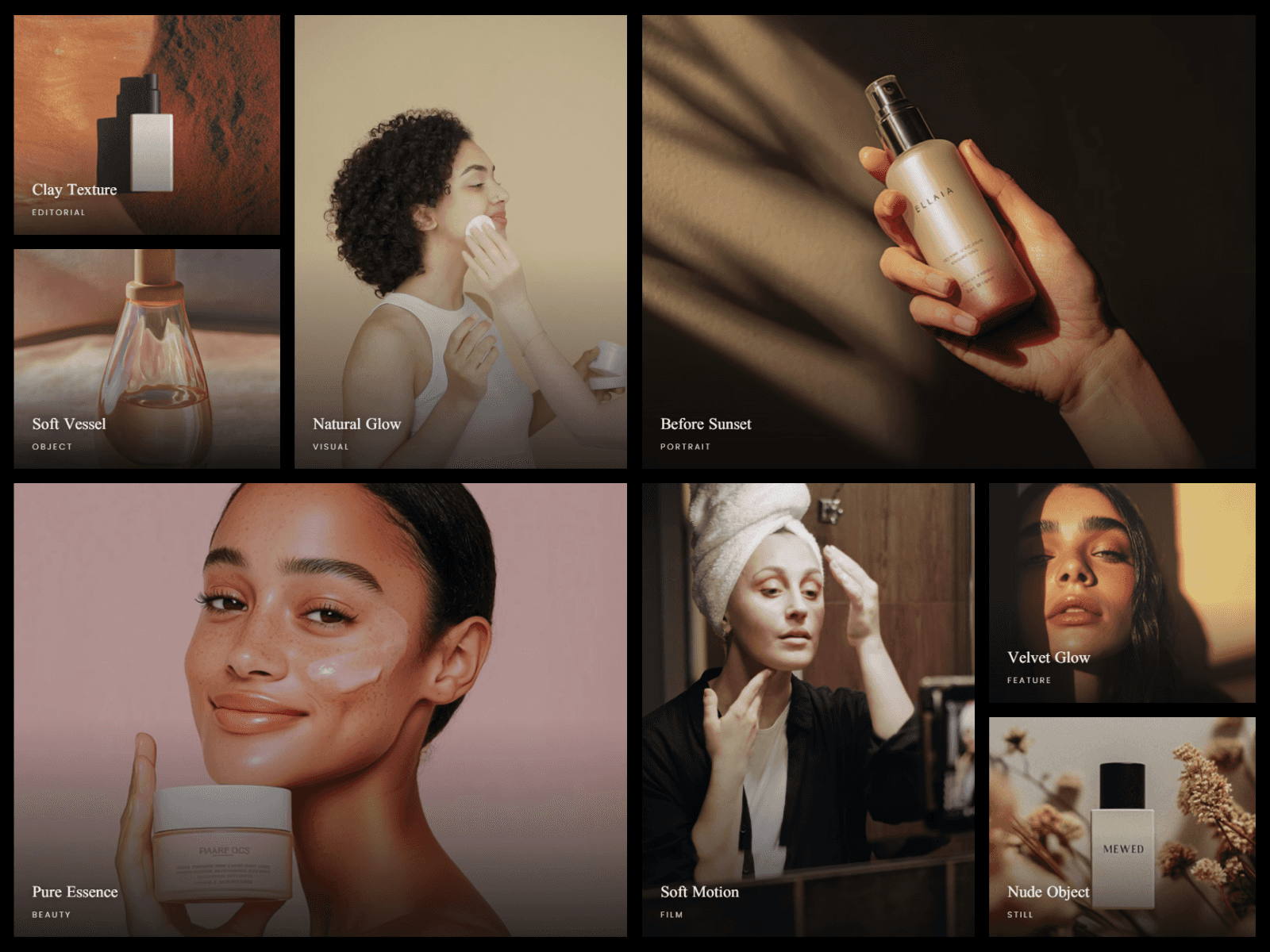
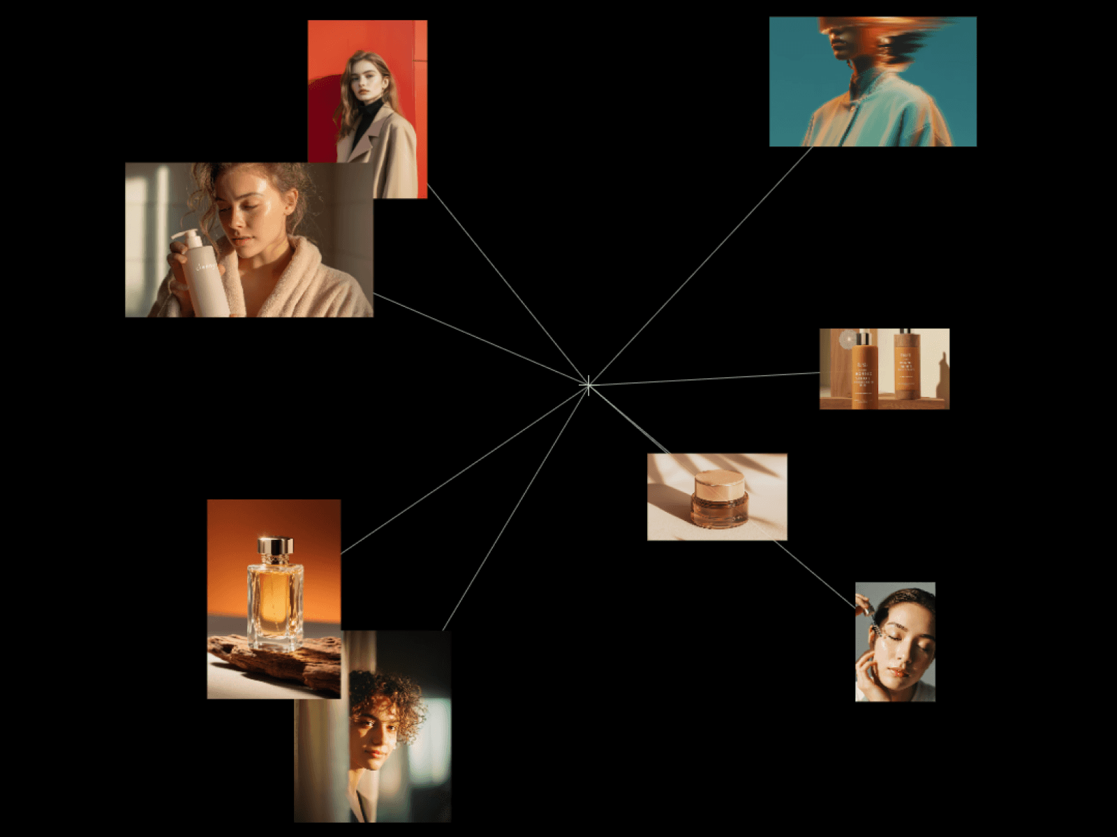
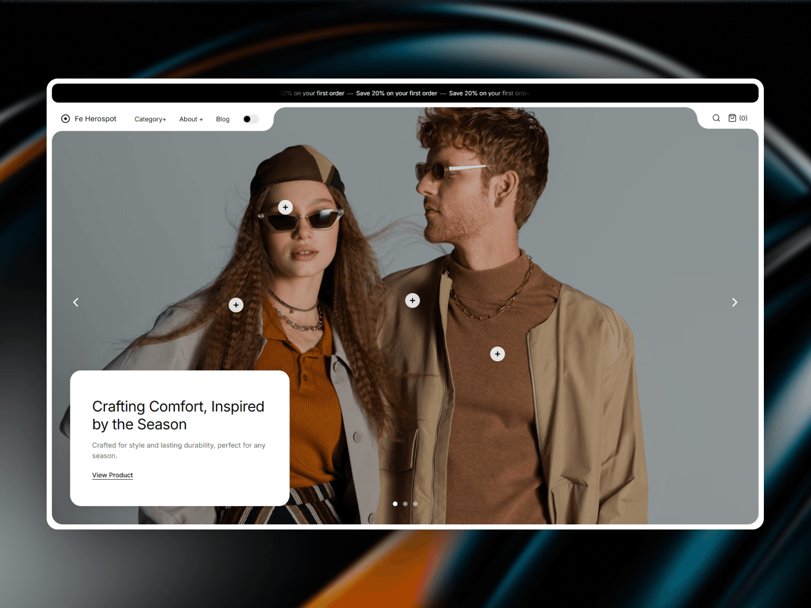
Fe Herospot pairs a tabbed navigation header with a fading image carousel, then
lets you pin product hotspots onto the photos. Someone hovers a hotspot and a
small card opens with the thumbnail, name, price, and a link to the product.
What you get
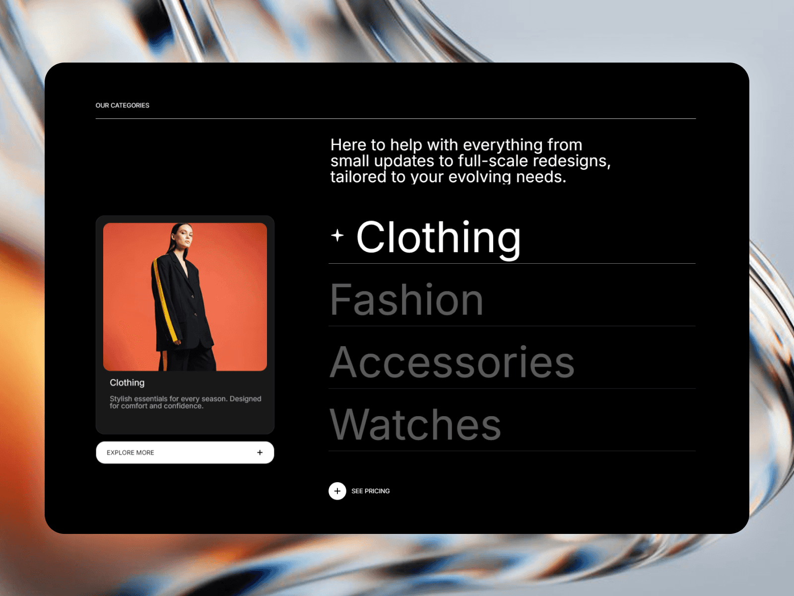
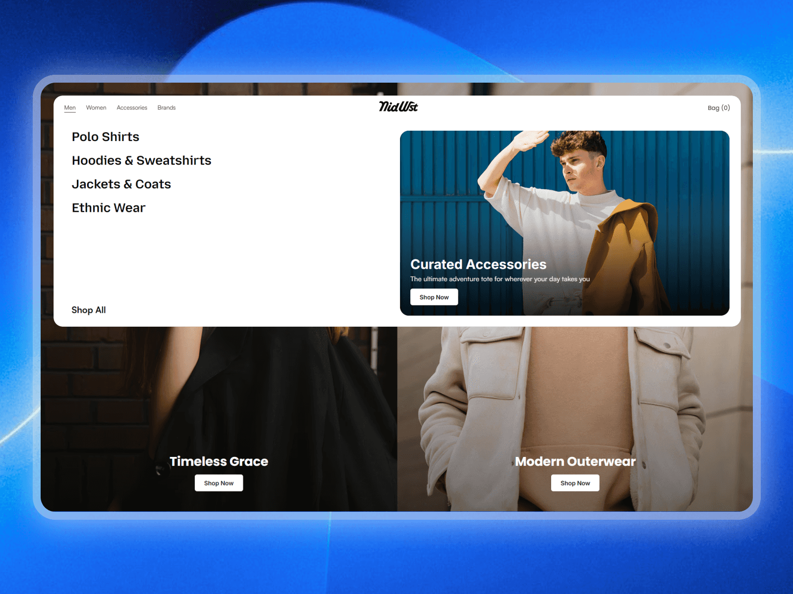
- A tabbed header that hangs off a scrolling announcement bar, with the hero
image showing through the gap between the tabs
- Dropdown menus on any nav item (just end the label with a plus sign)
- Nav links that roll vertically on hover
- A carousel with arrows, dots, and optional autoplay
- Up to 12 shoppable hotspots, four per slide
- A light and dark toggle, each with its own colors
- Search and cart icons with a counter
How it handles small screens
Breakpoints read the component's own width instead of the browser window, so it
behaves the same whether it runs full bleed or sits inside a narrower container.
On phones the nav folds into a Menu button and the content card slides up over
the image.
What you can change
Slides, nav labels, promo text, logo, hotspot copy, and links are all property
controls. Fonts are split out for headings, body, buttons, nav, and the promo
bar, and dark mode gets its own palette. If your page already has a nav, switch
the header off and keep the carousel on its own.
Worth knowing before you buy
Hotspot positions are fixed and tied to the first three slides, so they work
best with the photos included or with images shot a similar way. Hotspots stay
hidden on phones. Dropdown menu contents are preset.
No external libraries. Built with Framer's own Font, Color, Link, and
ResponsiveImage controls.