About Fe MissionaryGallery
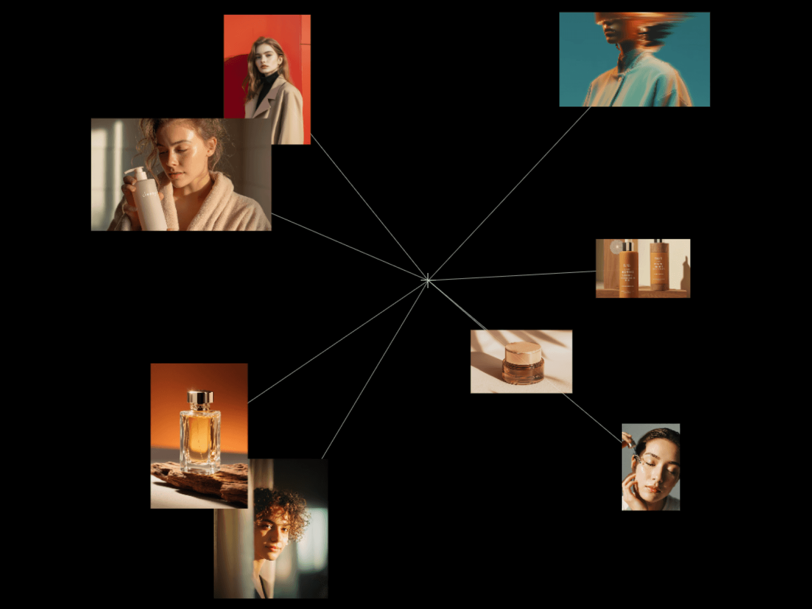
FE Masonry Gallery is a dark, editorial gallery section for beauty, product, fashion and portfolio sites. It drops in as a finished layout rather than a blank grid you have to assemble.
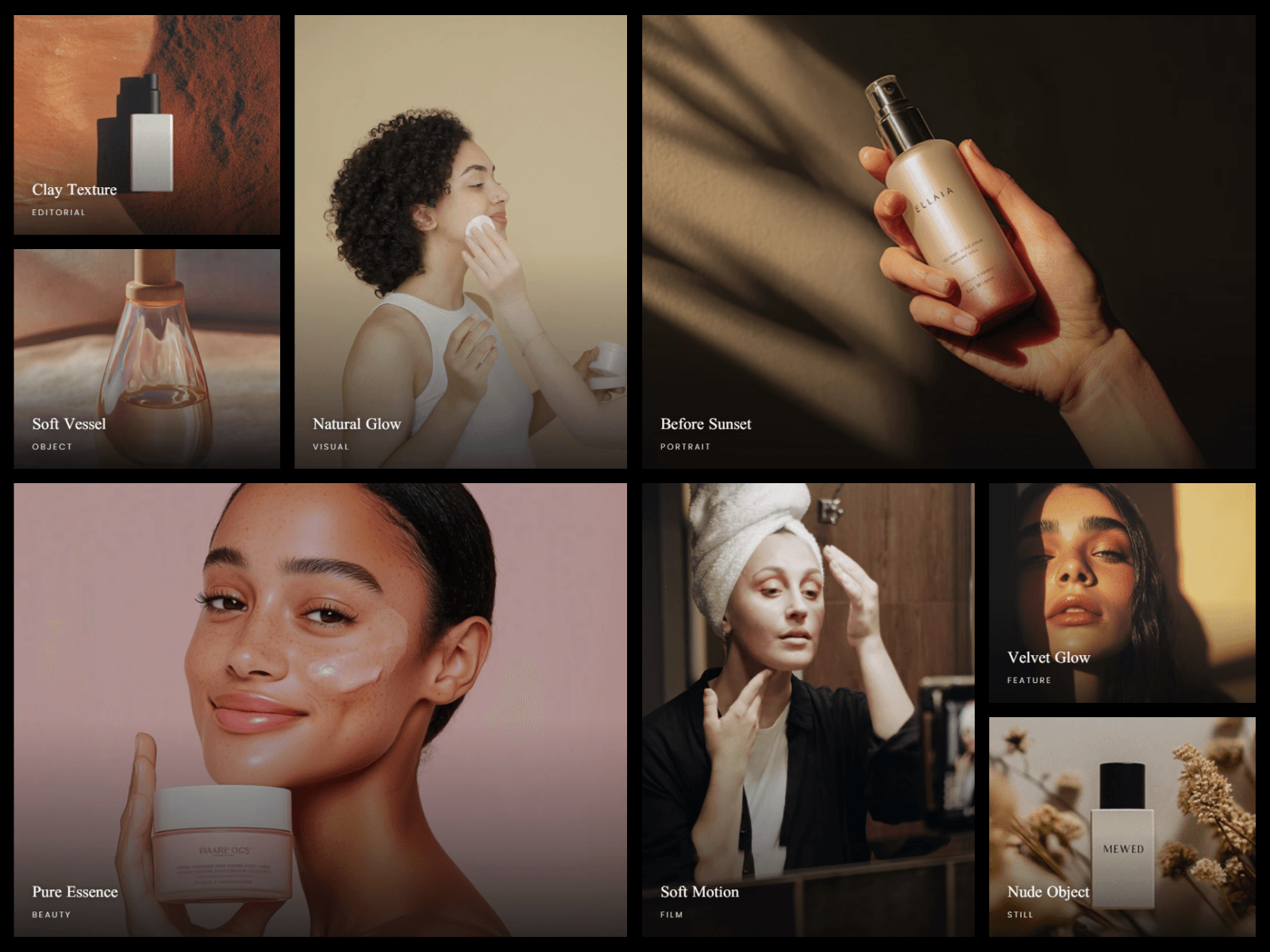
On desktop it renders an eight-tile metro grid: two stacked squares, a tall column, a 2x2 hero and a wide feature, with column ratios you dial in from the panel. Two of the large tiles crossfade through their own image sets, so the section keeps moving without carousels or scroll hijacking. Any card can hold silent looping video instead of a still, each with its own poster frame.
Responsiveness is measured from the component's own width, not the browser viewport, so it behaves correctly inside any container, column or modal rather than only at page level. Desktop keeps the metro grid, tablet folds to two columns, phone to one, with card height driven by a single aspect-ratio control.
Everything is a property control: column ratios, gap, corner radius, max width, row height, overlay gradient and blur, hover zoom and dim, title and meta fonts, label padding, crossfade timing, and the breakpoints themselves. Cards are an array, so each item carries its own image or video, title, subtitle and grid spans.
It is built to pass review, not just to look good. The component checks the static renderer, so animations, observers and video playback are disabled on the Framer canvas and in exports, which means no editor jank and no export artifacts. The markup is semantic: an h2 section heading above h3 card titles, alt text on every image, and no keyboard focus stops on cards that are not interactive. Stills ship as WebP and the bundled clip is 1080p, keeping the section light.