About Photos Widget
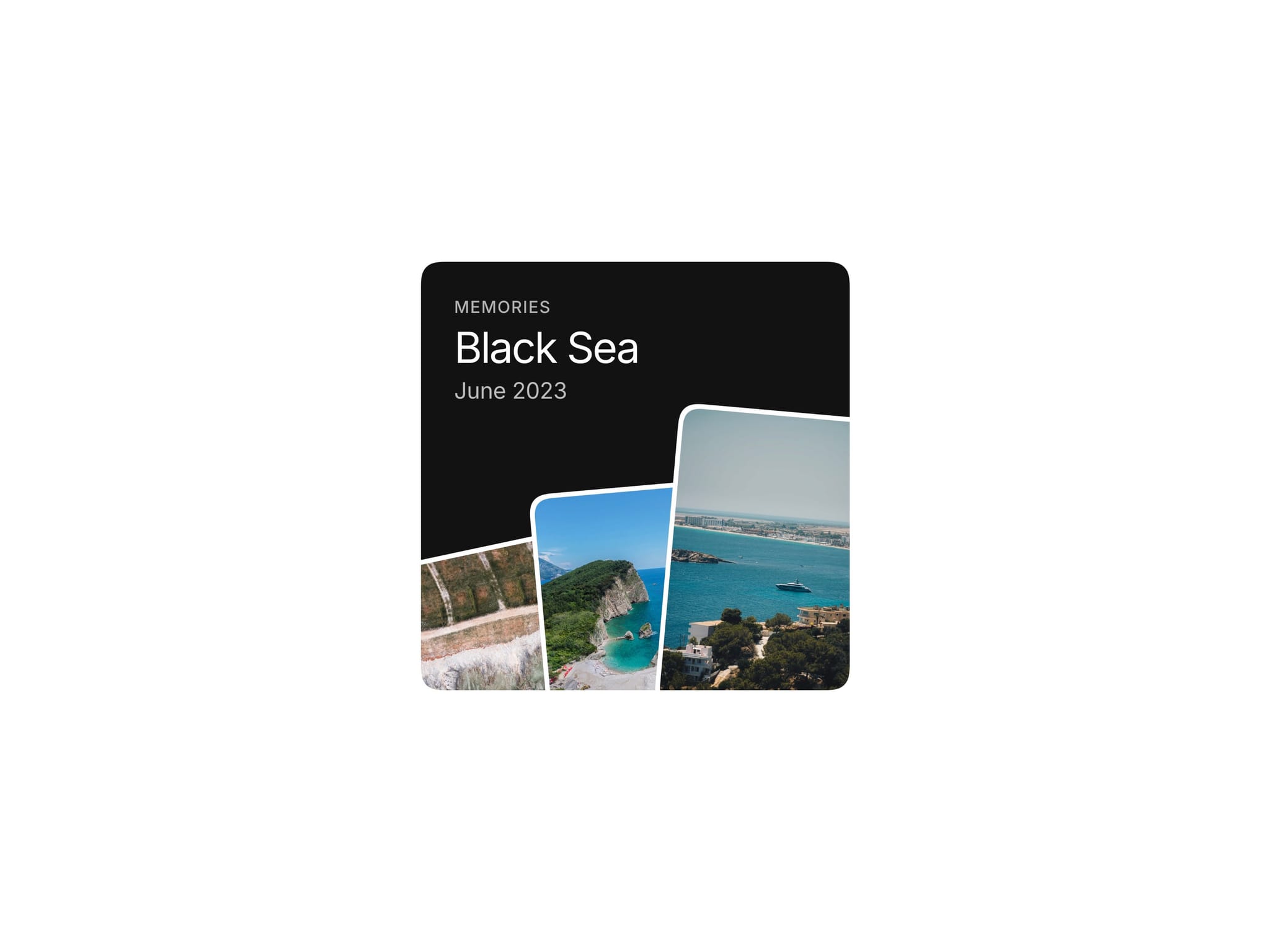
Photos Widget is a compact component for turning a small collection of images into an interactive memories display. Three overlapping photos sit inside a rounded square widget, creating a layered editorial composition that feels more considered than a standard image grid.
Select any image to bring it forward and expand it into a focused photo view. Select it again to return to the stacked layout. The interaction keeps the component simple to understand while giving a small content block a more tactile, visual role on the page.
How It Works
The default state presents three angled, overlapping photos with a short label, title, and date. Each image acts as an entry point into its own expanded state.
The transition moves the selected photo from the stack into a full-widget view, then returns it to its original place when selected again. This makes the component useful for showing a small set of highlights, travel moments, project visuals, or product details without sending visitors elsewhere.
Design and Motion
Photos Widget uses a compact square proportion, layered spacing, soft squircle corners, and restrained type to keep the composition readable. The angled images create depth while the clipped widget boundary keeps the layout contained.
Motion is focused on the change in visual hierarchy: a photo comes forward, straightens into place, and becomes the main view without distracting from the content.
Customization
Edit the component directly through Framer variables:
Three images
Label, title, and date
Widget background color
Image border color
The image arrangement, proportions, corner treatment, and interaction states are intentionally fixed to preserve the component’s composition and motion.
Great For
Portfolio highlights, creative agencies, photography sites, hotel and lifestyle pages, product storytelling, editorial layouts, and more.
Inspired by Pinterest reference.
Questions & Support
Reach out any time via x.com/omeronframer or email at contact@omermirza.com.