
About Axiora
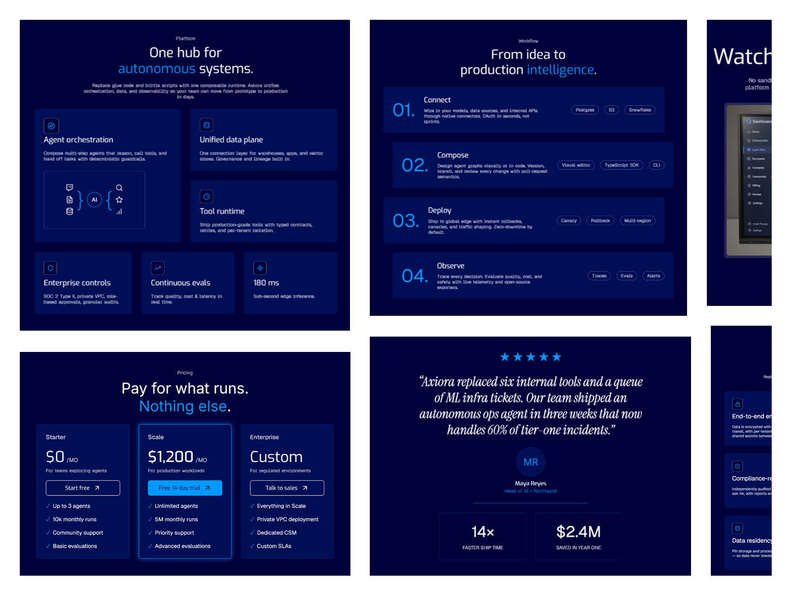
Axiora is a Framer template for teams building AI infrastructure, agent platforms, and the picks-and-shovels layer underneath the AI boom. It's built for the buyer who scrolls past the marketing copy and goes straight to the pricing table and the security page.
Design
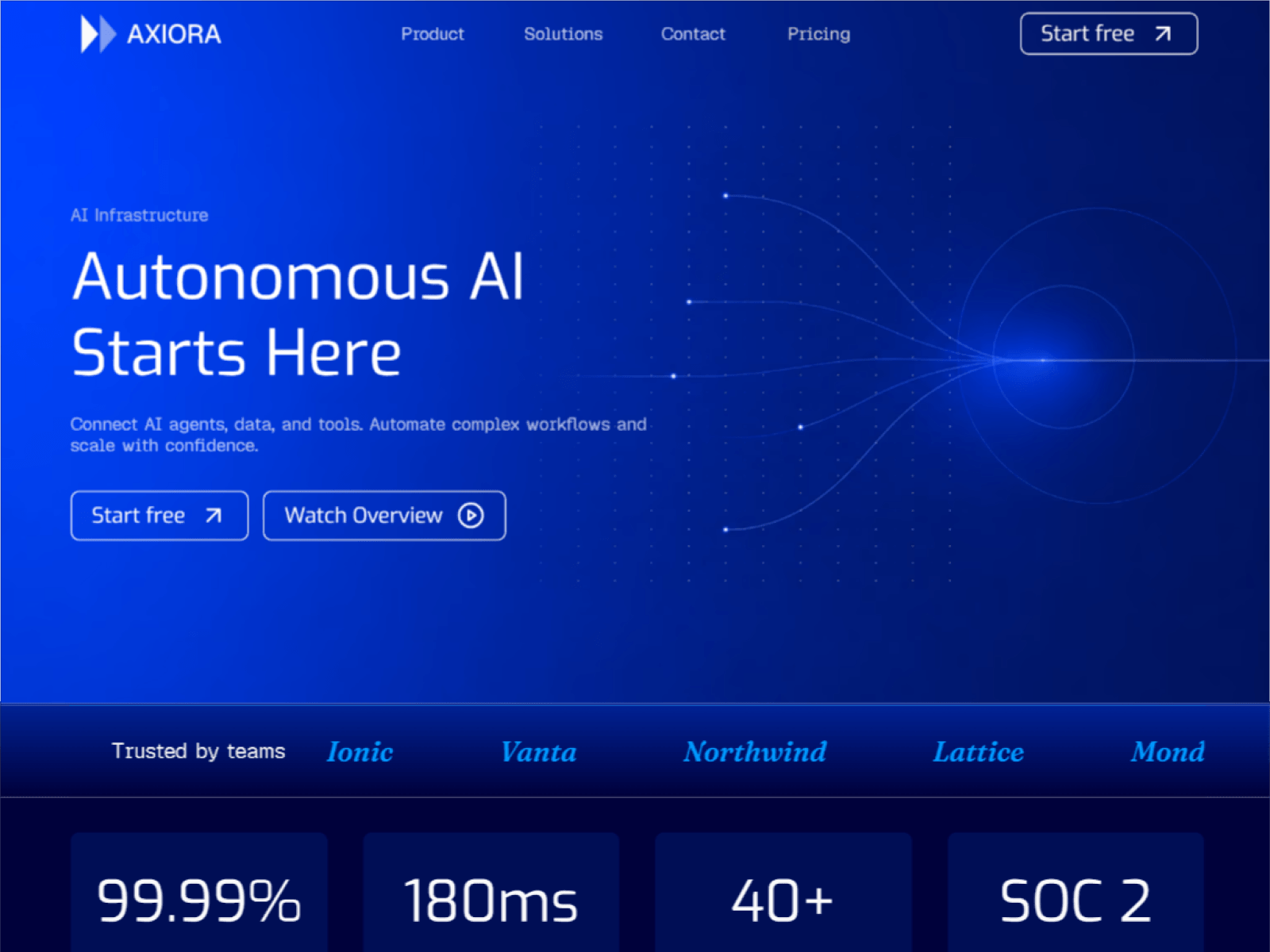
Navy, electric blue, and a lot of restraint. Nothing glows just to glow. Typography does the heavy lifting, cards stay quiet, and the whole thing is paced like a product walkthrough rather than a highlight reel, so it reads as something an engineer would actually trust.
Built Dark, Not Adapted
There's no light-mode compromise hiding in here. Every token, contrast ratio, and spacing decision was made for one mode, which is why it holds together instead of feeling like a theme was flipped.
More Than a Homepage
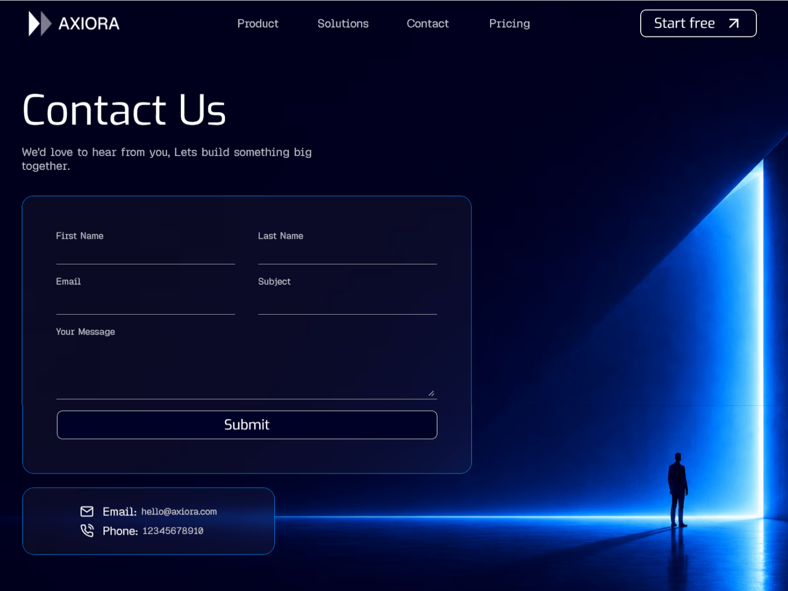
A Security page with real compliance and audit-log detail. A Demo page that runs a live trace instead of showing a screenshot. A Contact page and a 404 that don't feel like afterthoughts. This is the set of pages an infra product actually needs to close a deal, not just look good on a thumbnail.
Features
Fully responsive across every breakpoint
Security, Demo, Contact, and 404 pages included, not bolted on later
Interactive demo section with live trace animations
Restrained, dev-tool-grade typography and spacing
Simple to rebrand and make your own
Best for
AI infrastructure and agent-platform startups
Dev-tool and API-first SaaS teams
Founders who need to look enterprise-ready before they are
Anyone tired of AI templates that all look the same