About Form & Lights
Detailed Features
Form & Light: Editorial Media Template
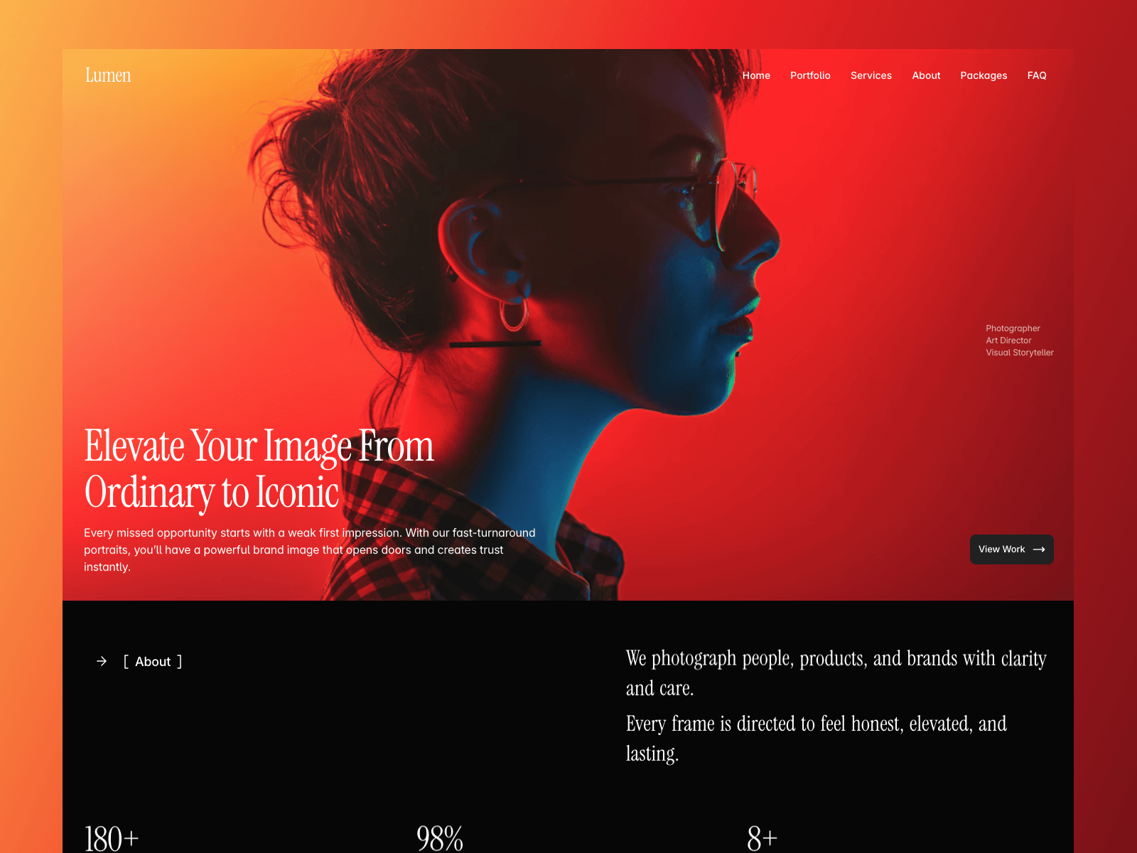
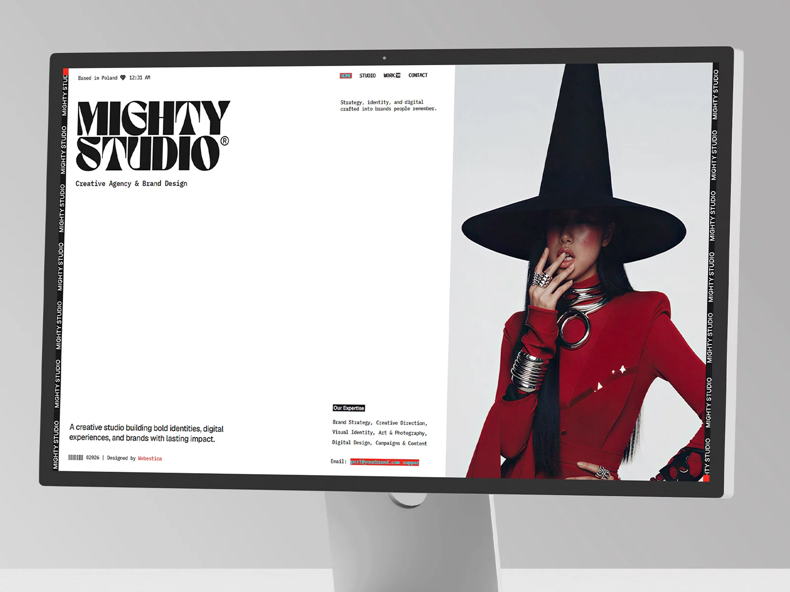
An editorial Framer template tailor-made for architecture, photography, and art storytelling. Designed for agencies and creators seeking a high-end, distraction-free aesthetic that lets the work take center stage.
System-Native Light & Dark Mode
Adapts instantly to user system settings. Light Mode delivers a crisp, gallery-like presentation for photography, while Dark Mode offers a quiet, immersive atmosphere. Every layout contrast and micro-space has been manually balanced for perfect readability.
Advanced CMS-Driven Architecture
Effortlessly scale your journal. Categorize titles, body copy, high-res imagery, and author profiles inside Framer's native CMS. Just paste your raw content—the template instantly builds your feed and post pages with flawless layout integration.
Typographic Precision
Engineered for both visual-heavy case studies and text-dense essays. Calibrated line-heights, fluid type scales, and responsive margins ensure an effortless reading experience that reduces bounce rates.
Fully Responsive & Custom Ready
Fluid Breakpoints: Fluidly transforms across desktop, tablet, and mobile with zero layout breaking.
Zero-Code Customization: Swap placeholders, update color styles, and launch your fully-functional site within minutes directly inside Framer.
Perfect For
Architecture & Interior Design Media
Photographer & Creator Journals
Art Gallery & Studio Portfolios
High-End Lifestyle Magazines