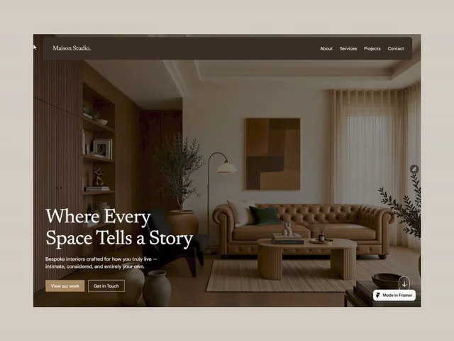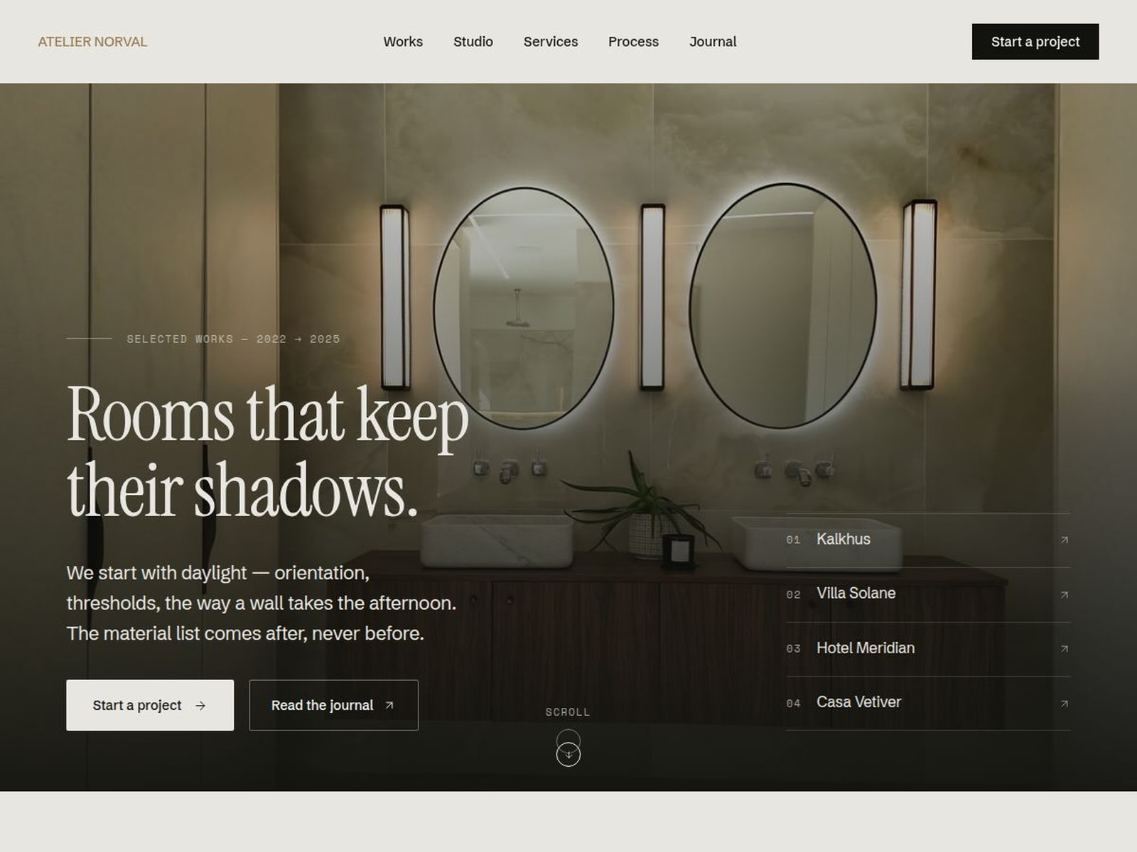
Atelier Norval is an editorial portfolio template for interior architecture and design studios — built around photography, long-form project stories and a quiet, material-led type system. Six pages, three CMS collections and a shared layout, all responsive across desktop, tablet and phone.
What's inside
Pages
• Home — immersive hero, services, 3D archive carousel, materials board, stats, testimonials and contact form
• Works — filterable project grid
• Project detail — CMS template with facts, gallery and prev/next
• Journal — featured post plus archive
• Journal detail — CMS template with rich text and prev/next
• Custom 404
CMS collections
• Projects — cover, gallery, location, year, type, scope, team and rich-text body
• Journal — cover, date, category, excerpt, reading time and rich-text body
• Testimonials — quote, author, project and location
Design system
• 14 colour tokens and 14 text styles, 8 with full responsive scales
• Shared layout template with navbar and footer
• Navbar component with five states and editable labels
• Instrument Serif, Schibsted Grotesk and Space Mono
Motion
• 3D archive carousel — drag, throw or step with the arrows
• Horizontal scroll track, sticky service stack and scroll-reactive marquees
• Odometer counters, word reveals, magnetic links and a custom cursor label
• Every animation respects reduced-motion preferences
Contact form
• Labelled fields with validation and pending, success, error and incomplete states
Getting started
Open the Start Here page for setup notes: rename and rebrand, swap the media, then edit the six featured cards on the home page. Color and type live in the Styles panel, so the whole site rebrands from one place.
Photography ships under the Unsplash license as placeholders — replace it with your own before publishing.

Atelier Norval is an editorial portfolio template for interior architecture and design studios — built around photography, long-form project stories and a quiet, material-led type system. Six pages, three CMS collections and a shared layout, all responsive across desktop, tablet and phone.
What's inside
Pages
• Home — immersive hero, services, 3D archive carousel, materials board, stats, testimonials and contact form
• Works — filterable project grid
• Project detail — CMS template with facts, gallery and prev/next
• Journal — featured post plus archive
• Journal detail — CMS template with rich text and prev/next
• Custom 404
CMS collections
• Projects — cover, gallery, location, year, type, scope, team and rich-text body
• Journal — cover, date, category, excerpt, reading time and rich-text body
• Testimonials — quote, author, project and location
Design system
• 14 colour tokens and 14 text styles, 8 with full responsive scales
• Shared layout template with navbar and footer
• Navbar component with five states and editable labels
• Instrument Serif, Schibsted Grotesk and Space Mono
Motion
• 3D archive carousel — drag, throw or step with the arrows
• Horizontal scroll track, sticky service stack and scroll-reactive marquees
• Odometer counters, word reveals, magnetic links and a custom cursor label
• Every animation respects reduced-motion preferences
Contact form
• Labelled fields with validation and pending, success, error and incomplete states
Getting started
Open the Start Here page for setup notes: rename and rebrand, swap the media, then edit the six featured cards on the home page. Color and type live in the Styles panel, so the whole site rebrands from one place.
Photography ships under the Unsplash license as placeholders — replace it with your own before publishing.