About Satz
Satz — Editorial Framer Portfolio Template
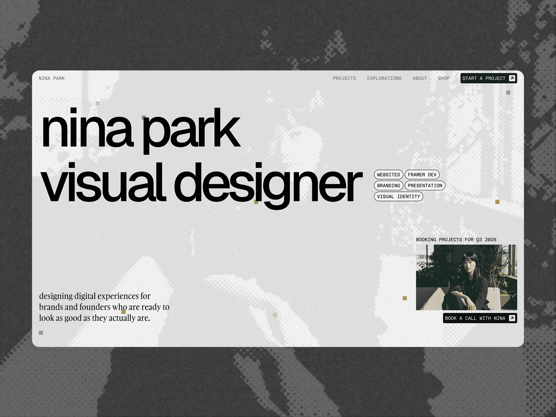
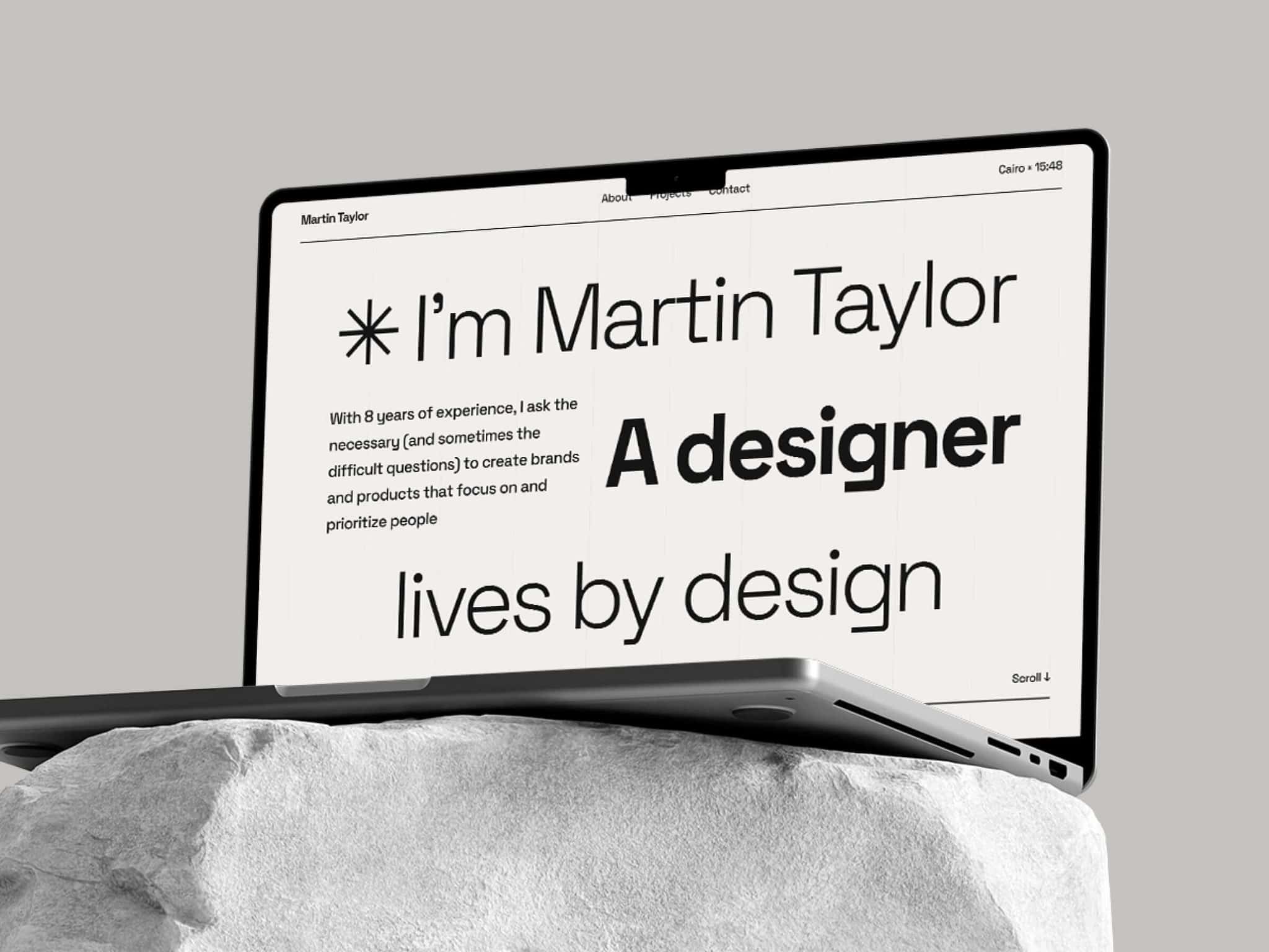
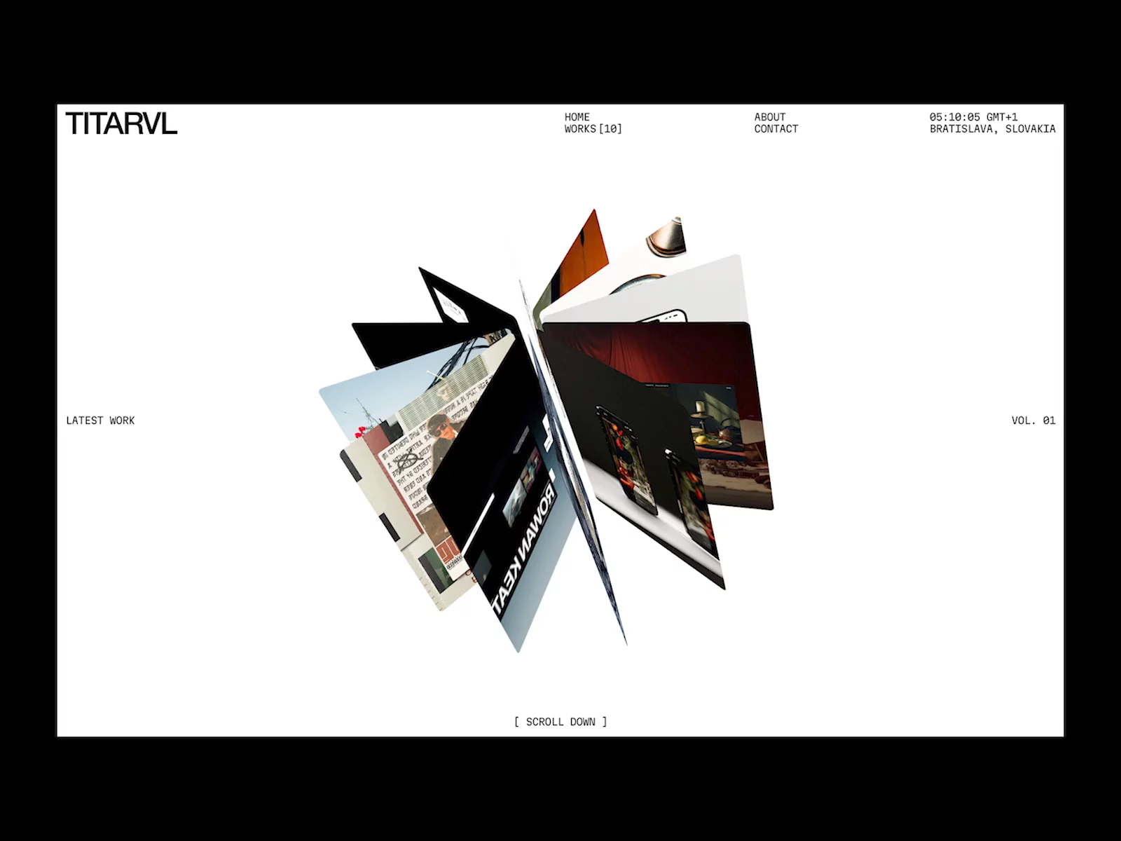
A minimal, bold, editorial portfolio template for independent designers, art directors, and creative strategists who take their work seriously. Built on Swiss grid principles, a precise type system, and a black-and-white palette — Satz isn't a starting point. It's a finished site waiting for your work.
Every section is designed with intention. Every spacing decision is deliberate. The result: a portfolio that positions you as a serious creative professional from the moment someone lands on your homepage.
Pages Included
Home — Hero · Selected Work · About · Process · Social Proof · Journal Teaser · CTA
Work — Full symmetrical project grid
About — Story · Philosophy · Awards · Education & Experience
Journal — Full article grid
Contact — Direct email + contact form
404 — Fully designed error page
CMS: Project Detail & Journal Article templates
Features
Built entirely in Framer — no code required
Full CMS integration for projects and journal articles
Responsive across desktop, tablet, and mobile
Complete type system — H1–H6, two body styles, responsive scale
Swiss grid layout, consistent spacing and hierarchy
Smooth page transitions and appear effects
Accordion service cards, symmetrical grids
Editorial case study template with pull quote and gallery
Full-width journal article layout
Personalizable favicon, CMS field descriptions included
Who It's For
Independent designers and art directors
Brand strategists and creative directors
Framer developers building client sites
Template sellers wanting a reference-level starting point
Why Satz Most templates look good in a screenshot. Satz is built to work — guiding a client through your story in order, turning attention into a conversation.
If you care about typography, grid systems, and restraint — Satz was built for you.
Questions? Reach out at aathif.design@gmail.com — happy to help.