About Spark X
Most templates hand you a good-looking first draft and leave you to hold it together. Spark hands you the rules instead.
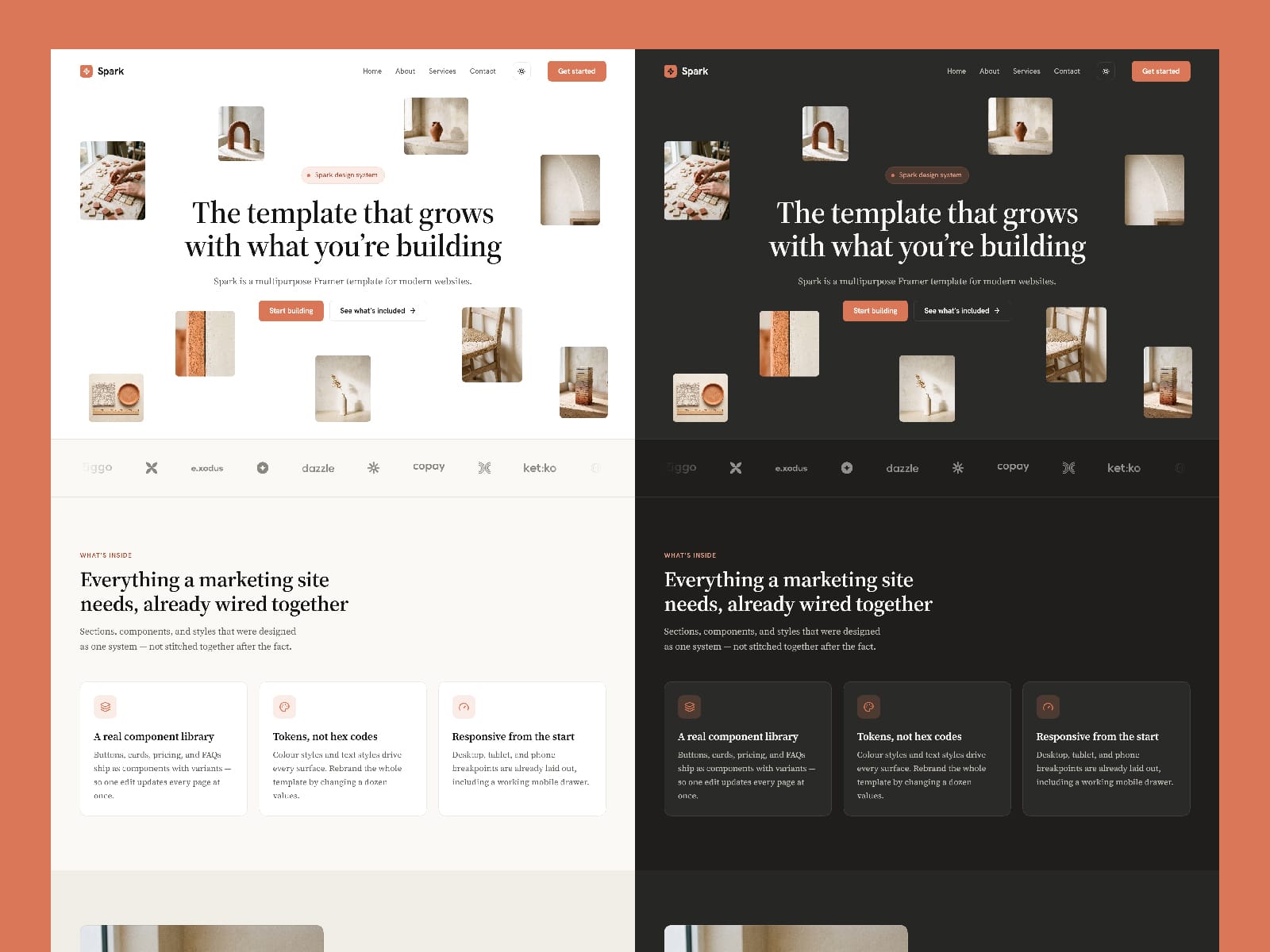
Every surface reads from the same colour styles and text styles. Change the accent, and buttons, taglines, icon tiles, links, and hover states follow — across all four pages, in both themes. Nothing is hard-coded, so the second edit is as easy as the first.
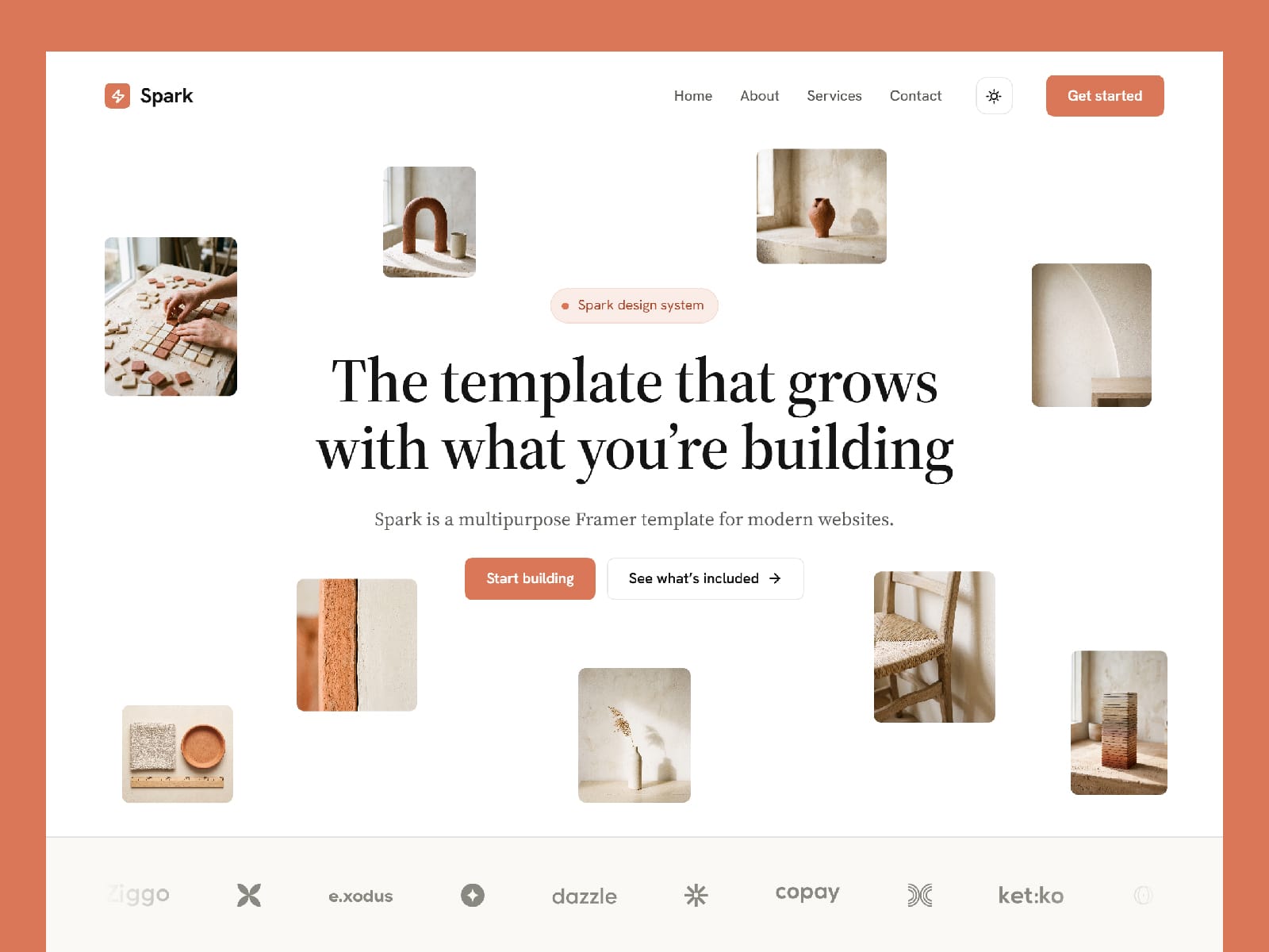
The look is warm and editorial: an ivory paper base, a single clay accent, and a serif set at reading scale for everything you actually read, with a clean sans reserved for interface chrome. Calm enough for a studio portfolio, structured enough for a product site.
Underneath, it's assembled properly. A shared layout template drives the navigation and footer, so one edit updates every page. Ten components carry the repeating UI, each with real variants and hover states. Three breakpoints are laid out by hand — not auto-scaled — including a working mobile drawer.
Swap the copy, drop in your images, and ship.
What's included
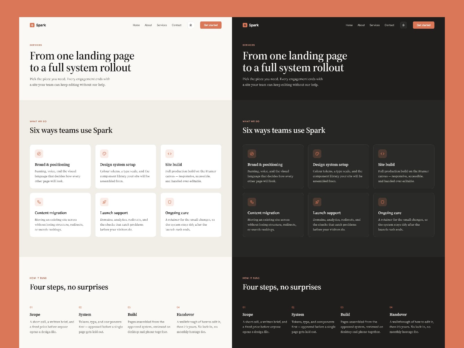
4 pages — Home (10 sections), About, Services, Contact
3 breakpoints — Desktop, Tablet, Phone
15 colour styles with full light and dark values
14 responsive text styles and 3 link styles
10 components — Button, Nav Bar, Feature Card, Testimonial Card, Pricing Card, FAQ Item, Media Placeholder, Submit Button, Parallax Floating, Cursor
Shared layout template for navigation and footer
Built in
Light/dark theme toggle with system detection and saved preference
Custom cursor that grows over interactive elements
Parallax floating hero and an animated page loader
Scroll reveals with staggered timing
Accordion FAQ, mobile drawer, and forms with pending, success, and error states
Ideal for design studios, agencies, product and SaaS sites, portfolios, and consultancies.
If you have any questions or need support, feel free to reach out via email: muminulhasankhan@gmail.com