About Theo Vance
Vance — Creative Director & Studio Portfolio
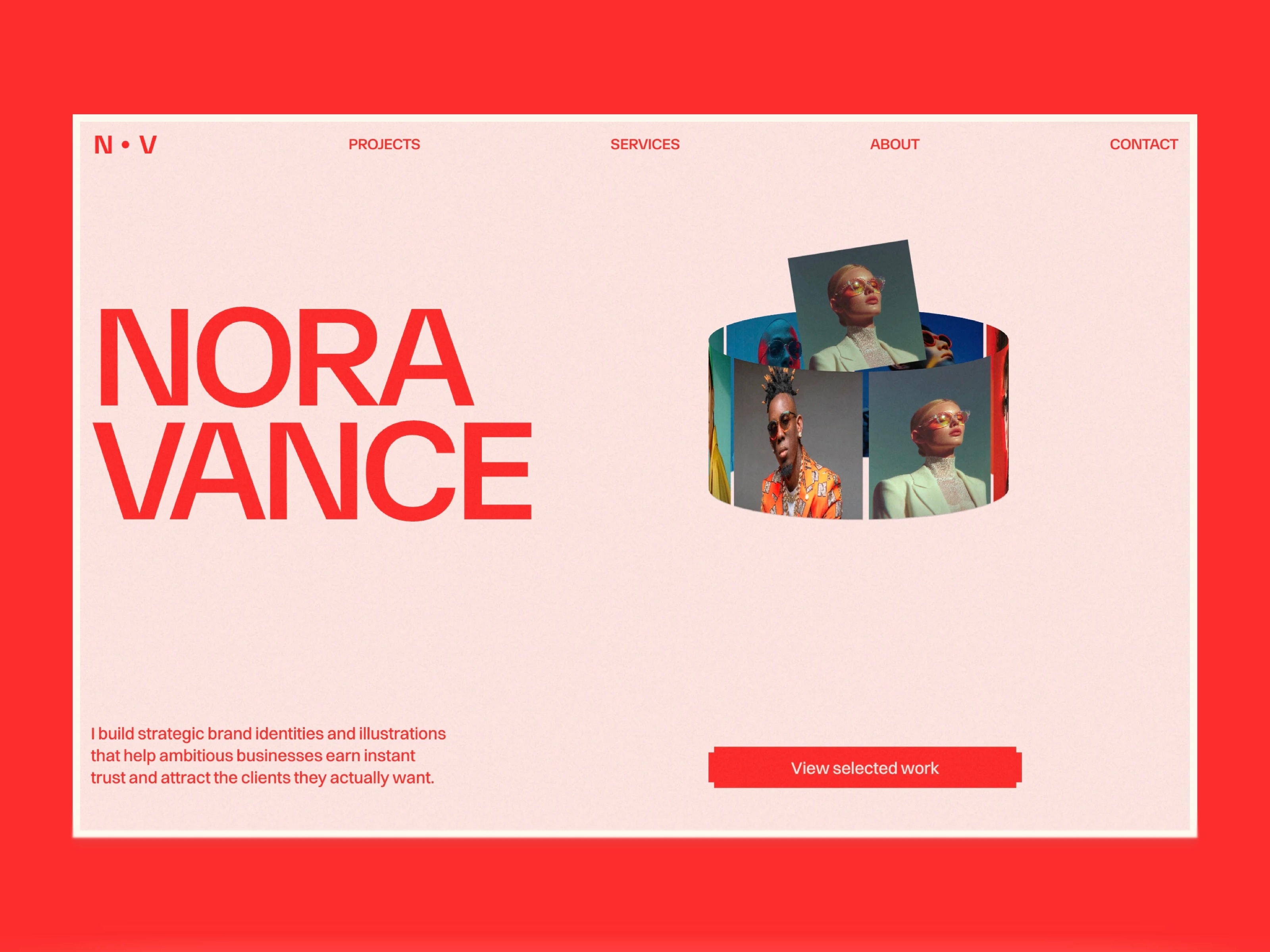
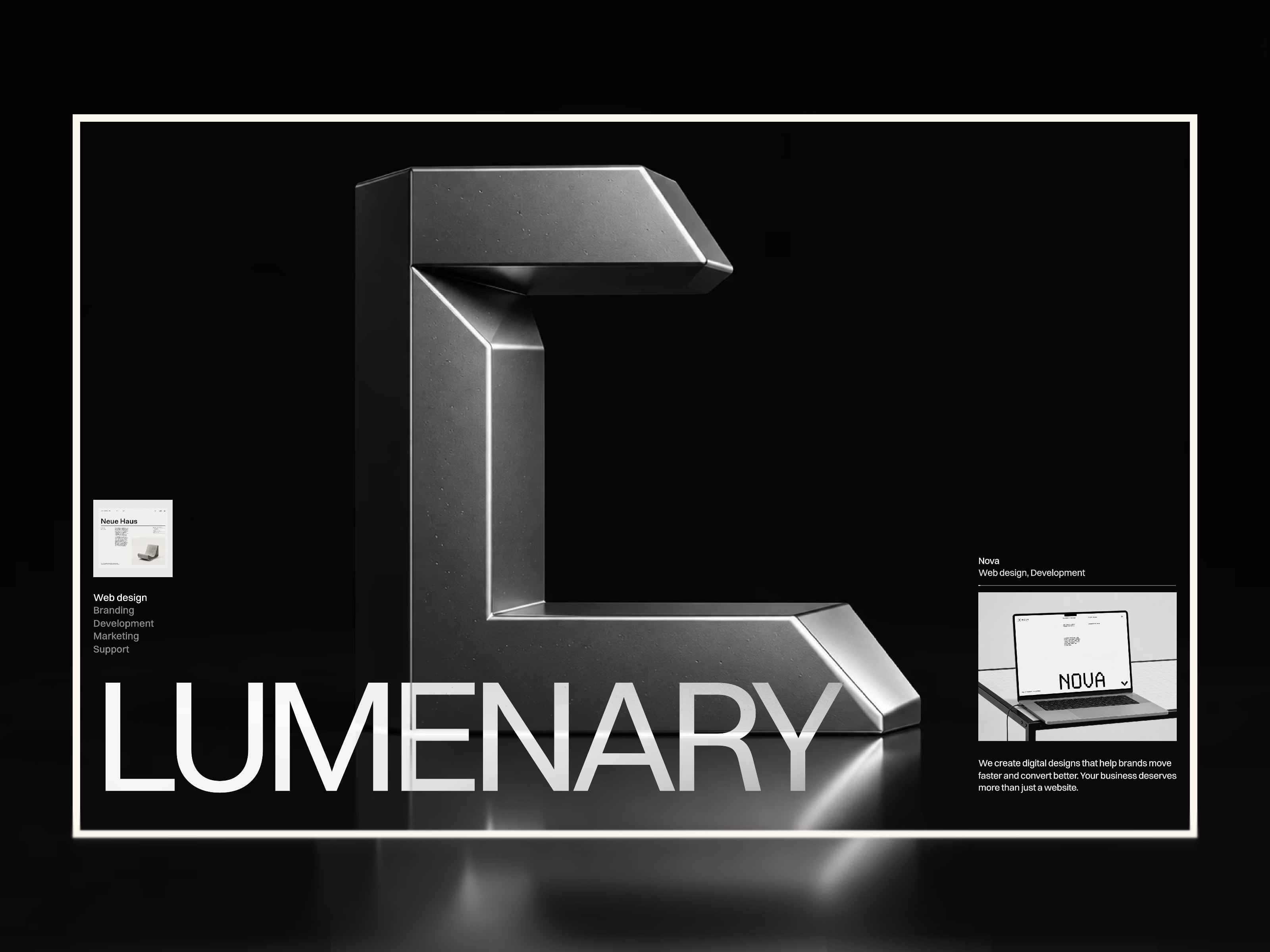
A bold, editorial portfolio template for creative directors, designers, and studios who want their work to speak first.
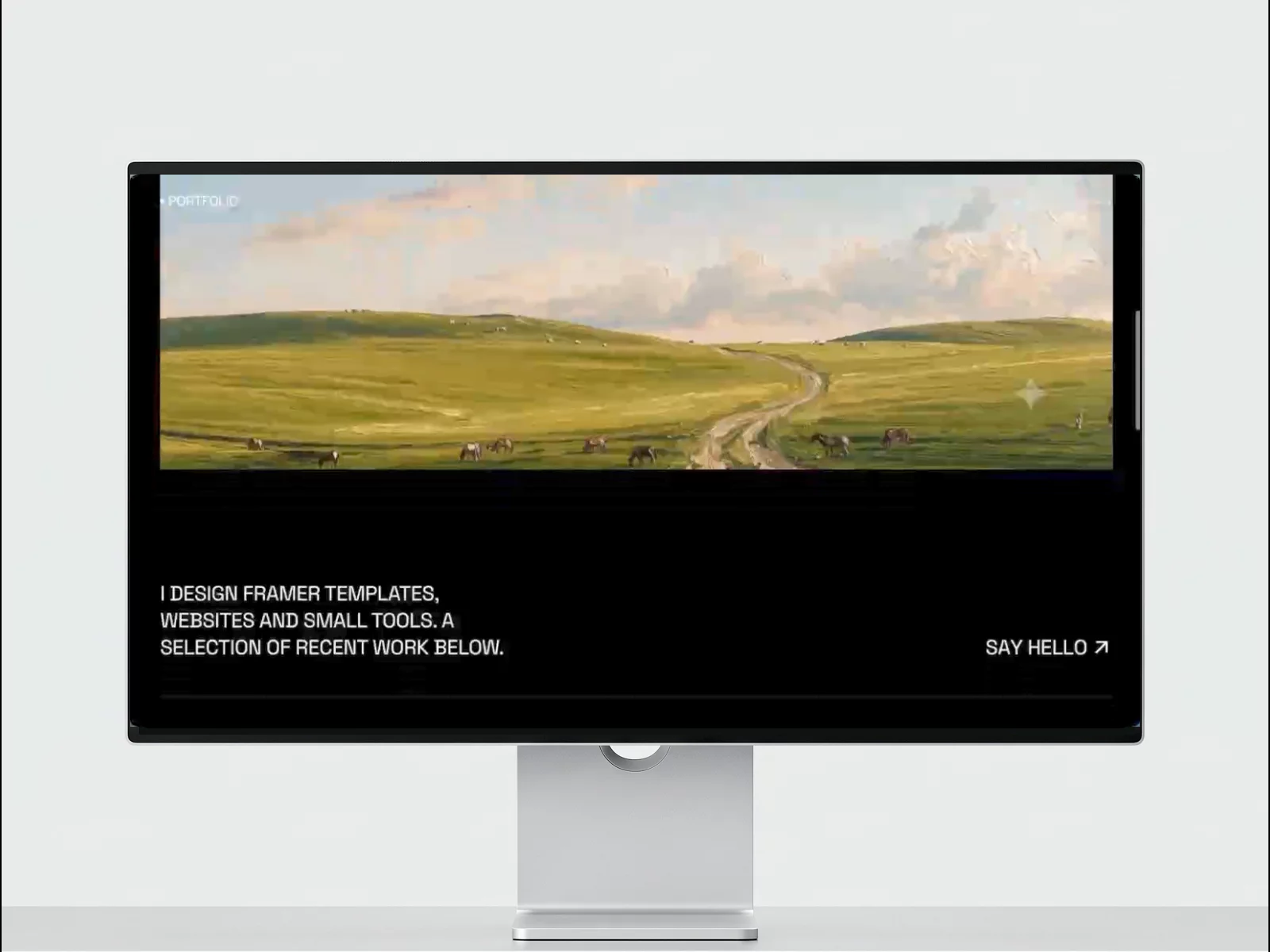
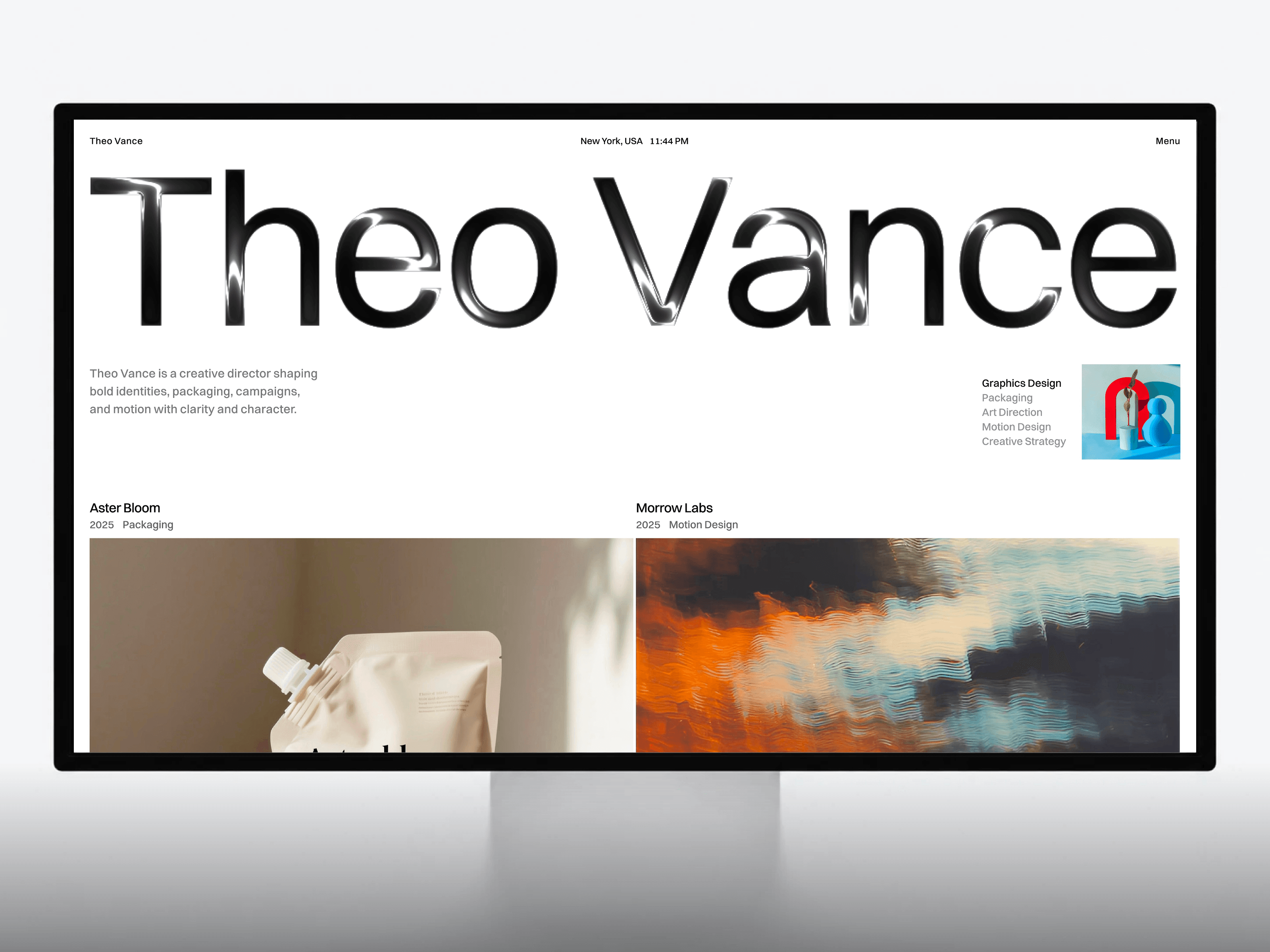
Vance is a refined, motion-led portfolio template built for creative professionals. With a confident monochrome aesthetic, a signature red accent, and clean Switzer typography, it puts your projects center stage while staying fast, flexible, and fully responsive across desktop, tablet, and phone.
Key Features
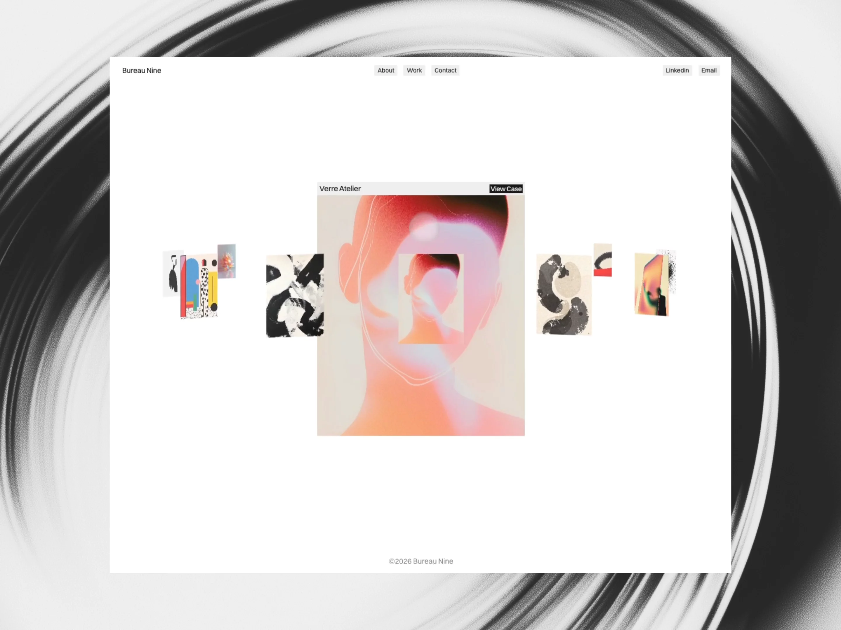
Fully CMS-driven work — Manage projects from the CMS with per-project title, category, year, tools, overview, and a flexible media system (each project supports an image or a video preview, plus five individual gallery images for total layout control).
Dynamic case study pages — Auto-generated detail pages with a large media hero, editorial overview panel, and a masonry gallery grid.
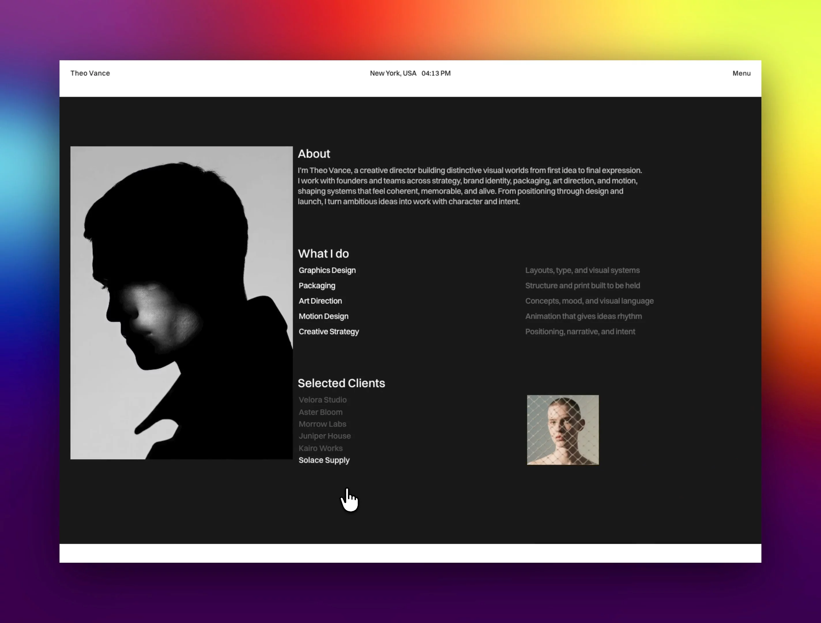
Interactive touches — Animated particle headline, an auto-cycling clients showcase, smooth-scroll, and thoughtful hover states throughout.
Reusable component system — Neatly organized components (navigation, buttons, work cards, testimonials, clients, footers) for effortless customization.
Sections included — Hero intro, selected works, experience timeline, about, services, client logos, testimonials/reviews, and a strong contact/footer close.
Responsive by default — Tuned layouts and typography for every breakpoint.
Perfect for Creative directors, art directors, brand and motion designers, freelancers, and small studios building a portfolio that feels premium and intentional.