About Spring Card
Regular cards are fine, but why not make them a little more fun?
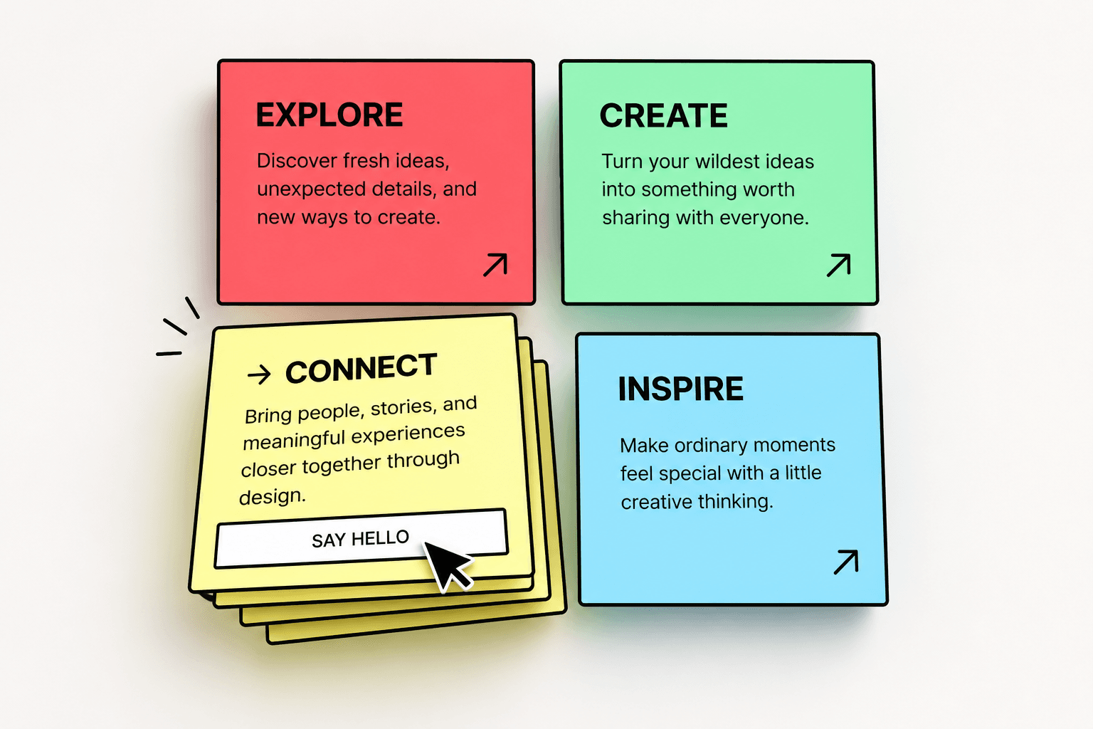
Spring Card is an interactive Framer component that turns simple content cards into playful, stacked hover experiences.
Hover over a card and watch it come to life with smooth motion, layered effects, and interactive buttons. It's a simple way to add some personality to your website without building everything from scratch.
Made to be yours.
You can customize pretty much everything directly from the Framer properties panel:
Content: Change titles, descriptions, links, and button text.
Colors: Match the cards to your website's style.
Layout & Stack: Adjust spacing, positioning, borders, and stacked layers.
Motion: Fine-tune animation timing and easing.
Buttons & Arrows: Customize CTA styles and interactive elements.
Typography: Choose your own fonts for titles, descriptions, and buttons.
Interactions: Adjust hover previews, link behavior, and touch experience.
Where can you use it?
Perfect for portfolio projects, services, feature sections, creative landing pages, resource links, or anywhere you'd normally use a static card.
Just add it to your Framer project, customize it however you like, and you're good to go.
A little movement can make a simple card much more interesting.