About Snapshot Footer
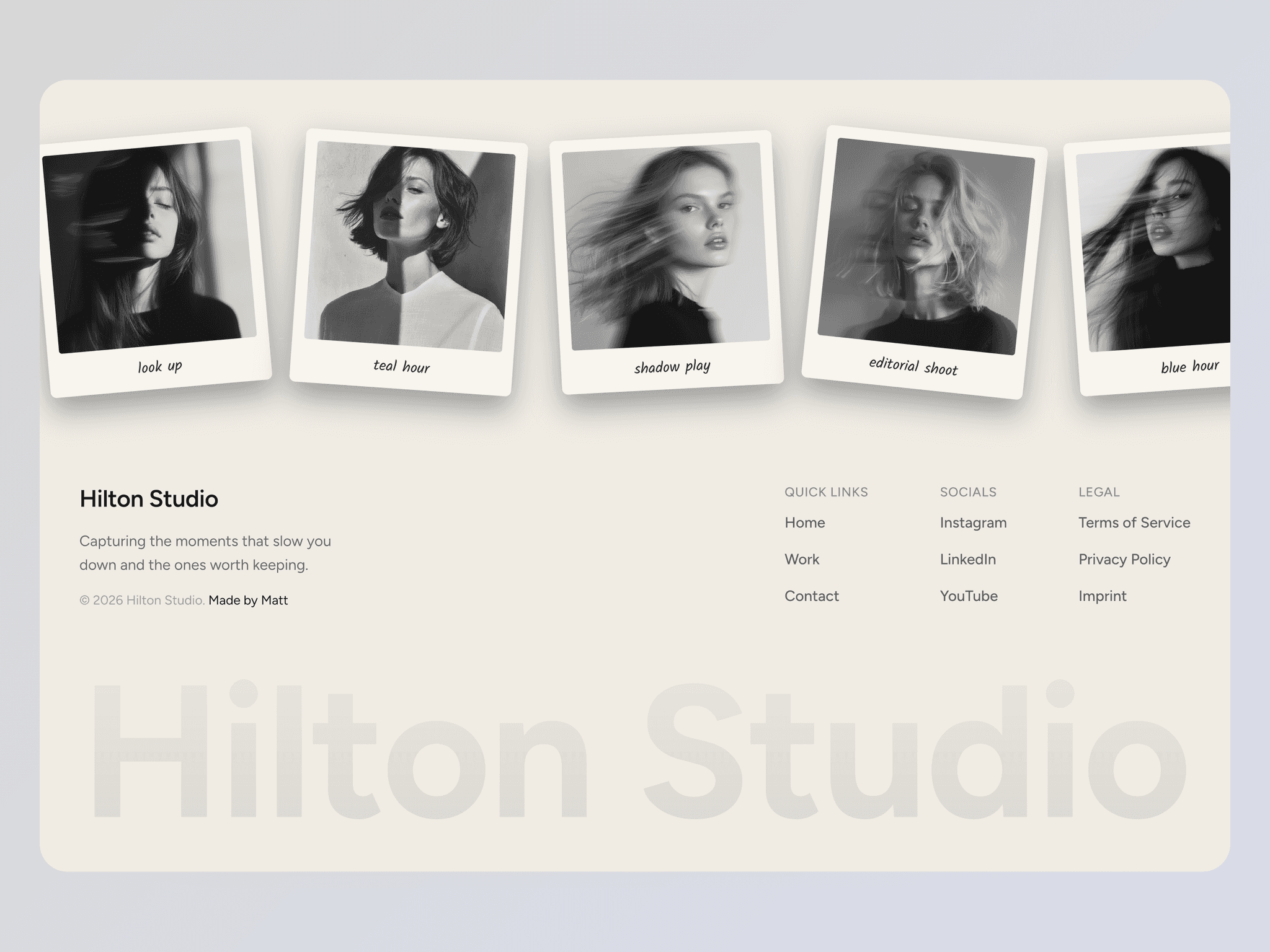
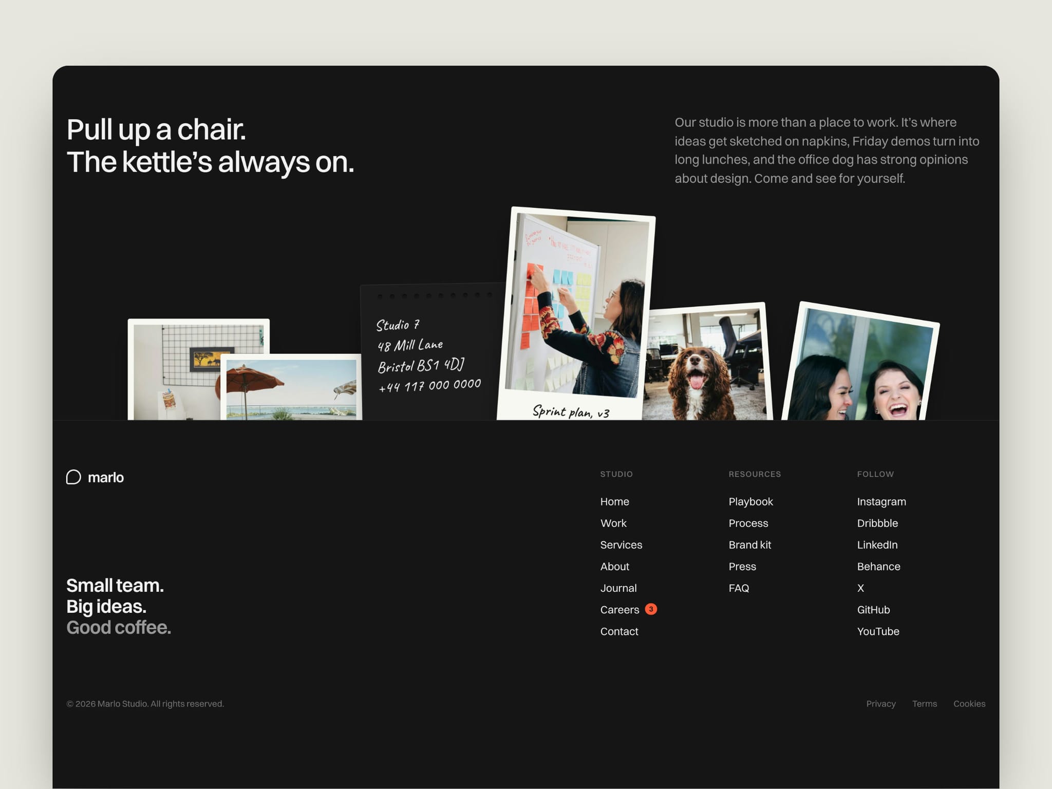
Snapshot Footer turns the end of your page into a small moment. A pile of tilted photo prints sits tucked behind the divider, like snapshots in a back pocket. Hover a print and it lifts out with a soft spring, swings to a new angle and shows the handwritten caption that was hidden below the line. A notepad card holds your address. Hover it and a sticker pops up to say hi.
When visitors scroll down, the prints rise into place one after another and the heading fades in word by word.
Features
• Photo prints that lift out on hover, each with its own angle
• Hidden handwritten captions that appear when a print lifts
• Notepad address card with a pop-up sticker
• Staggered rise-in when the footer scrolls into view
• Desktop, tablet and phone layouts, each designed on purpose
• Press and hold to lift a photo on touch screens
• 100% native Framer: effects and variants only, no code
• Three link columns, a careers badge, a tagline and a legal row
Easy to customize
• 29 content controls in the properties panel, no need to open the component
• Swap the five photos and their captions, the address, hours and sticker text
• Edit the heading, paragraph, wordmark, tagline and copyright
• Add, remove and reorder links in every column and in the legal row
• Give any link in the first column a badge count, like open roles on Careers
• Colors and type are set up as styles, so one change updates everything
What's included
• Footer component with Desktop, Tablet and Phone variants
• Snapshot photo print component (Default and Small)
• Note Card component with Hover and Pressed states (Default and Small)
• 10 color styles, 10 text styles and 2 link styles
Setup
1. Add the Footer to the bottom of your page or layout template.
2. Set its variant to Desktop, Tablet or Phone on each breakpoint.
3. Fill in your photos, text and links in the properties panel.