About Badges Kit
MORE FRAMER COMPONENTS LIKE THIS
✦ Browse +38 FREE + 85 premium components: https://frameze.com/components
✦ Get everything for one price: https://ahmetloca.dub.link/allcomponents
About Badges Kit
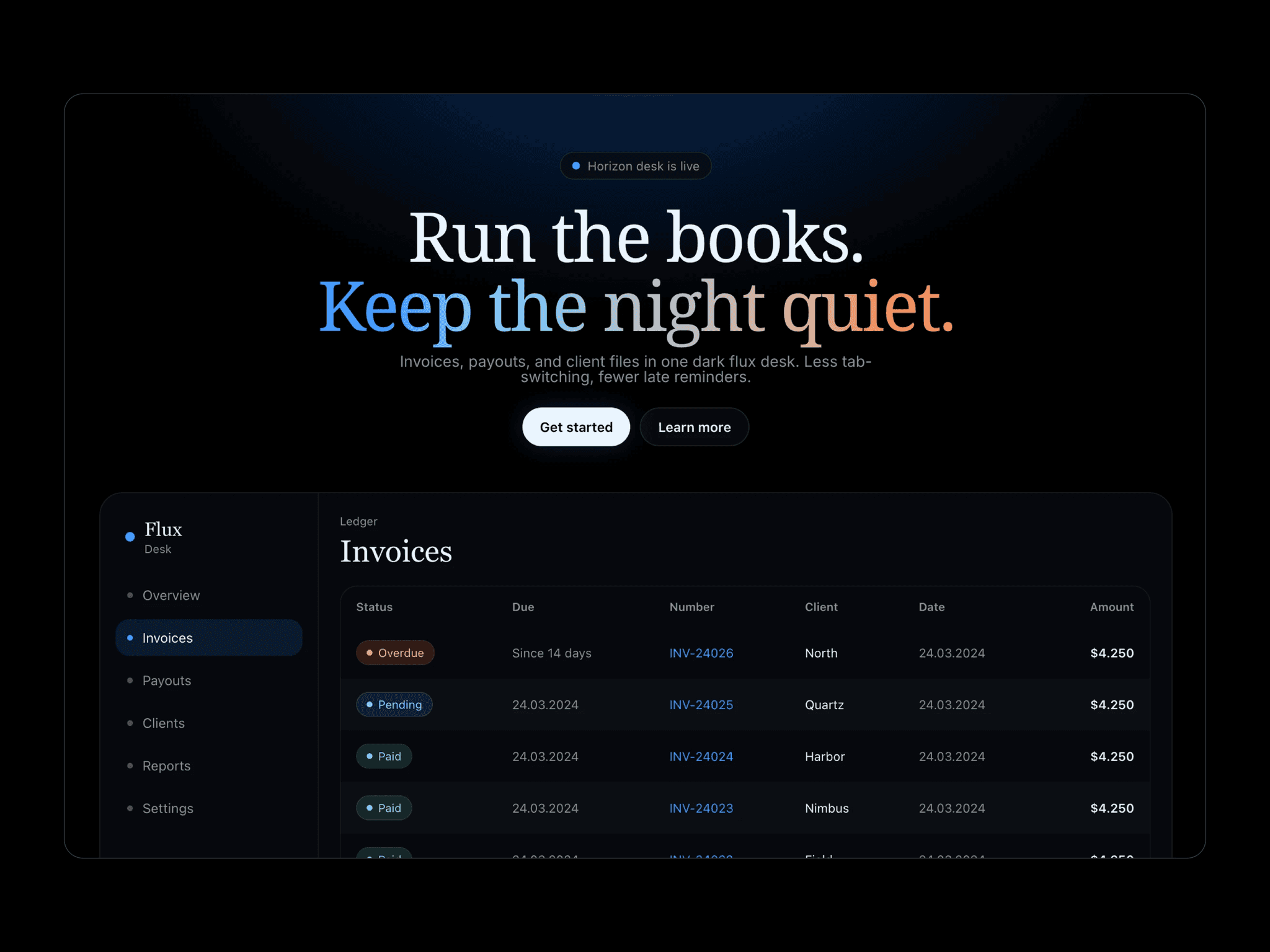
BadgesKit is a flexible, production-ready badge component for Framer, built for status indicators, tags, and labels across dashboards, SaaS products, and marketing sites. Choose from 9 built-in tones, 3 sizes, and both light & dark themes, or define fully custom colors to match your brand. Each badge supports icons (check, cross, minus, dot, animated spinner, or any custom emoji/symbol) and can be made dismissible with a smooth exit animation. A built-in Demo Mode showcases every tone and icon combination side-by-side in light and dark panels — perfect for picking the right style at a glance.
Key Features
9 built-in tones: neutral, success, error, warning, info, purple, orange, indigo
Custom color mode — set your own background, text, and border
Light & dark theme support, switchable per instance
3 sizes: small, medium, large
6 icon types: check, cross, minus, dot, animated spinner, custom emoji
Closable badges with smooth fade-and-scale dismiss animation
Full font control: family, weight, style, and variation settings
Use Cases
SaaS dashboards(status, plan, subscription tags)
E-commerce order & payment status indicators (Paid, Shipped, Refunded)
Product showcase & feature comparison sections
Pricing pages (Popular, New, Limited Offer tags)
Portfolio & personal branding sites (skill, availability tags)
Event & conference websites (Live, Sold Out, Upcoming)
CRM & support tools (ticket priority, lead status)
Keywords
Status badge, badge component, badge UI kit, dismissible badge, animated badge, status indicator, tag component, label component