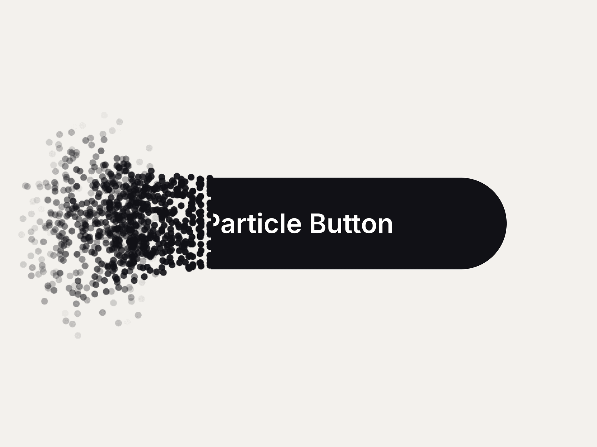
About Blueprint Motion
Bring your UI to life with Motion
The Blueprint Motion button is more than just a call-to-action—it’s an interactive experience. Built using precision CSS animation logic, the button "sketches" itself into existence when a user hovers, providing a high-end feel for portfolios, SaaS landing pages, and creative agencies.
✨ Interactive Features
Clockwise Drawing Border: Staggered line animations that follow a precise clockwise path upon interaction.
Kinetic "Flying Dots": Four perimeter dots that launch from the center to the corners on hover, creating a 3D depth effect.
Organic Scaling: Features a unique "stretched" border-radius ($30\% / 200\%$) that shifts to a standard rounded rectangle on hover for a satisfying morph effect.
Icon Library Support: Fully integrated with Framer's Component Instance control—swap in any icon from Phosphor, Lucide, or your custom sets.
🎨 Full Customization
No coding required. Use the Framer properties panel to adjust:
Primary Accent: Control the main button color and the transparent background "glow" effect.
Blueprint Details: Independently style the drawing lines and the kinetic dots.
Typography: Change the font family and size to match your brand's style guide.
Flexible Sizing: Adjustable width and height with "visible overflow" to ensure animations are never clipped.
🚀 Setup
Add the component to your Framer project.
Type your desired Google Font name into the Font Family field.
Choose your Icon from your project's assets or an icon library.
Adjust colors and watch the magic happen in Preview mode!