About Circle Navigation
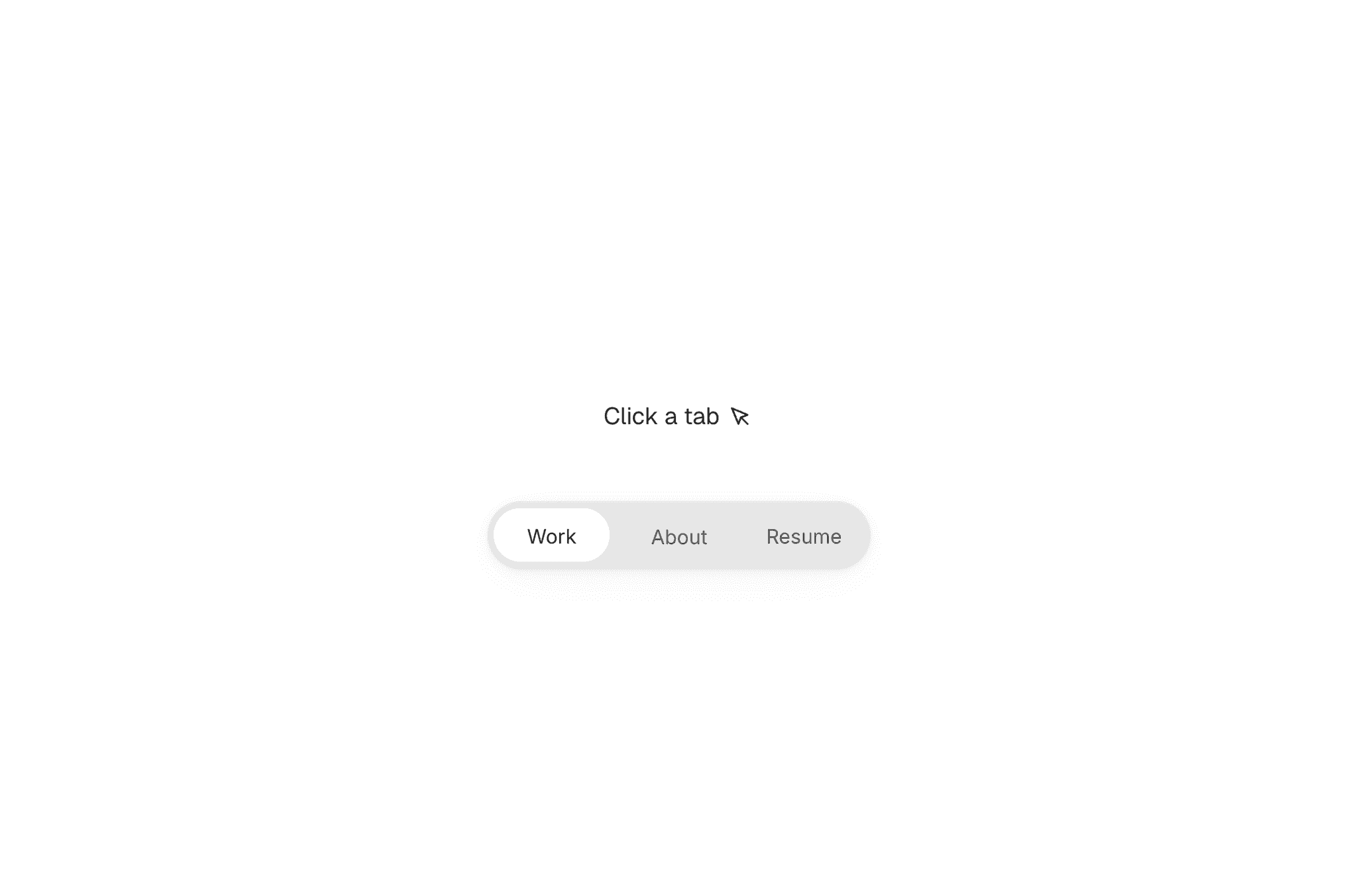
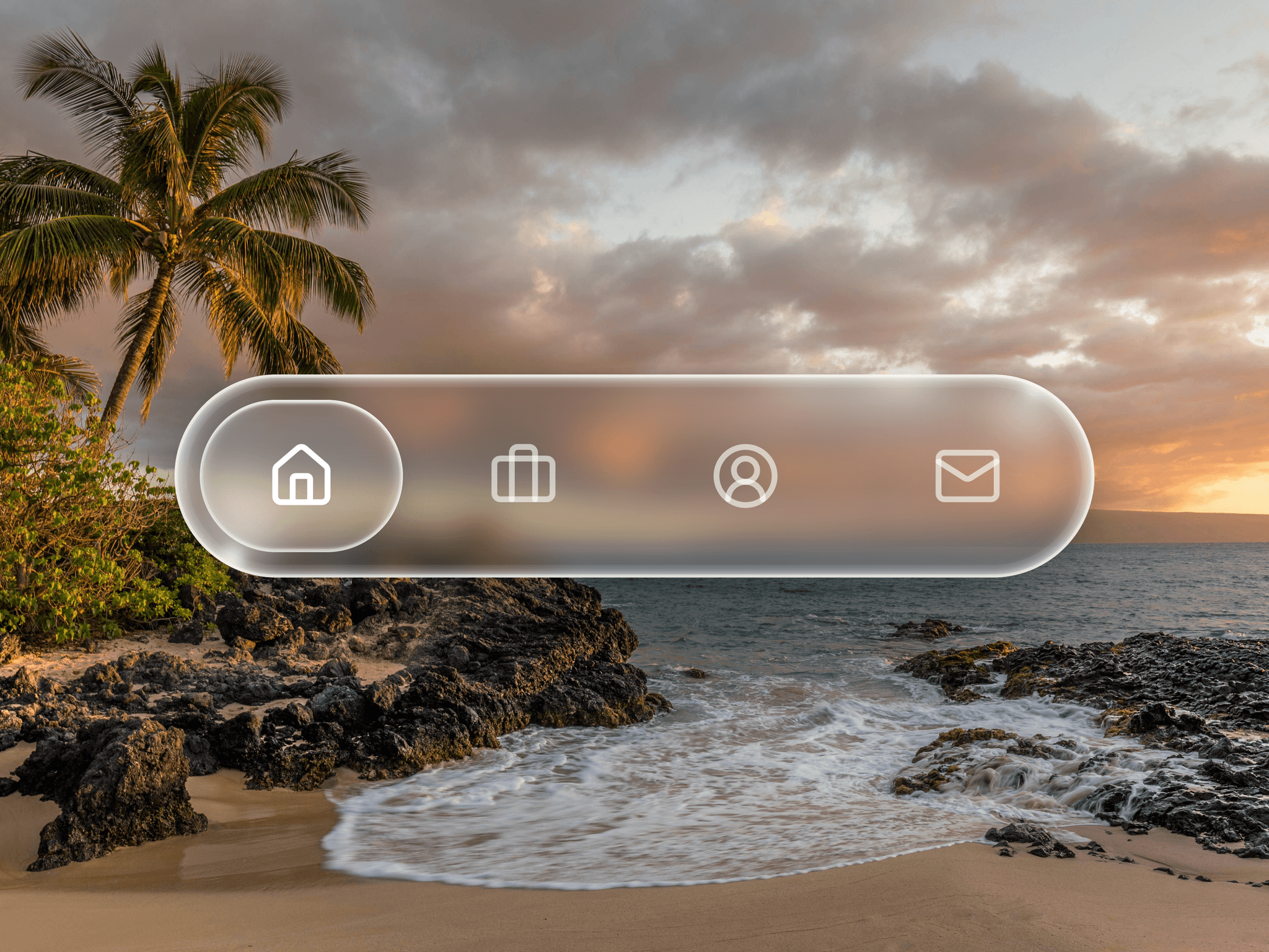
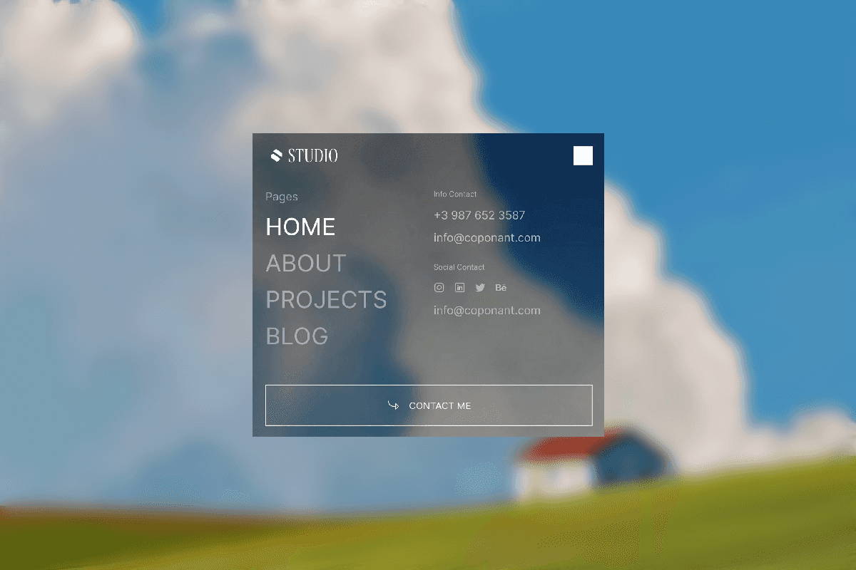
This component provides a modern, interactive circular navigation menu built entirely in Framer. It features a central trigger button that expands menu items outward in a radial layout, offering a clean and engaging alternative to traditional navigation. Ideal for creative websites, dashboards, game UIs, and experimental interfaces.
Main Features
Variants: Switch between collapsed and expanded states with smooth animations.
Radial Layout: Menu items are evenly distributed around the center for a balanced circular design.
Custom Styling: Easily adjust colors, sizes, spacing, and icon styles to match your brand.
Animation Control: Fine-tune transition timing and easing for a fluid interaction.
Responsive Behavior: Works seamlessly across desktop and mobile layouts.
Menu Item Properties
Icon Support: Use built-in icons or replace them with custom images.
Hover States: Visual feedback for interactions using glow, or opacity effects.
Rotation Control: Adjust item angles and spread to create unique circular or semi-circular menus.
This component is designed to be flexible, no-code friendly, and easy to customize, allowing designers to create visually striking circular menus without writing a single line of code.