About CMS Tag Grid
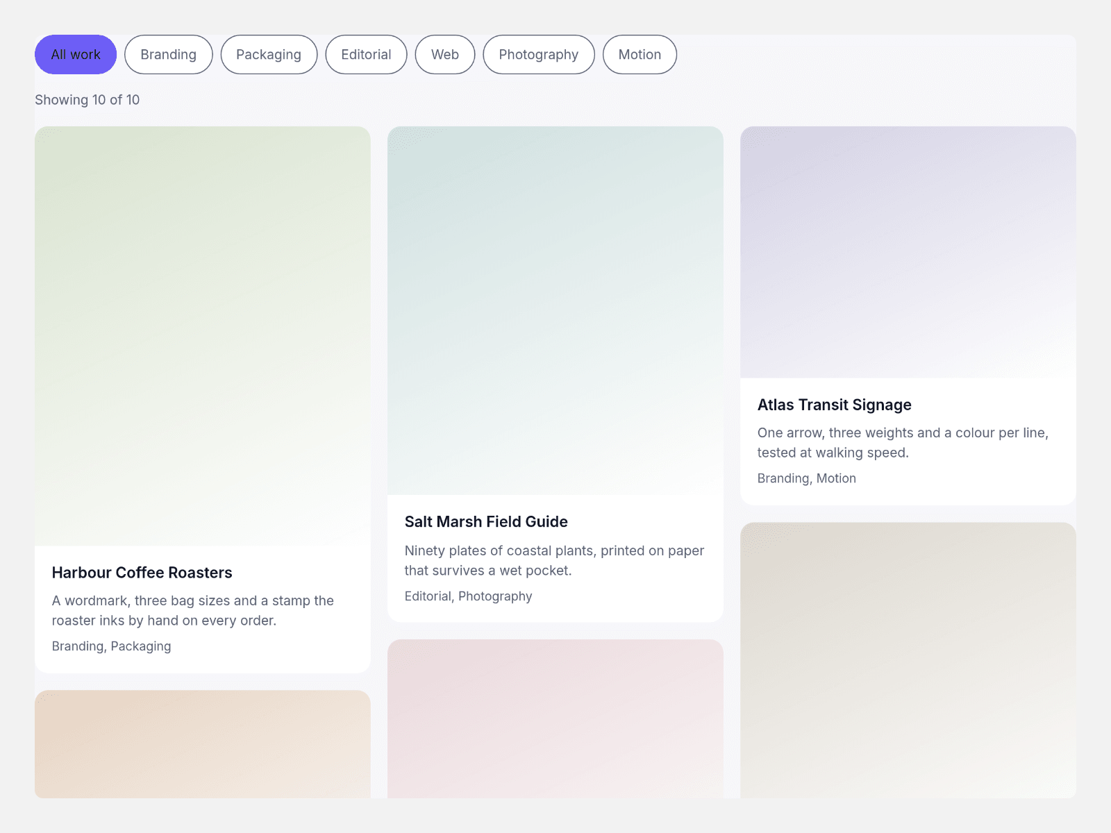
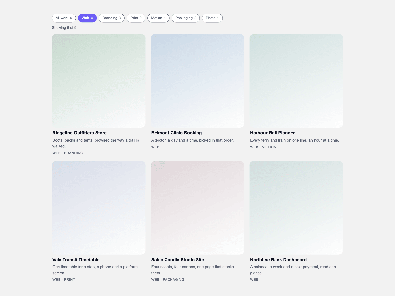
CMS Tag Grid lays a collection into an even grid of fixed-ratio cards and narrows it with tag chips: a chip press swaps a class and CSS does the rest, nothing measured and no observer.
Pick several tags at once and choose whether a card carries any of them or every one; each chip shows the count behind it and a polite line reads out the total on screen.
Bind a CMS collection through the card slots, or use the built-in card face at 1:1, 4:5 or 16:9; columns follow the frame, and the Framer canvas shows the finished grid on its first frame.
- **One even grid.** Every card face shares a ratio, so rows line up.
- **Three ratios.** Square, 4:5 or 16:9, set once.
- **Chips that stack.** Several tags stay on at once, matching any tag or every tag.
- **One class swap.** A chip press swaps classes; the rest is CSS.
- **Counts on the chips.** Each chip carries its count; a polite line reads the total.
- **CMS slots.** One component slot per card binds a collection straight into the grid.
- **Columns that follow the frame.** Auto, or two to four across; a phone holds two.
- **Styled by you.** Gap, radius, five colours, text size, alignment, max width and every label.
What you control
• Items as an array: title, caption, tags as a comma list, image with alt text, link and a tint for the empty face
• Card slots for the CMS path, paired one to one with the items
• Card ratio, column count, gap, radius, match mode, initial tags, the All chip and its label, and alignment
• Five colours, text size, max width, the count wording, the placeholder lines and the accessibility labels
Limits: one grid per section, one ratio for every card face (a slotted card keeps its own height), images from your project or CMS, up to about eighty cards.