About Compact Navigation
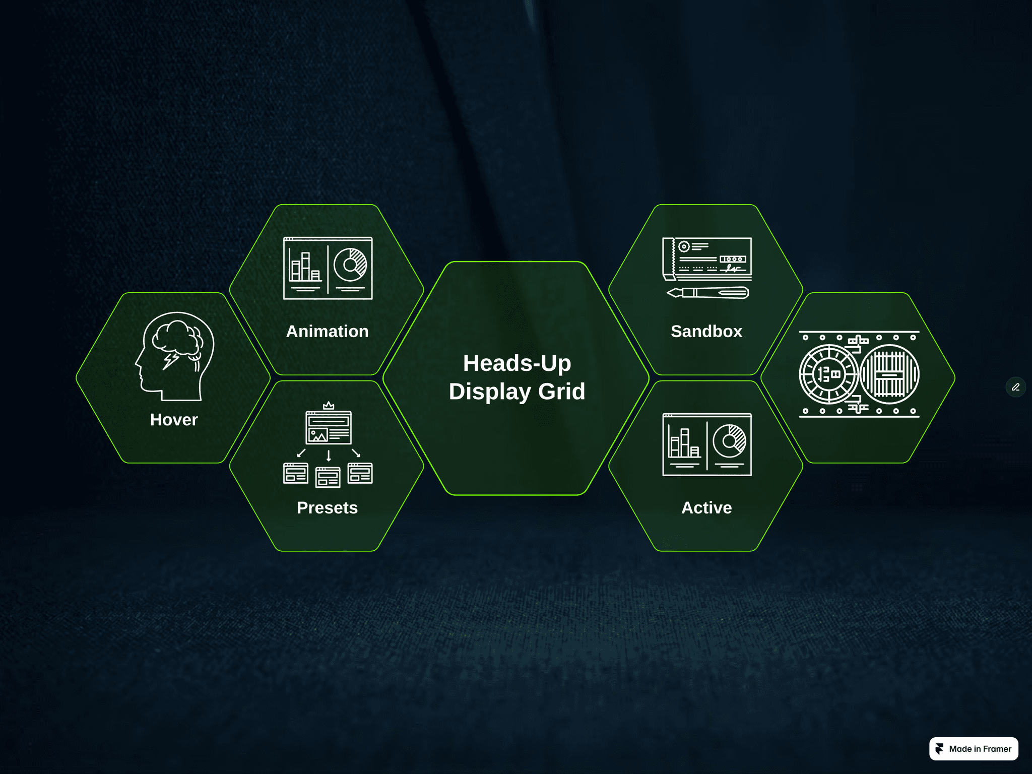
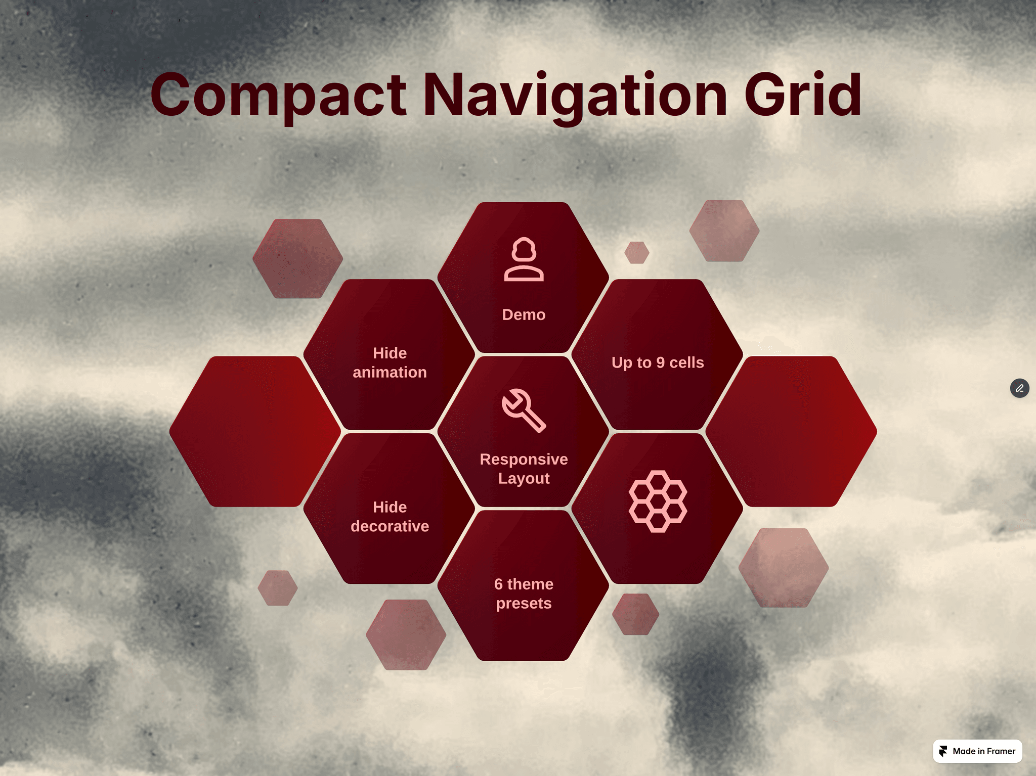
Compact Navigaton is a fully customizable hexagon-based navigation component designed for clean layouts, interactive experiences, and responsive behavior across devices. Easily control layout, styling, and content directly from the properties panel - no coding required.
Settings
Additional ID Required only when using multiple instances on the same breakpoint. Ensures each component works independently without conflicts.
Mobile Layout Switch between desktop and mobile layout behavior.
Preset Select a predefined visual style (e.g. Cyber-Noir).
Font Size Adjust the size of text inside cells.
Base Color Defines the primary accent color of the grid.
Text Color Controls the color of labels and content.
Show Animation Toggle hover and transition effects.
Hide Decorative Cells Show or hide non-interactive visual cells for a cleaner layout.
Content
Responsive Items Add and configure up to 9 navigation cells:
Text labels
Internal anchor links
Icon
External links
Search Keywords:
hexagonal grid, honeycomb layout, bento grid, framer component, interactive hover, svg filters, cyberpunk ui, tech portfolio grid, glowing effects, custom layout, dark mode component.
Notes
Fully responsive by default
Works in both simple and complex layouts
Optimized for performance and smooth interactions