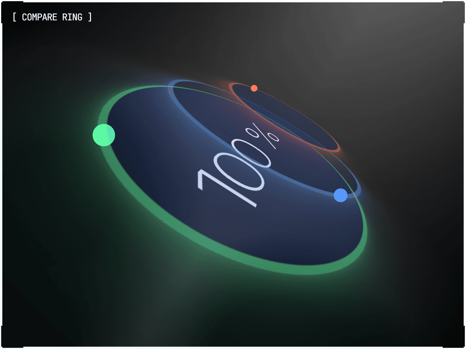
About Compare Ring
Comparison Ring ⭕
Ditch the static stat block. This component turns any comparison into a living ring — arcs that fill to show scale, or dots that lap the track to show speed. Built for the moment a number needs to feel like proof, not just text.
Best use cases:
Competitive comparisons, wait-time or turnaround stats, pricing and feature scorecards, KPI dashboards, and any "us vs. them" moment where the difference deserves a motion graphic instead of a table.
How to Use:
Drag and drop the component onto your canvas.
Add your comparisons to the array — label, value, prefix/suffix, and color for each.
Choose a mode: Compare (arcs fill to each value) or Race (dots lap the ring at independent speeds).
Customize the ring geometry (Size, Start angle, Gauge span) and motion (Transition, Stagger, Emphasis) to match your layout.
Highlights:
Two modes in one component: arc-fill Compare and lap-based Race
Any values, any units — free-text prefix/suffix, no shared scale required
Native Framer Motion transitions, including springs and custom easing curves
Full gauge support — partial-span rings, not just full circles
Per-item control over direction, animate-from-full, and independent lap speed
Synchronized Race heats — every dot restarts together after the last one finishes
Pulse, glow, and breathe emphasis effects with adjustable intensity and speed
Continuous loops run on pure CSS — zero ongoing JS cost after mount
Independent typography for labels, the center value, and the subtext