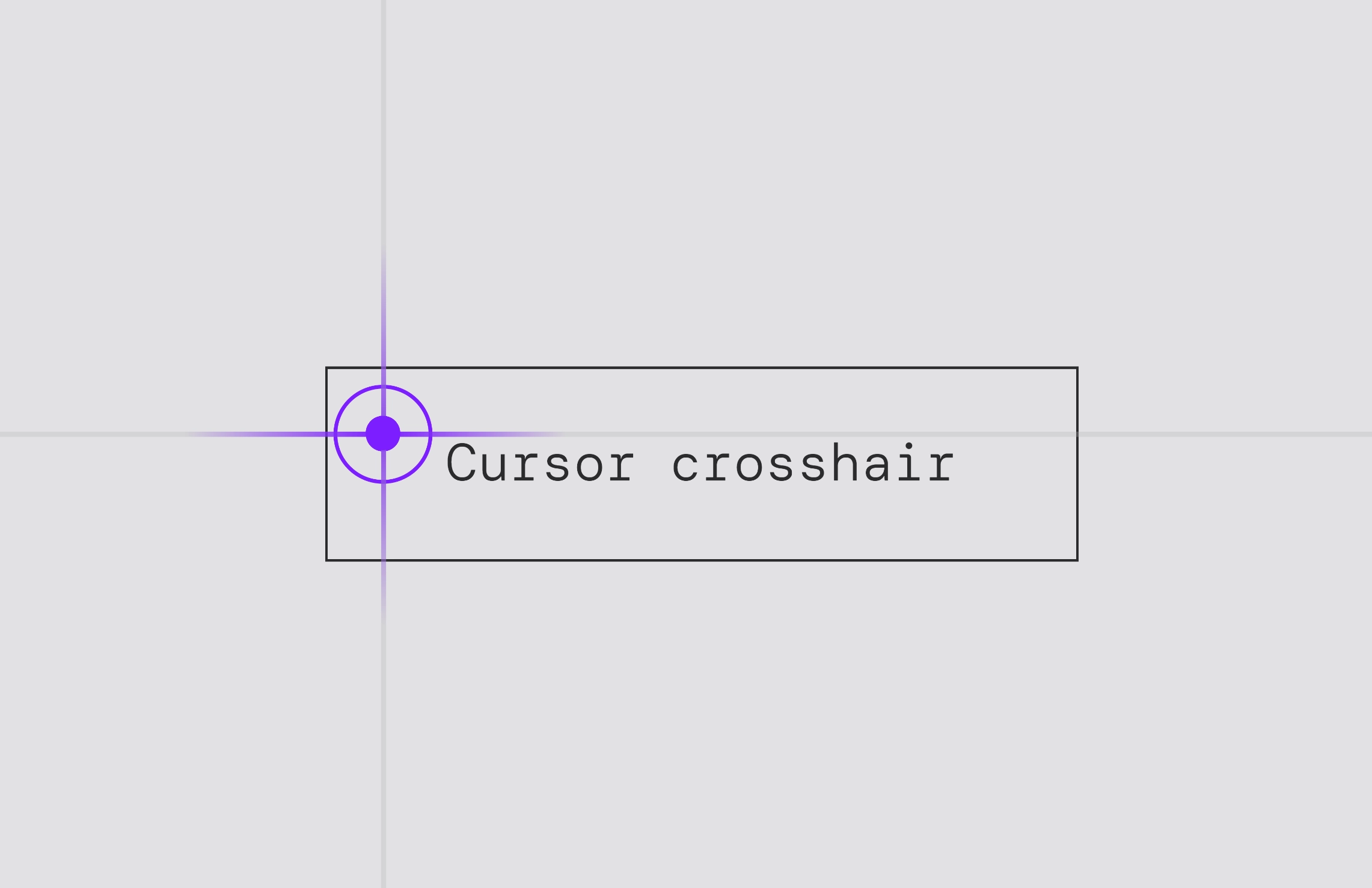
About Cursor Dot Trail
Cursor Dot Trail follows the pointer naturally and transforms over buttons and links, creating a subtle but expressive layer of interaction without a single line of code.
Built to feel native to Framer, the component works instantly with smart defaults and optional layer keywords to enable link mode, hide the dot, or switch to inverted colors for modals and contrasting overlays.
You have full control over size, hover scale, border width, spring physics, friction, trail length, and transition speed, allowing everything from minimal elegance to bold, magnetic behavior.
Features
Smooth cursor-following dot with configurable trail
Automatic hover transformation on buttons
Optional link mode with underline support
Inverted color for modals and overlays
Fully adjustable physics and timing
Lightweight and performance friendly
Zero setup, no code required
How it works
Just add a keyword to the layer name to enable effect. The layer name can be anything, or even empty, the component only looks for the exact keyword and adapts its behavior automatically.
Available keywords/effects
trail{hide} — hide the dot
trail{invert-color} — switch to the inverted color
trail{link} — activate text link mode
Customization
Full control over size, physics, trail, and transitions, from subtle elegance to bold motion.
Questions & Support
Reach out via 𝕏/Twitter or email support@pixelthrone.com — I’m here to help.
License Notice
Not allowed to be included in redistributable templates. Contact me for a custom license.