About Feature Section 03
About Feature Section 03
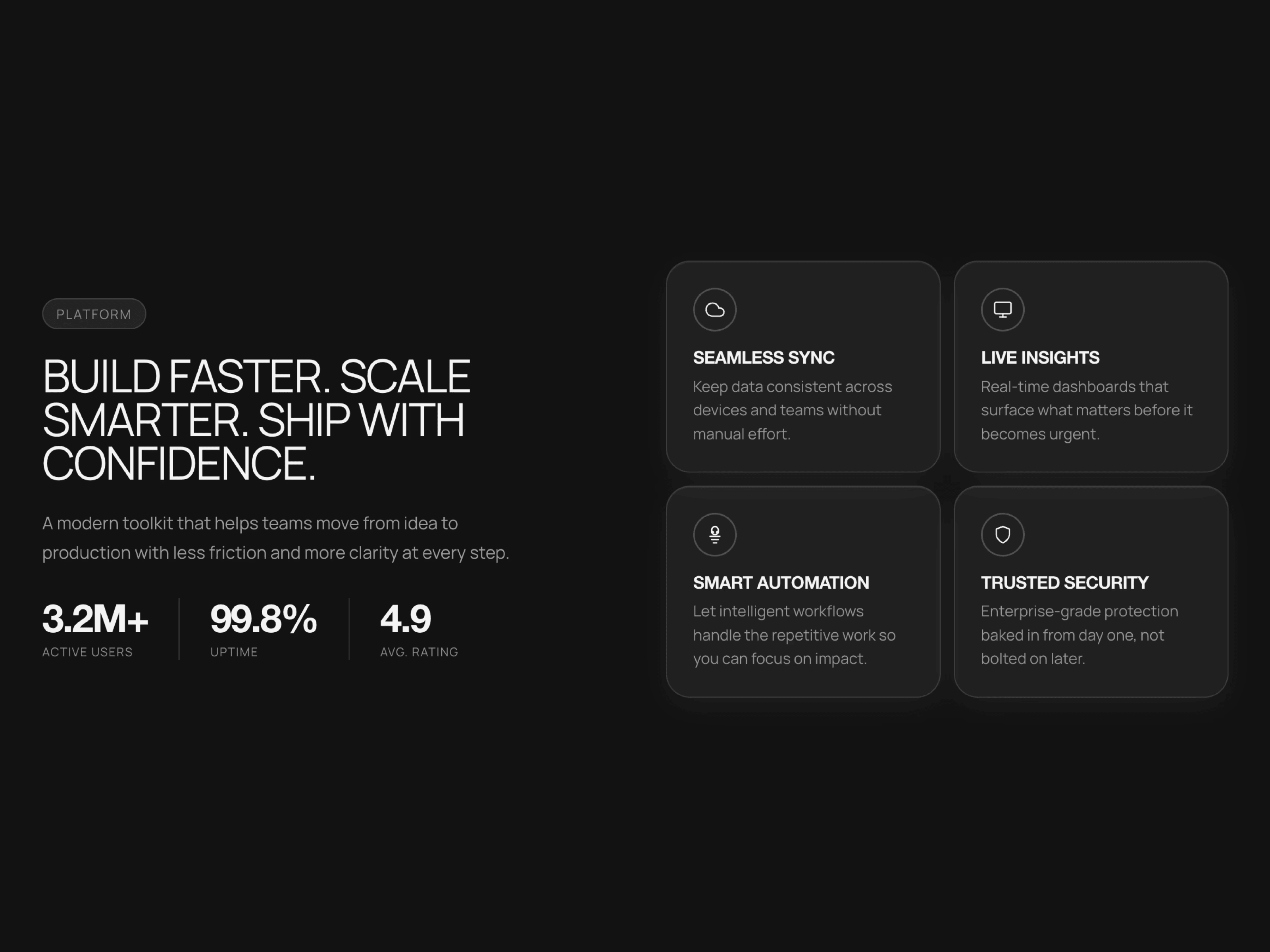
Feature Section 03 is a features block built for product and studio pages. It splits a strong headline, stats, and a 2×2 icon card grid, then switches dark and light with a circular clip-path reveal from the toggle. Entrance motion (blur, slide, fade, or scale) runs on view, respects reduced motion, and stays frozen on the static canvas.
Two-column layout: copy + stats on the left, feature cards on the right
Circular dark / light / custom theme reveal from the toggle
Eyebrow badge, uppercase title, muted description, optional stat row
Up to six feature cards with icon, title, and description
Entrance types: blur, slide, fade, scale with duration and stagger
Responsive stack under 768px; tighter type and padding on small screens
Accessible markup: section, header, lists, h2/h3, focusable theme button
Use Cases
SaaS marketing and product feature pages
Agency and independent studio sites
Startup landing pages and pitch sites
Devtools, cloud, and security product pages
AI and automation platform homepages
Architecture and practice websites
Portfolio case-study intros
Event, conference, and community pages
Editorial brand and magazine sites
Internal product and changelog sections
Keywords
feature section, feature grid component, icon feature cards, two column features, dark light theme toggle, circular theme reveal, stats row framer, saas feature block, product features layout, blur entrance animation, staggered card reveal