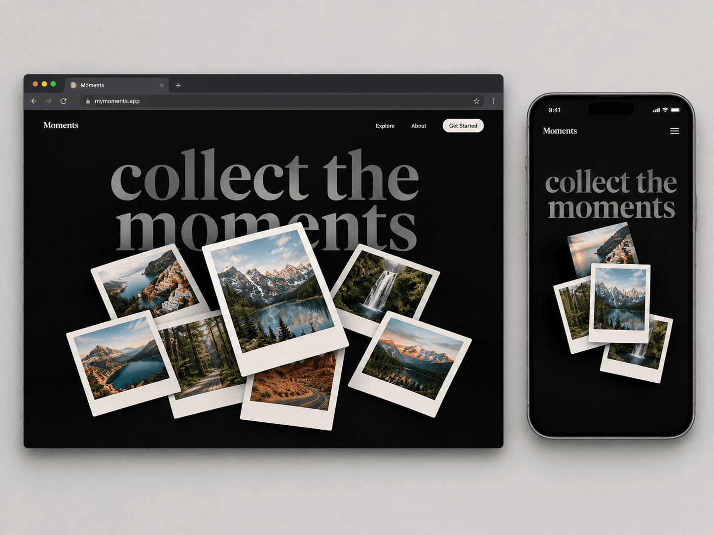
About Draggable Card
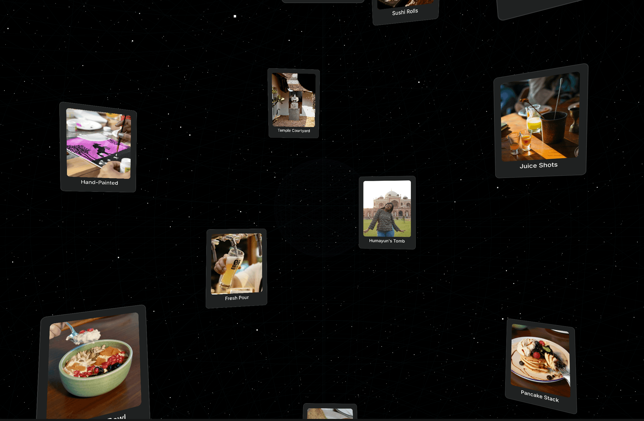
A playful, physics-driven polaroid card stack you can drag anywhere on screen — tilts in 3D as you move it, settles with a spring bounce, and stays right where you drop it.
Turn a static photo grid into something people actually want to touch. Draggable Card Stack scatters a pile of polaroid-style photo cards over a bold background quote, and lets visitors grab, fling, and rearrange them freely across the section. Each card tilts in 3D based on drag speed and direction, jumps above the rest of the stack while active, and lands with a natural spring overshoot when released — no snapping back, no reset. Fully responsive, touch-ready, and respects reduced-motion preferences.
How to Use
1. Drag Draggable Card Stack onto your canvas from the Insert panel — it fills the section by default (full viewport height recommended).
2. Open the Cards array in the properties panel and swap in your own images and captions (6 sample photos are included so it works out of the box).
3. Set your Quote Text — this large background heading sits behind the cards and works best as a short, punchy line (2–3 lines max).
4. Customize the look under Style: background color, quote color/size, font (Google Fonts), caption styling, card color, corner radius, card width, shadow strength, and how much the cards randomly rotate in the default stack.
5. Tune the feel under Behavior: toggle drag on/off, adjust Drag Elastic (resistance at the edges) and Tilt Intensity (how strongly cards wobble in 3D while dragging fast).
6. Drop it into a hero, portfolio, or gallery section — cards stay draggable within the section bounds on desktop, tablet, and mobile (touch supported).