About DropdownNavigation
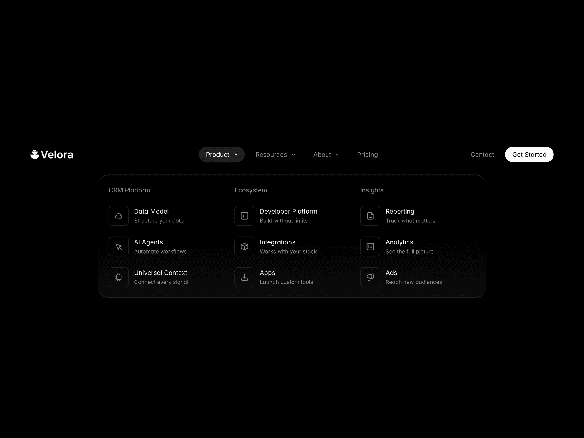
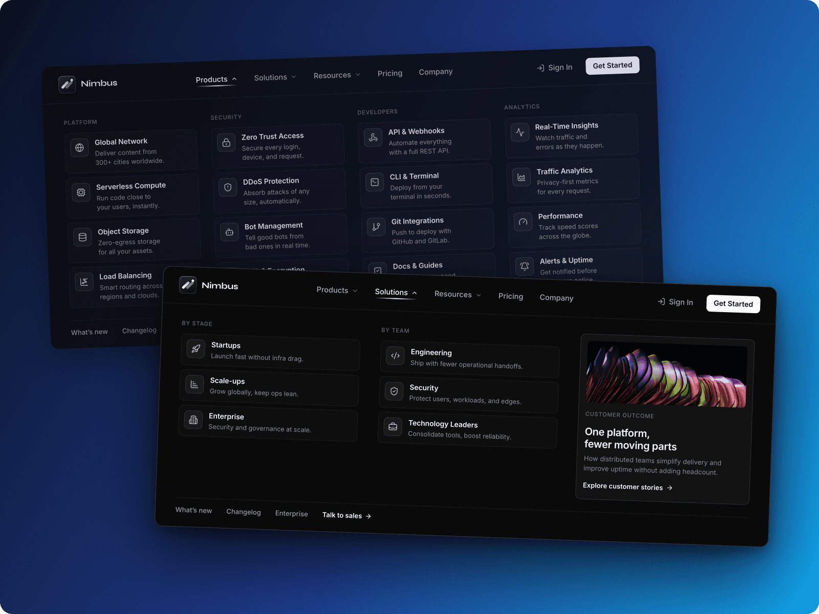
DropdownNavigation is a customizable dropdown select component for Framer with navigation support and animations.
Features
Navigation & selection
Supports internal and external links (opens external links in new tabs)
Configurable initial selection via index
Custom placeholder text
Click-outside-to-close
Animations
Framer Motion transitions for open/close
Animated chevron rotation
Scale and fade transitions
Selected item checkmark animation
Hover state transitions
Styling
Font control (family, size, weight, line height) applied to trigger and options
Color controls: background, text, border, accent
Adjustable border radius (0–20px)
Configurable padding (4–32px)
Optional shadow
Hover effects with accent color highlights
Selected state with accent background and checkmark
User experience
Text overflow handling with ellipsis
Scrollable dropdown (max height 300px)
Visual feedback for hover and selected states
Accessible keyboard and mouse interactions
Static renderer support for previews
Property controls
Array of options (label + link)
Initial selected index
Placeholder text
Extended font controls
Color pickers for all elements
Border radius slider
Padding slider
Shadow toggle