About Hover Product Card
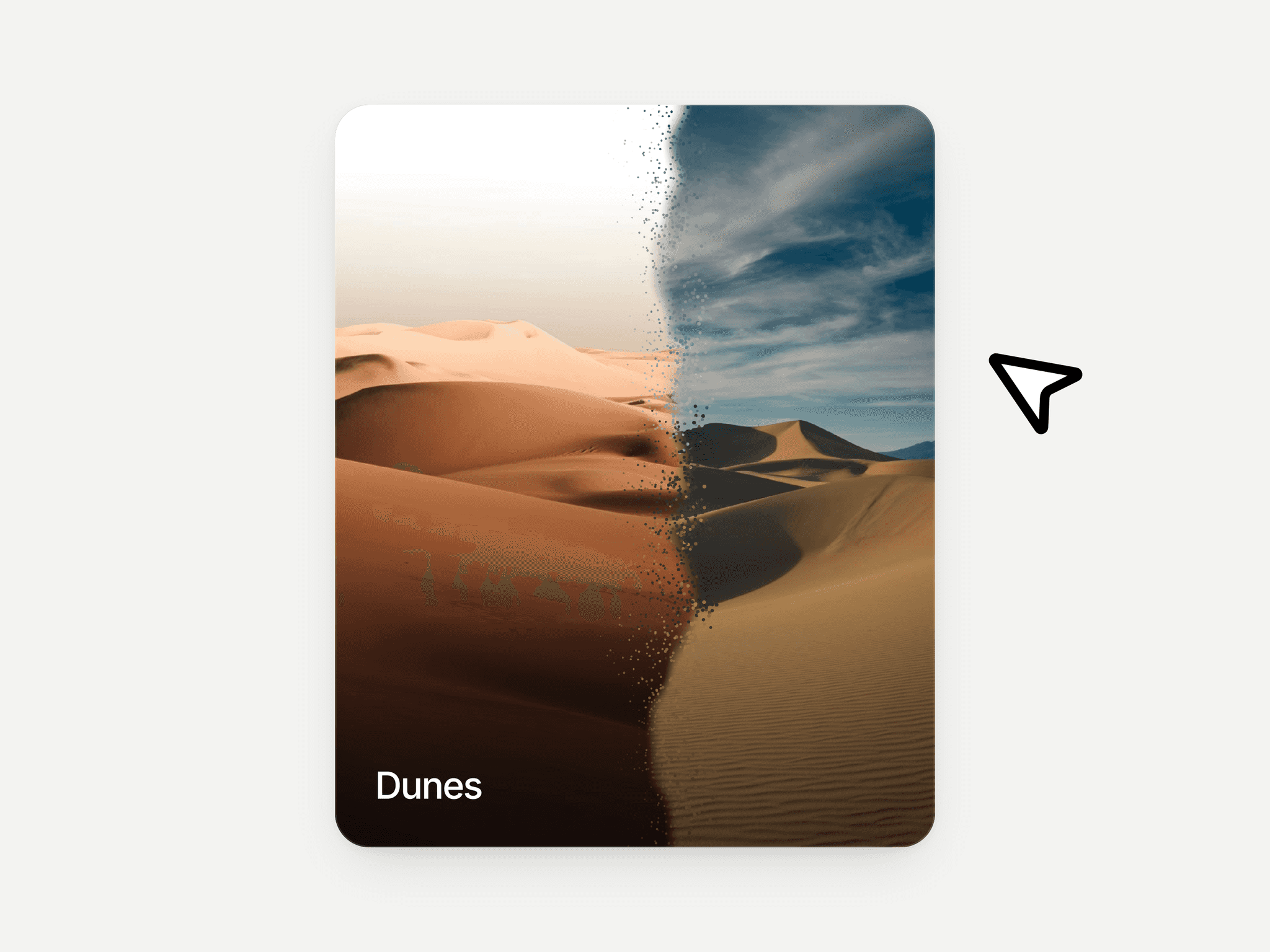
The Hover Product Card is a refined, minimal Framer component designed for modern ecommerce and brand-driven websites. On load, the card enters smoothly, establishing presence without distraction. On hover, a soft blurred overlay fades in, creating depth and focus while the content animates into view with cleantransitions.
The heading and supporting text slide in from the top with a swift, controlled motion, while the pill-shaped CTA rises from the bottom, creating a balanced, layered reveal. The CTA itself is interactive — on hover, the arrow subtly tilts upward, reinforcing motion and responsiveness. Every animation uses physics-based spring settings for a natural, premium feel.
This component is ideal for ecommerce product grids, skincare and beauty brands, fashion collections, tech accessories, digital product showcases, SaaS feature highlights, portfolio work displays, and modern landing pages that require a polished, high-end aesthetic.
Interaction & Motion Details
Smooth Load-In Animation
The card animates into view using spring-based physics, making it feel responsive and alive without being aggressive.
Blurred Hover Overlay
On hover, a soft blur overlay fades in smoothly over the image, increasing contrast and readability while maintaining visual depth.
Staggered Content Reveal
Heading and description slide down from the top
CTA button rises from the bottom
Carefully timed sequencing creates a structured visual hierarchy
Interactive CTA
The pill-shaped button includes its own micro-interaction. When hovered, the arrow subtly shifts upward, adding motion feedback and reinforcing clickability.
Physics-Based Motion
All transitions are powered by smooth, natural spring settings for a refined and modern interaction experience.
Customizable Design Controls
The component includes flexible Framer property controls so it adapts to any brand or design system.
Customize:
Background Image – Upload any image as the card background
Heading – Edit product or feature title
Heading Color – Adjust for light or dark imagery
Description Text – Customize supporting copy
Text Color – Control readability and tone
CTA Background Color – Match brand identity
CTA Text – Modify button label
CTA Link – Set destination URL
CTA Text Color – Ensure proper contrast
Design Characteristics
Rounded squircle-style corners for a soft, modern aesthetic
Minimal, image-first layout
Balanced spacing built on a clean grid system
Fully responsive across desktop, tablet, and mobile
Optimized for performance with GPU-friendly animations