About Hover Reveal Service
Hover Reveal Service List - Rows that reveal images on hover
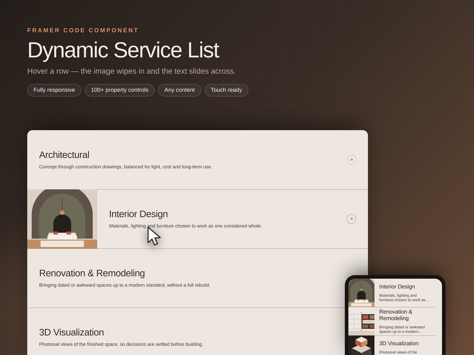
Hover any row and its image wipes in from the side while the title and text slide across to make room. It is the interaction you have seen on studio and agency sites, as a drop-in Framer component.
Use it for services, features, FAQs, process steps, case studies, a blog index, pricing tiers or a menu. Every row carries its own title, text, image and link, added and reordered from the Items list.
WHAT YOU CONTROL — 105 property controls, no code:
Row height, padding, insets, alignment, max text width
Image mode: on hover, always visible, or hidden
Image side, width, radius, fit, start scale, beside or stacked
Full font controls for title and body, with idle and hover colours
Dividers: colour, hover colour, weight, first and last line
Icon: arrow, chevron or plus — size, stroke, ring, fill, hover rotate and shift
Row fill, hover fill, corner radius
Hover and scroll-in entrance, each with its own transition editor
Per-row stagger and viewport threshold
RESPONSIVE, PROPERLY
Three tiers desktop, tablet and mobile each an independent override group with its own row height, insets, type sizes, max lines and icon size. Breakpoints measure the component's own width by default, so the list collapses correctly inside a narrow column, not only on a small screen.
Touch devices never report a hover, so the mobile tier sets images to always visible. Your photography still reads on a phone instead of quietly vanishing.
BUILT WITH CARE
Rows with links are real anchors keyboard accessible, and focus reveals the image
prefers-reduced-motion collapses every transition
No sticky hover left behind on touch
First measurement runs before paint, so phones never flash the desktop layout
A Preview Row control styles the hover state on the canvas
services list, hover reveal, image reveal, interactive list, responsive list, hover animation, portfolio, agency, features, FAQ, process steps, link list, editorial, accessible