About HoverReveal Card
Hover Reveal Product Card – Smooth Hover Animation with Expandable Details
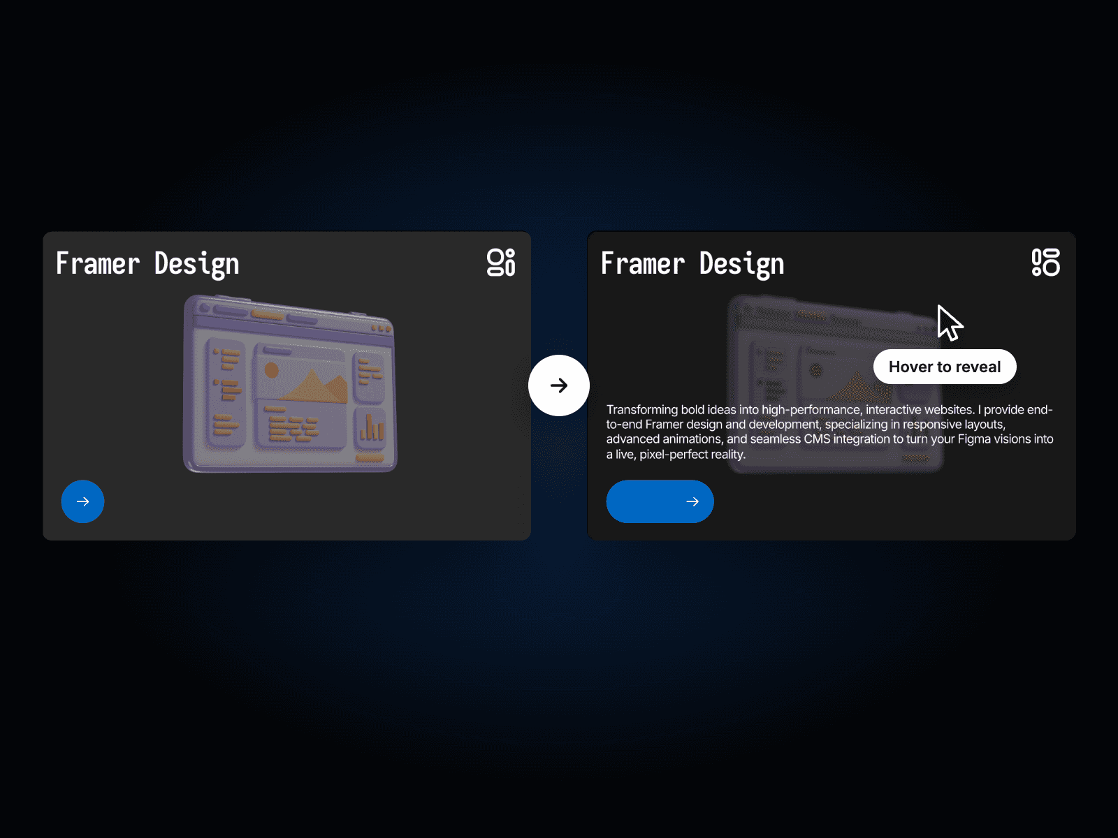
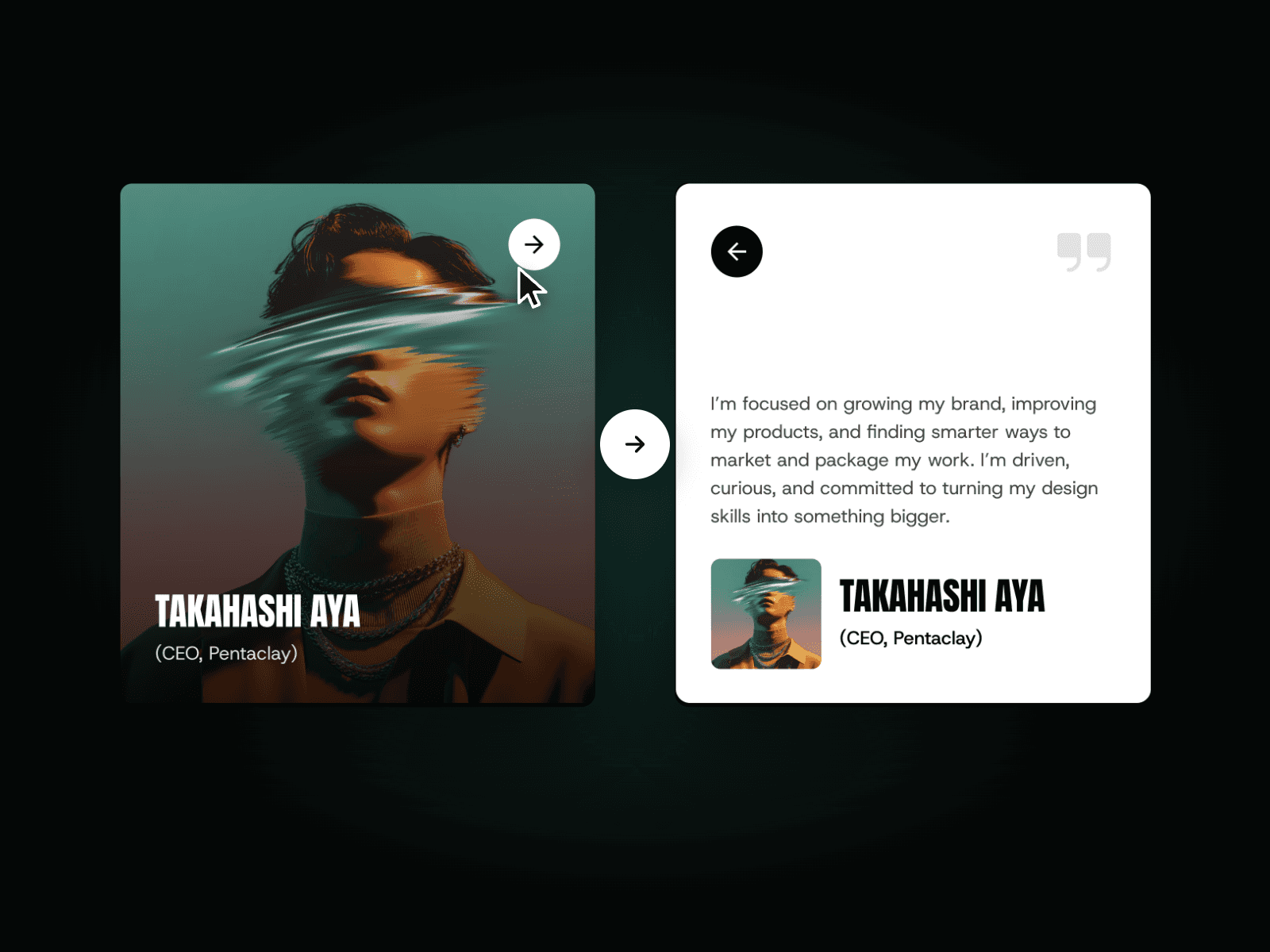
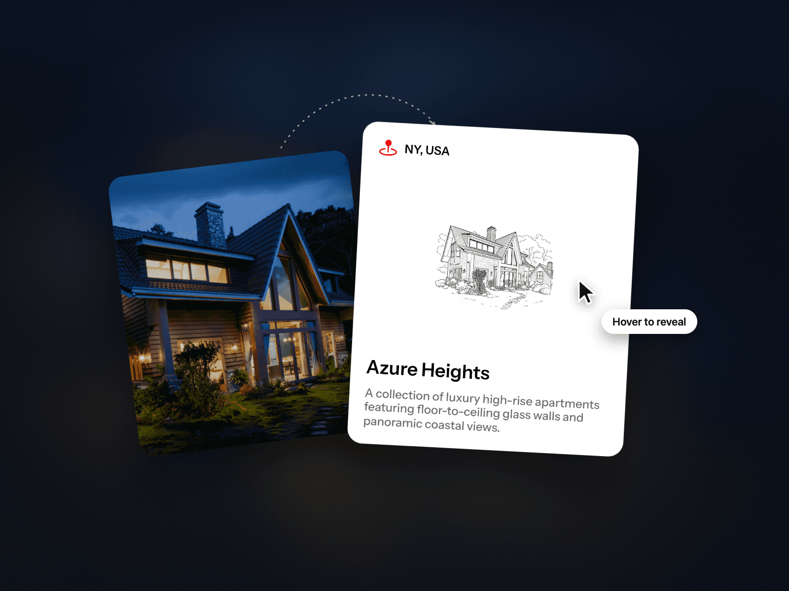
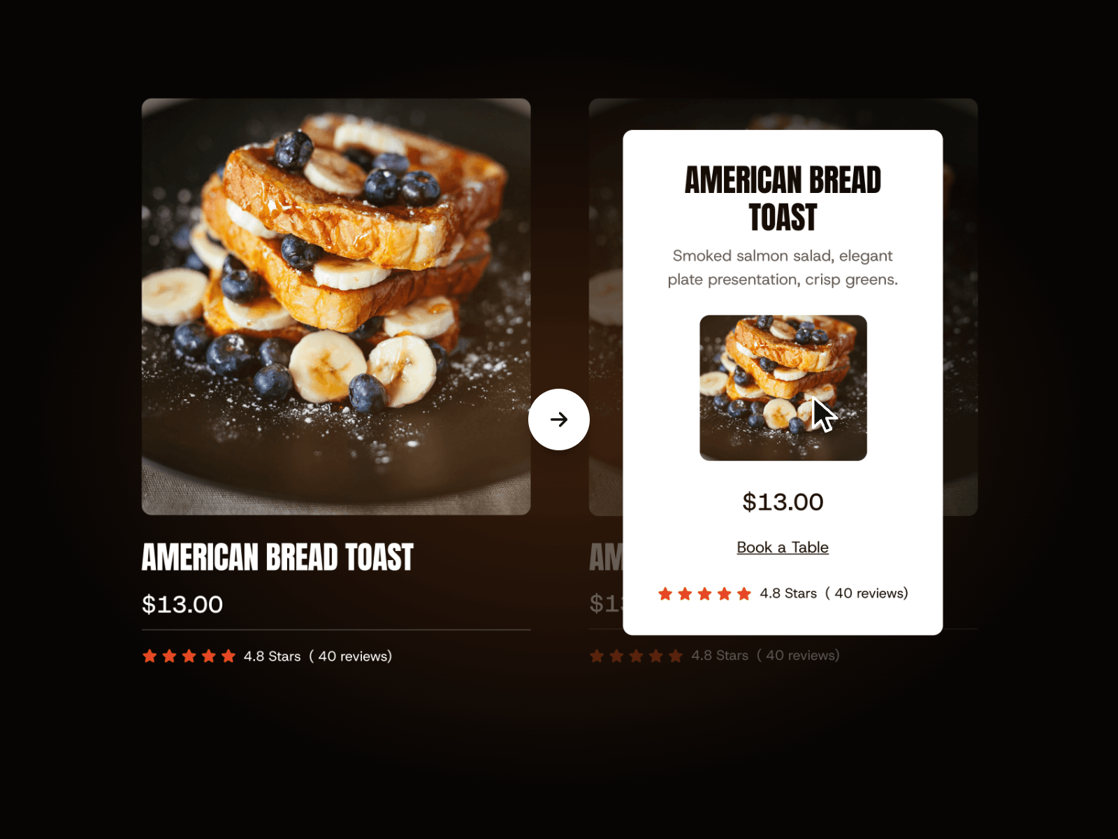
The Hover Reveal Product Card is a modern, interactive Framer component designed to showcase products with clean hover-to-reveal interactions. Instead of overwhelming users with information upfront, this card displays a minimal layout by default—and reveals additional details, features, or CTAs the moment someone hovers. The smooth animation, layered transitions, and elegant motion give your product grid, marketplace, or landing page a polished, premium feel with almost no setup required.
Interactive Hover Reveal
Expands or slides open additional product details on hover.
Smooth layered animation that feels natural and responsive.
Supports image, title, price, description, tags, or custom content.
Subtle motion, opacity, and blur effects create a refined reveal.
Fully responsive and optimized for modern GPU-accelerated performance.
Customizable Design Controls
The Hover Reveal Product Card includes full Framer property controls so you can instantly match it to your brand or layout.
Customize
Cover Image – Add any product image or thumbnail.
Title & Subtitle – Edit product name, description, price, or labels.
Reveal Layout – Choose slide-up, fade, or overlay-style details.
Background & Overlay Colors – Adjust card base colors and reveal panel.
Border Radius – From sharp to rounded corners.
Shadow Toggle – Add or remove depth for a floating card look.
Reveal Speed & Easing – Control how quickly details animate in.
Opacity & Blur Levels – Fine-tune the reveal aesthetic.
How It Works
The Hover Reveal Card uses the cursor’s hover state to trigger a reveal animation. When a user hovers over the card, a hidden panel animates upward or fades into view, displaying extended product information. Behind the scenes, the component uses motion-based transitions—adjusting opacity, translation, and layering—to deliver a smooth, polished animation.