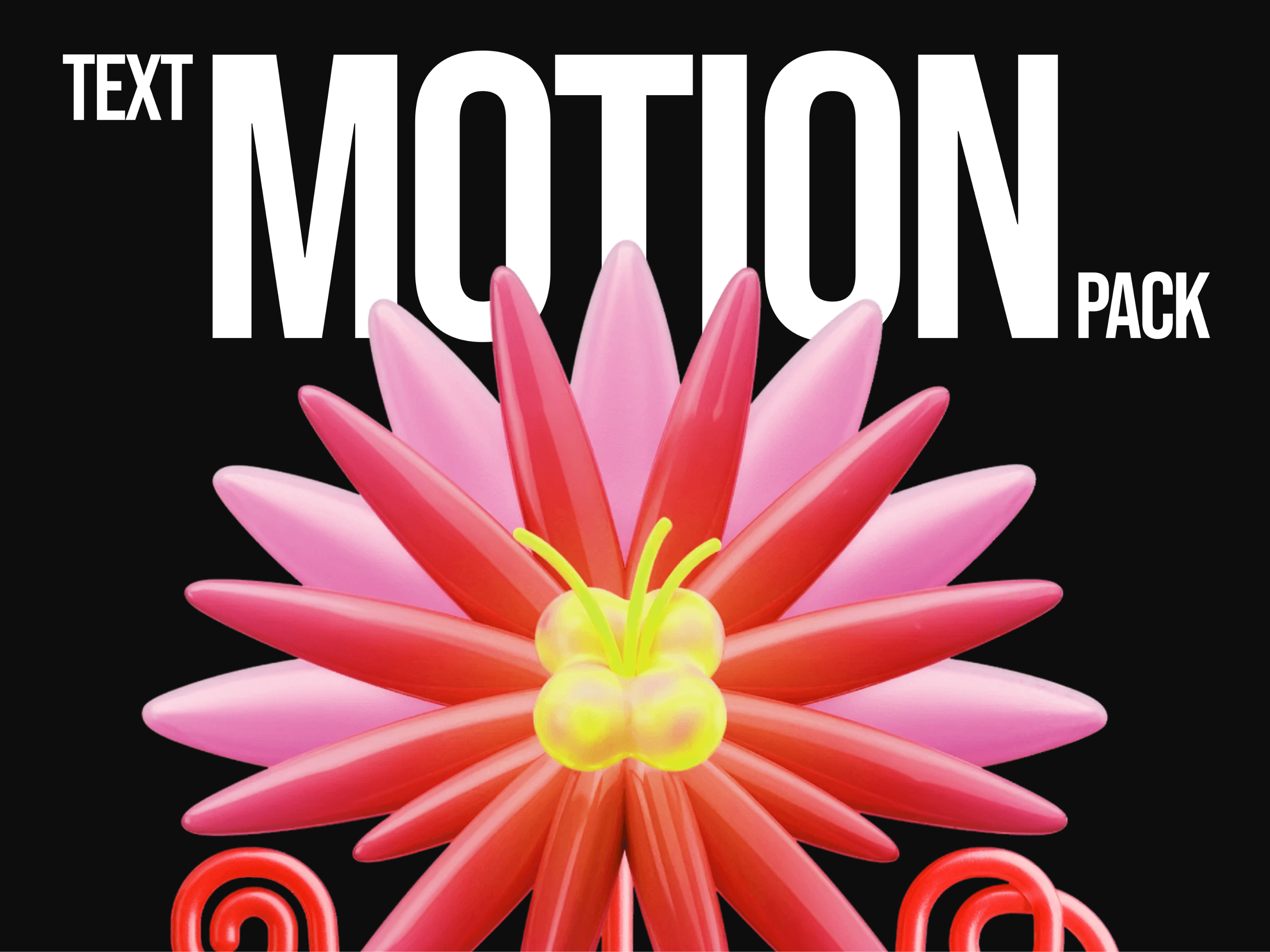
About ImgMask
Details
Transform your text into an interactive visual experience with animated image reveals that respond to both hover interactions and scroll-based triggers. This versatile component allows you to blend typography with imagery by replacing designated characters in your text with animated images that smoothly reveal themselves either when users hover over the component or as they scroll it into view.
Simply use a custom character (like ~) as a placeholder within your text, and watch as images mask into view based on your chosen trigger method. The reveal animation can be customized to expand horizontally or vertically, creating everything from subtle accents to bold visual statements that captivate your audience. Perfect for creative headlines, interactive portfolios, scroll-triggered storytelling, and memorable call-to-action elements.
Features
Dual trigger modes: hover interaction or scroll-based animation
Dynamic text-to-image animation with customizable timing
Customizable mask character for flexible text integration
Smooth reveal animations with horizontal or vertical directions
Adjustable scroll threshold for precise trigger control
Optional click-through linking functionality
Responsive image sizing that scales with font size
Full typography control with custom fonts and styling
Multiple alignment options for versatile layouts
Optimized performance with smooth animations
Controls: How to Use
Trigger Type – Choose between hover activation or scroll-triggered animation
Scroll Threshold – Set what percentage of the element must be visible to trigger scroll animation
Text – Enter your text content with mask characters as image placeholders (e.g., "Hello ~ World")
Mask Character – Define which character will be replaced with animated images
Font – Complete typography control, including size, family, weight, and spacing
Text Color – Choose the color for your text content
Text Alignment – Align text left, center, or right within the container
Mask Image – Upload the image that will animate into view
Reveal Direction – Set whether images reveal horizontally or vertically
Animation Duration – Control how long the reveal animation takes (0.1-5 seconds)
Animation Easing – Choose from 11 different easing options for motion style
Link URL – Optional URL to make the entire component clickable
Refund Policy
As a digital product, all purchases are final and non-refundable. Upon purchase, you receive immediate access to the Framer component, and since digital products cannot be returned once delivered, we cannot process refunds, exchanges, or cancellations.
I encourage you to carefully review all features, documentation, and preview materials before purchasing. If you have any questions or need clarification about the component's functionality, please don't hesitate to reach out before your purchase.
Your purchase confirms acceptance of these terms and conditions.Credits - Hover SVG provided by streamlineicons.com.