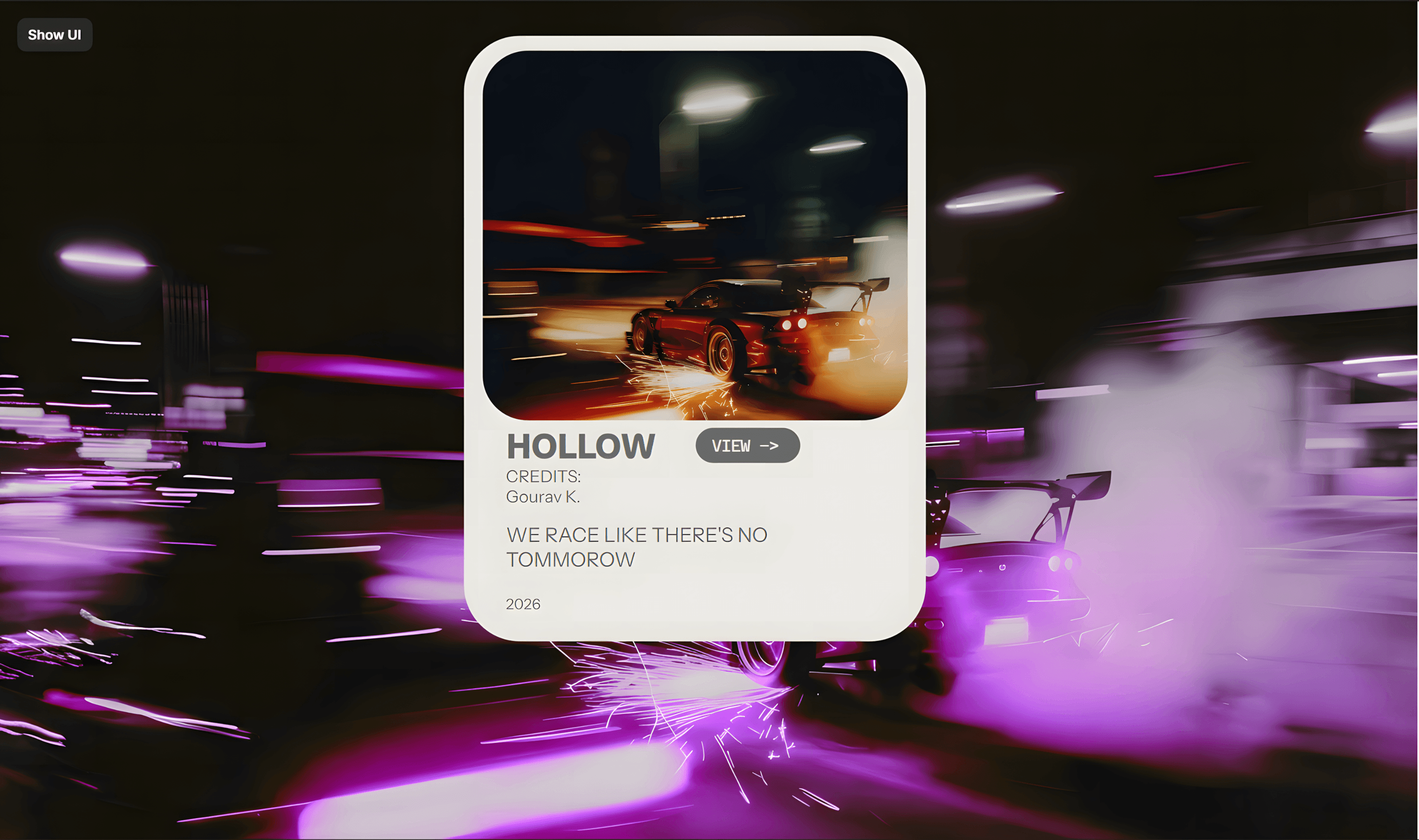
About CMS PREVIEW
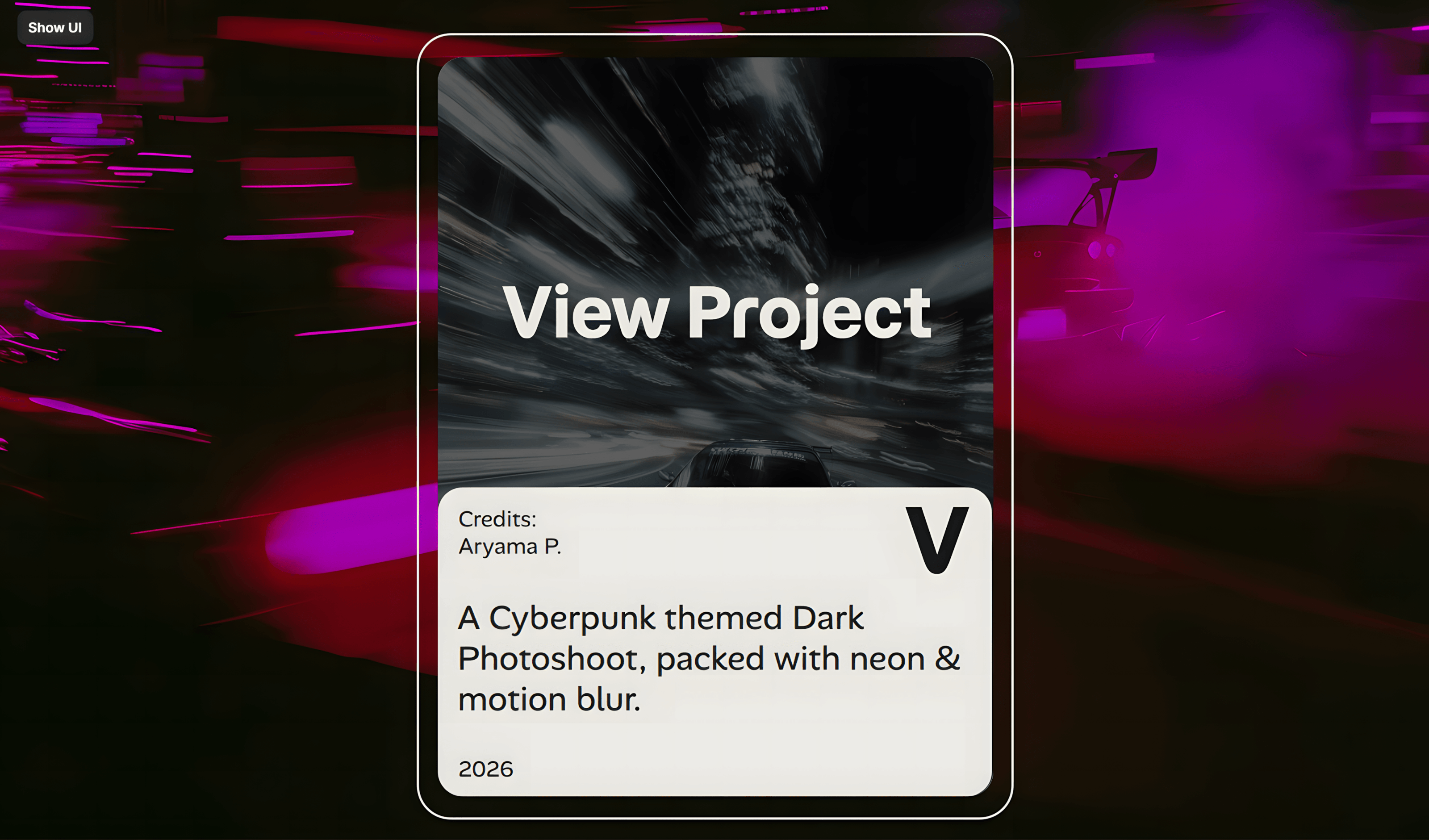
Interactive CMS Preview Card
Designed for seamless content presentation, this Framer CMS card component delivers an engaging user experience by combining a compact default state with a fully expandable detail view.
---
Card Structure & Layout
* Header & Media Canvas: Features a high-impact preview image container with automatic ratio scaling, built to showcase project thumbnails, hero images, or category banners.
* Primary Metadata Bar: Houses the primary title, publish date, category tag, and quick-action icons for instant context.
* Accordion Body: The core expandable container that holds the condensed excerpt in its idle state and smoothly transitions to reveal the full multi-LINE description upon user interaction.
* Action Footer: Features a dedicated, customizable "View Project" or "Read Article" button designed for direct routing to the target CMS item page.
---
Interactive Behavior
* Click-to-Expand Toggle: Clicking anywhere on the card's body triggers a smooth, spring-animated expansion, revealing the complete item description without requiring a page reload.
* Direct CMS Navigation: The primary view button operates independently of the toggle, allowing users to jump straight to the dedicated CMS dynamic page instantly.
* Hover & Focus States: Integrated micro-interactions provide tactile visual feedback, including subtle image scaling and depth shifts when hovering.
---
Customization Controls
* Dynamic Image Property: Swap the visual canvas directly through your CMS field mapping or property controls.
* Editable Copy Fields: Customize titles, subtitles, tags, excerpt length, and full-body descriptions seamlessly.
* Custom Link Destination: Bind the primary button to your collection's dynamic path (e.g., /works/:slug) or any custom external URL.
* Styling & Theme Variables: Adjust border radius, padding, background blur, and color tokens directly in the Framer canvas panel.