About Morph Pill Card
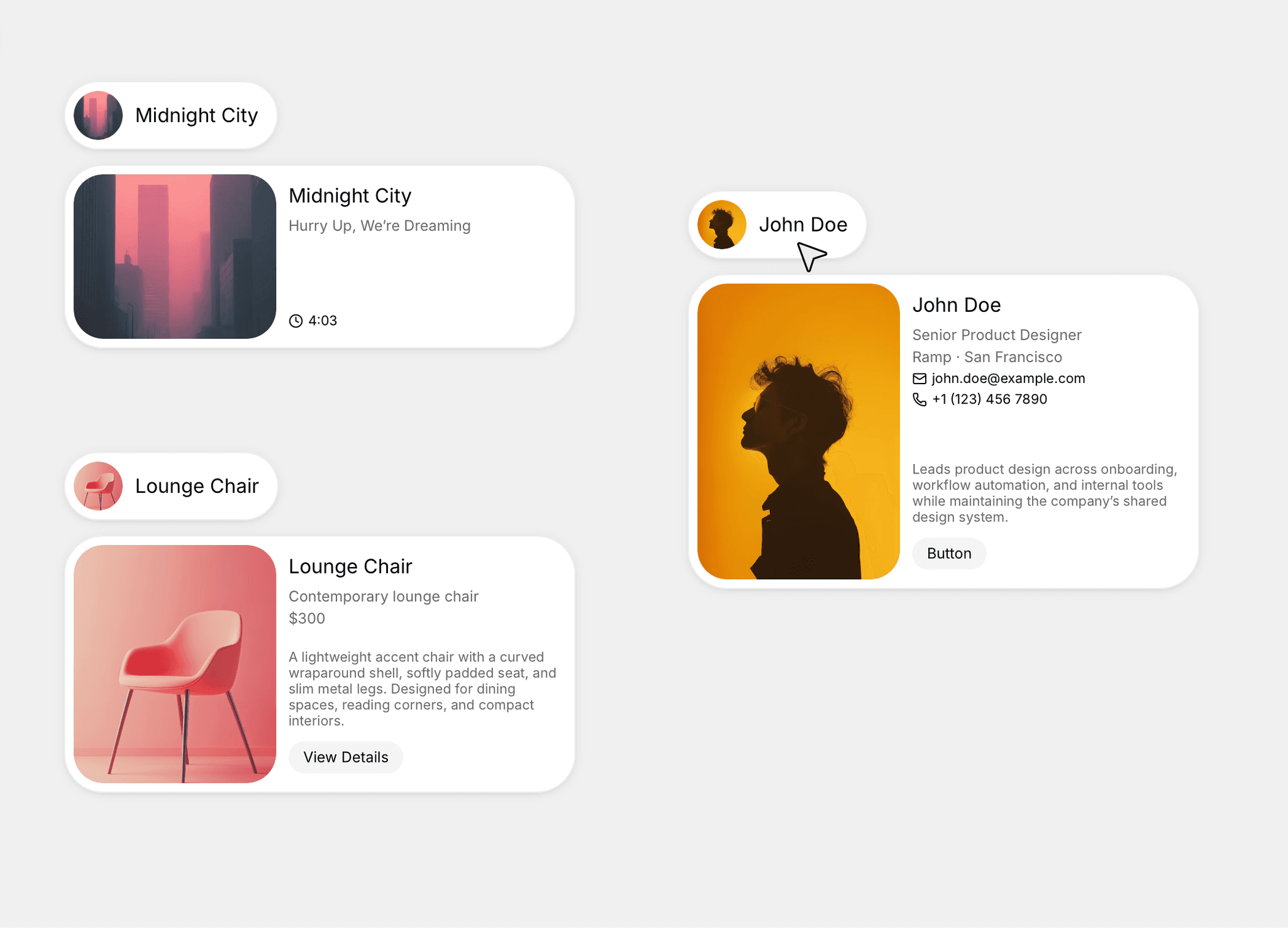
Morph Image Pill is a customizable Framer component that transforms a compact image pill into a detailed content card on hover.
On hover, the pill expands smoothly to reveal supporting text, icon-based information, a longer description, and an optional call-to-action button. The progressive reveal keeps layouts compact while giving visitors access to more information when they interact.
Designed for profiles, products, projects, services, events, and other visual content, the component can be configured directly through Framer’s property controls without editing the internal structure.
Features:
Smooth pill-to-card hover animation
Compact default state
Expanded image card layout
Custom title and image
Two supporting text fields
Two optional icon and text rows
Optional long description
Optional call-to-action button
Custom button link
Individual visibility controls
Adjustable content spacing
Fully customizable inside Framer
No code required
No extra setup required
Customizable Controls:
Title
Image
Primary supporting text
Secondary supporting text
Supporting text visibility
First icon
First icon text
First icon row visibility
Second icon
Second icon text
Second icon row visibility
Description
Description visibility
Button label
Button visibility
Button destination link
Tertiary section spacing
Supporting text section spacing
Default and hover variants
Best For:
Team member profiles
Portfolio introductions
Product previews
Project showcases
Service cards
Contact cards
Event previews
Property listings
Course cards
SaaS interfaces
Creative agency websites
Modern landing pages
For help or suggestions, contact vaspdesigns@gmail.com