About Morphing Mega Menu
About
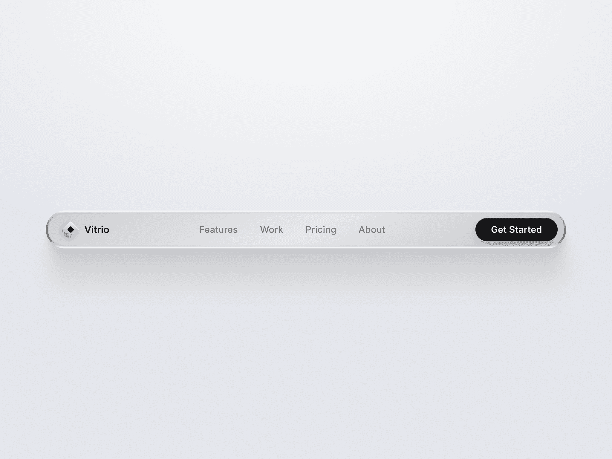
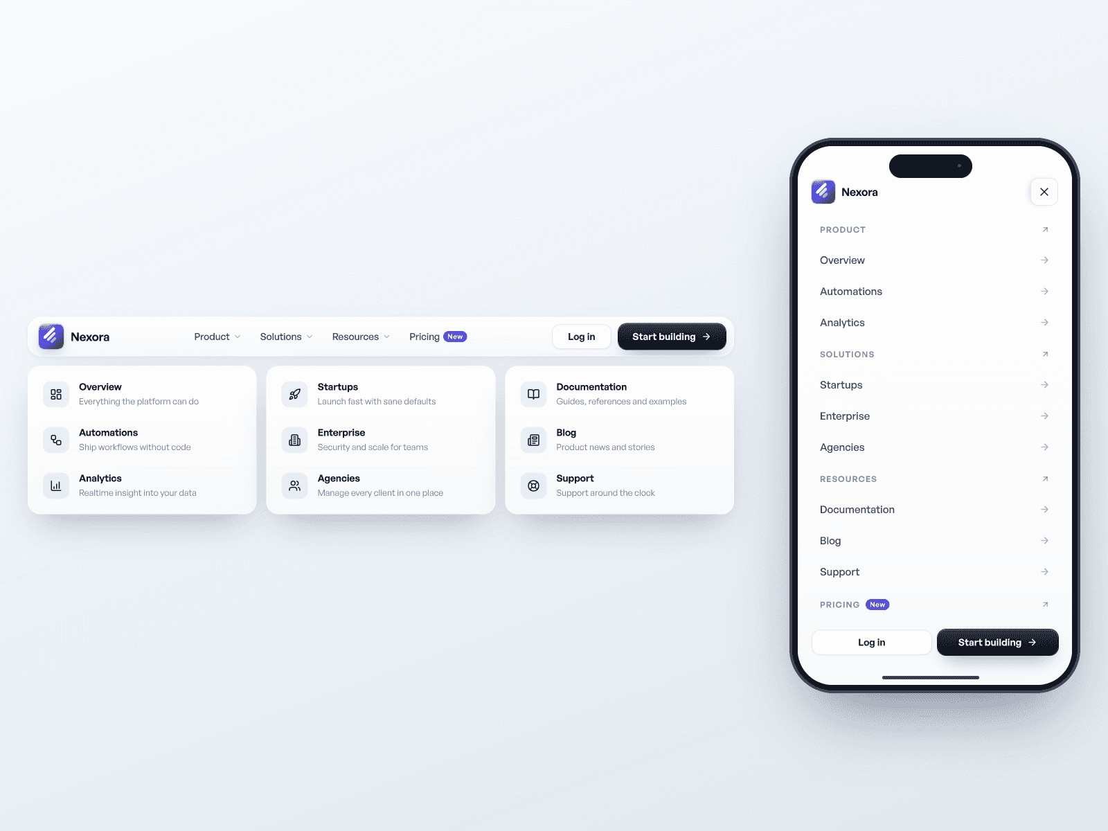
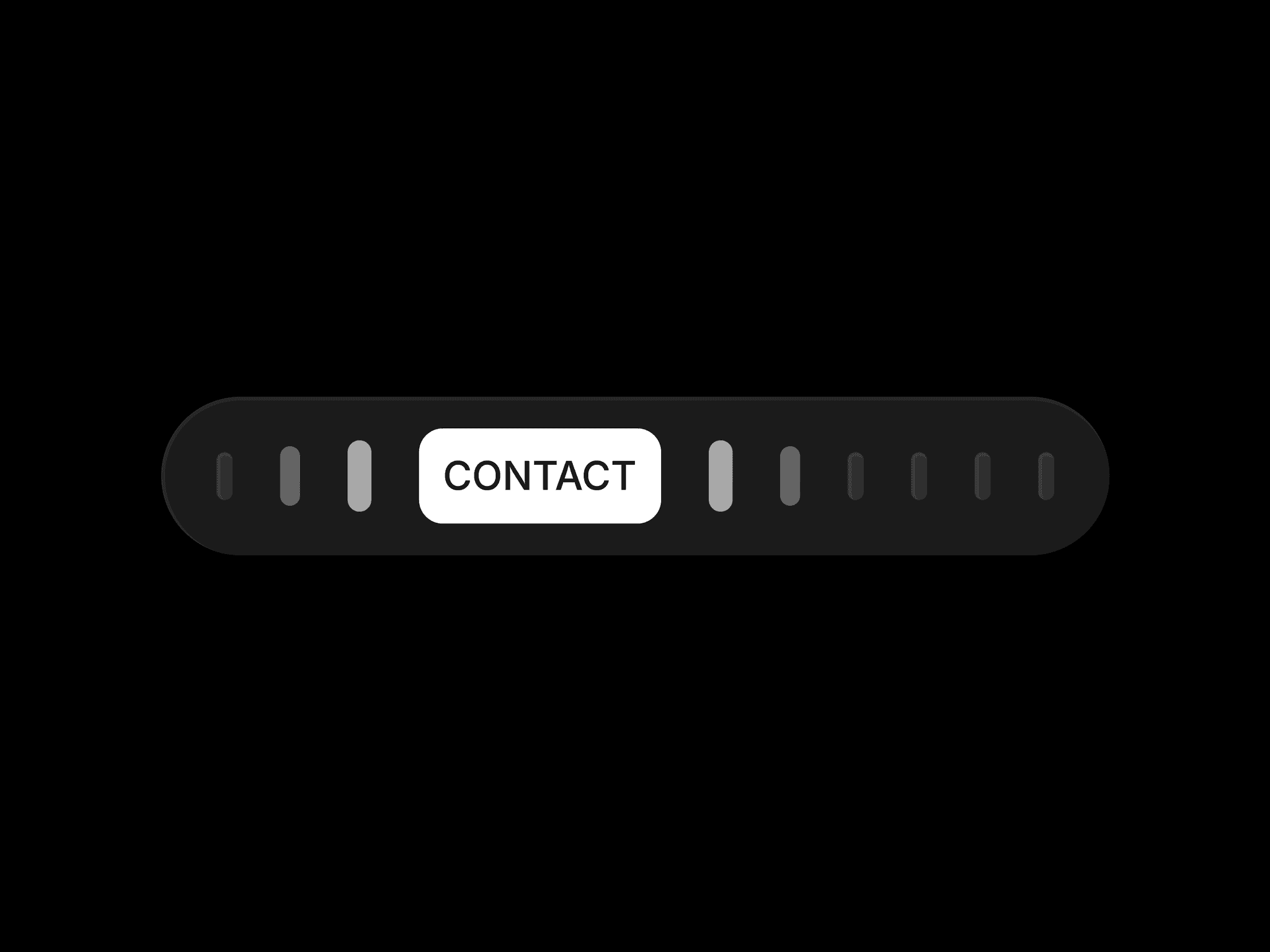
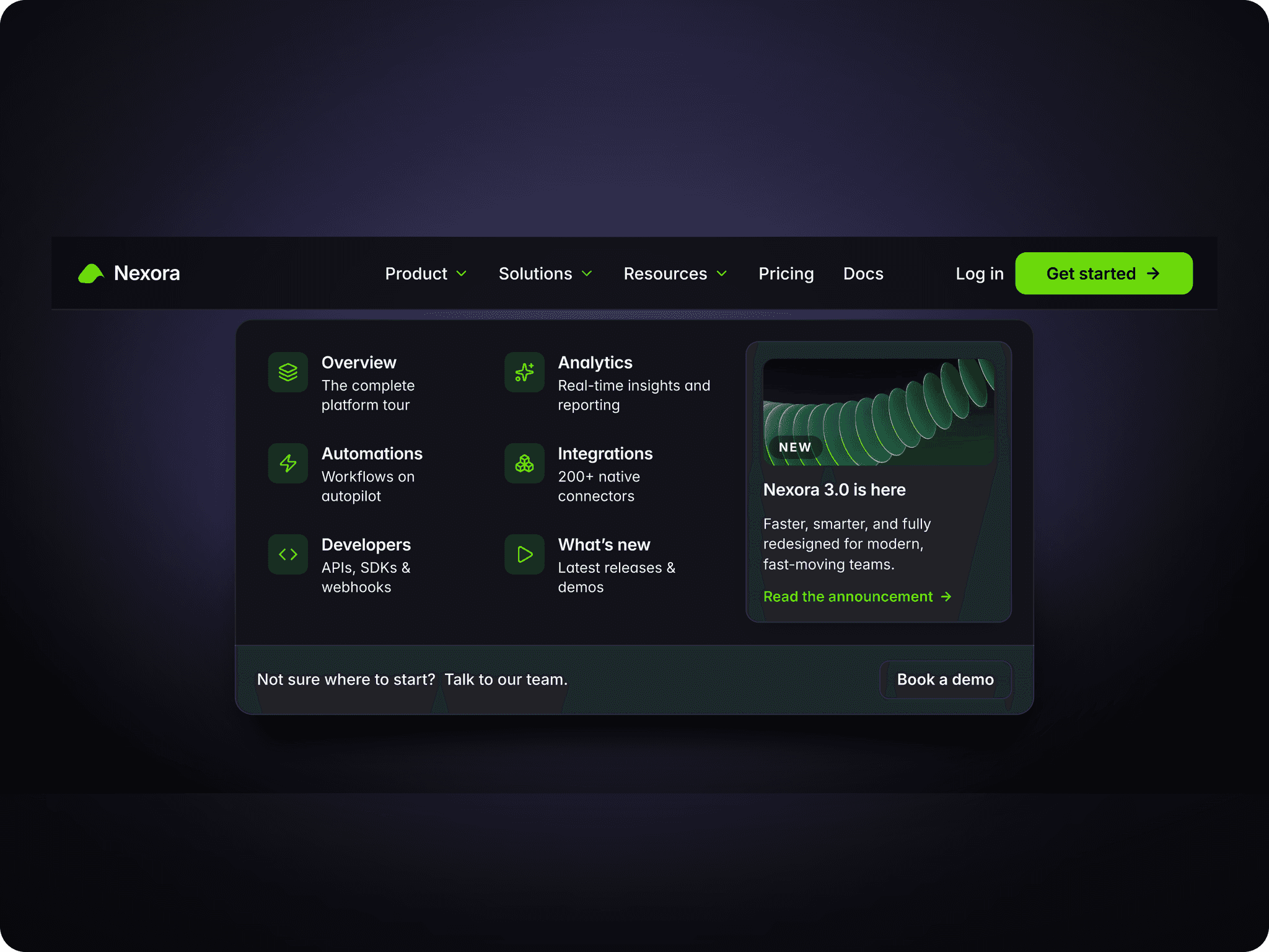
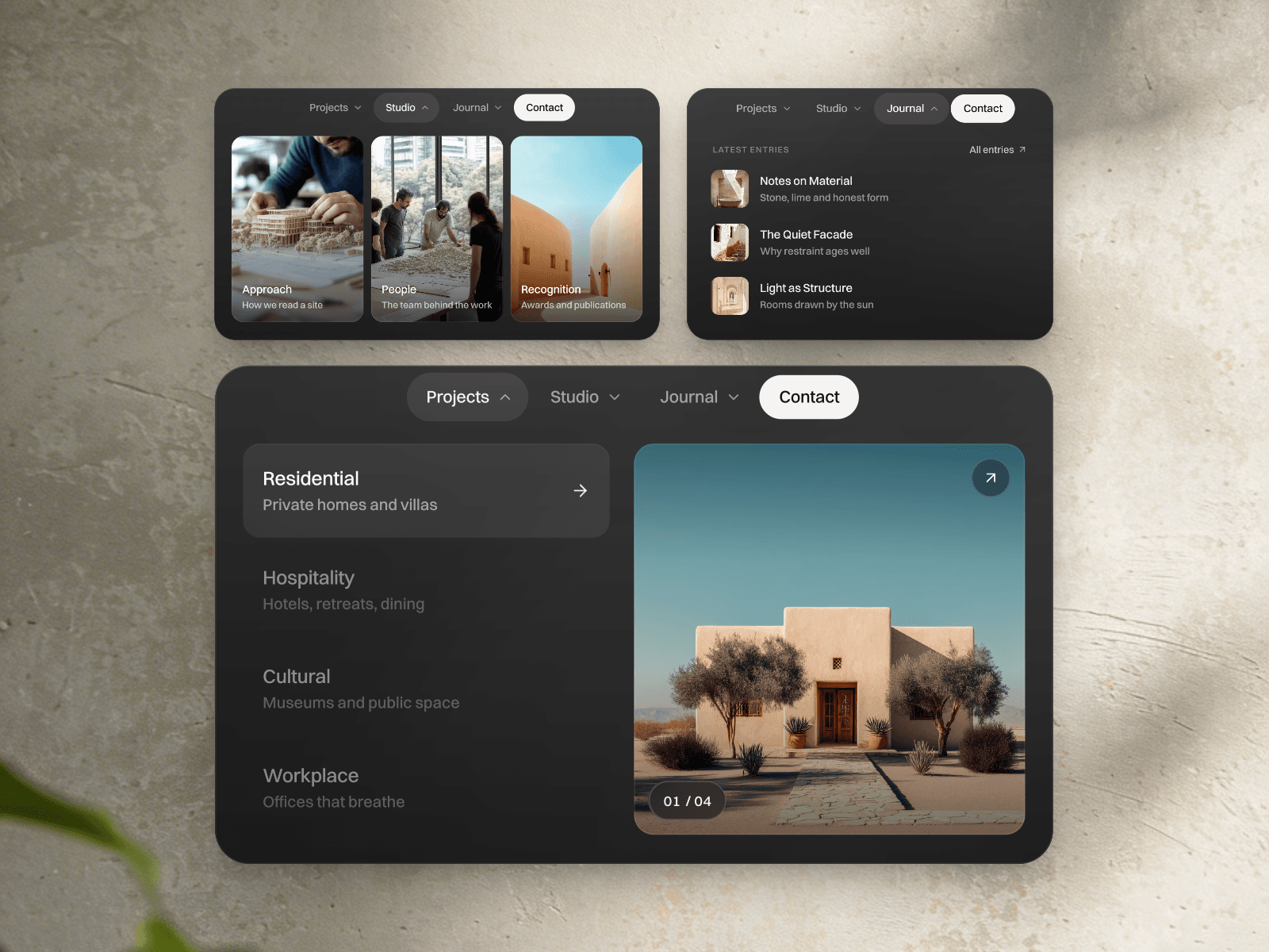
Morphing Mega Menu is a responsive Framer mega menu that turns a compact floating navbar into image-led navigation. Built with native Framer layers, it brings projects, studio content and journal entries into a frosted-glass panel without code.
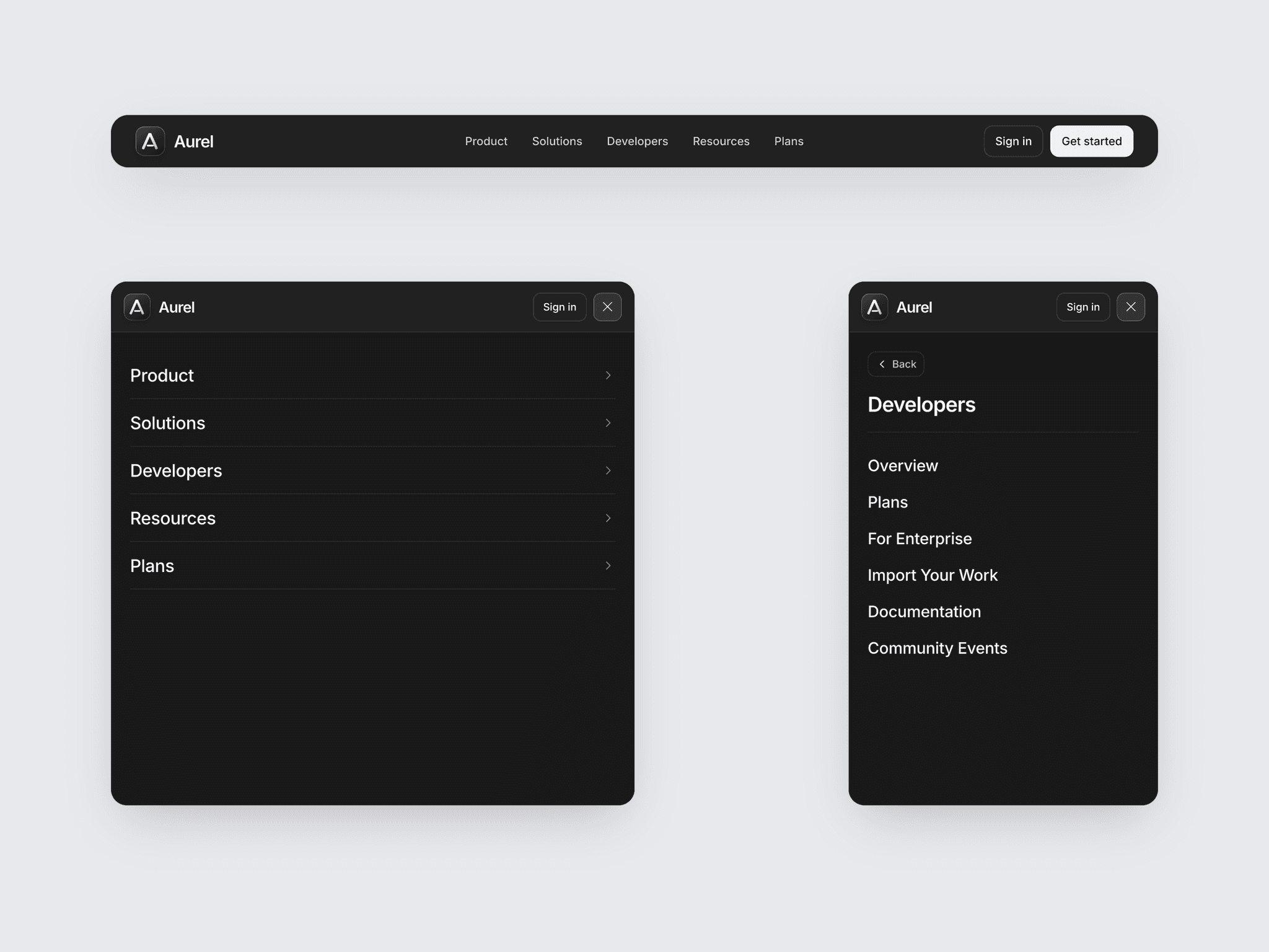
Hover or click to open each section with smooth spring motion. Project previews slide through an image reel with a rolling counter, studio cards reveal an arrow, and journal rows pair titles with thumbnails. On Phone, a tap-based drill-down menu and Back controls keep browsing clear while the open panel overlays your page.
What you can customize
Make the navigation feel like your brand, from the imagery to the smallest label. Replace project previews, card images, titles and supporting text; set menu labels, contact details and destinations through the component controls. One shared toggle manages new-tab behavior.
Fine-tune colors, typography, blur, corner shapes and layout directly in the native Framer layers. Content stays shared across Desktop, Tablet and Phone variants, so your visual story stays consistent as the layout changes.
Great for (examples)
Give visitors a visual starting point:
Designer portfolios with project previews
Architecture and interior design studios
Creative agency website navigation
Photography and art-direction showcases
Editorial websites with journal entries
Brand sites with a compact floating header
Share your build
If you ship something cool with it, post it on X and tag me @Matthias_Oel, or send it over. I’d love to see what you create.
Need help?
Questions or feedback? Reach me anytime: matthias@lmvision.de or on X @Matthias_Oel.
Need a matching component?
Carry the same interactive feel through your project showcase and footer: