About Orbit® – Integration
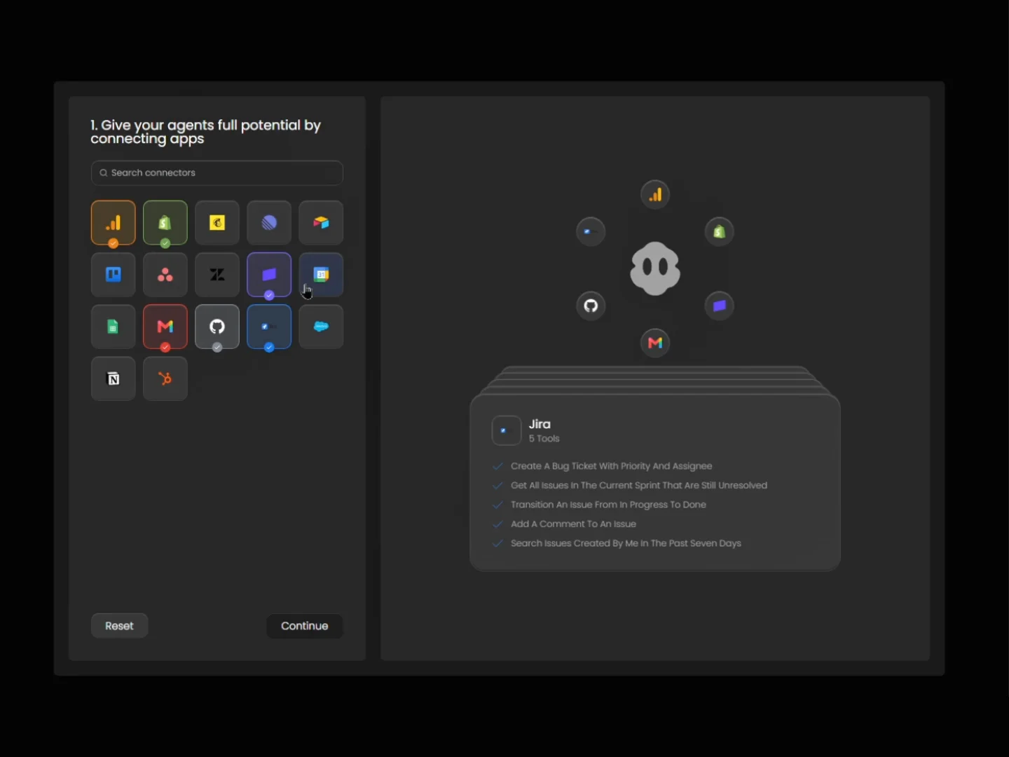
Designed with a sleek dark interface, Orbit turns “connect your apps” into an experience visitors actually want to play with. Pick a tool and watch its logo fly into orbit around your brand, while a stacked detail card shows exactly what it can do.
What makes Orbit® different?
Interactive & Engaging – Visitors select connectors, search, and reset with smooth, springy animations that make your integrations feel alive.
Fully CMS-Driven – Add a connector once in the CMS and its logo, tools list, tick color and “Featured” state update everywhere automatically.
Clear & Persuasive – Show real use cases per integration, so visitors instantly see what your product can do for them.
Plug & Play – Prebuilt overrides and code components work together out of the box. No custom code needed.
Orbit® is built for Framer, ensuring smooth performance and a frustration-free setup. Whether you’re building an AI agent platform, a SaaS product, an automation tool or an integrations page, this component gives you everything to showcase your connectors in a way that converts.
WHAT’S INCLUDED
Connector Grid (CMS) – Selectable app buttons with Default and Selected states, per-connector accent colors.
Live Search – Filter connectors by name as visitors type.
Logo Ring – Orbiting logos that grow with every selection, with hover effects and scale-to-fit.
Detail Card Stack – Stacked cards that show each connector’s name, tool count and checklist.
Reset & Continue Buttons – With automatic disabled states when nothing is selected.
Featured Defaults – Preselect your top integrations on load with a simple CMS toggle.
AI Behavior Select – Single-choice cards with a linked description panel and disabled-state button.
Responsive Layouts – Desktop, tablet and phone breakpoints.
Changelog
1.0
Initial release