About Peek Slider
About
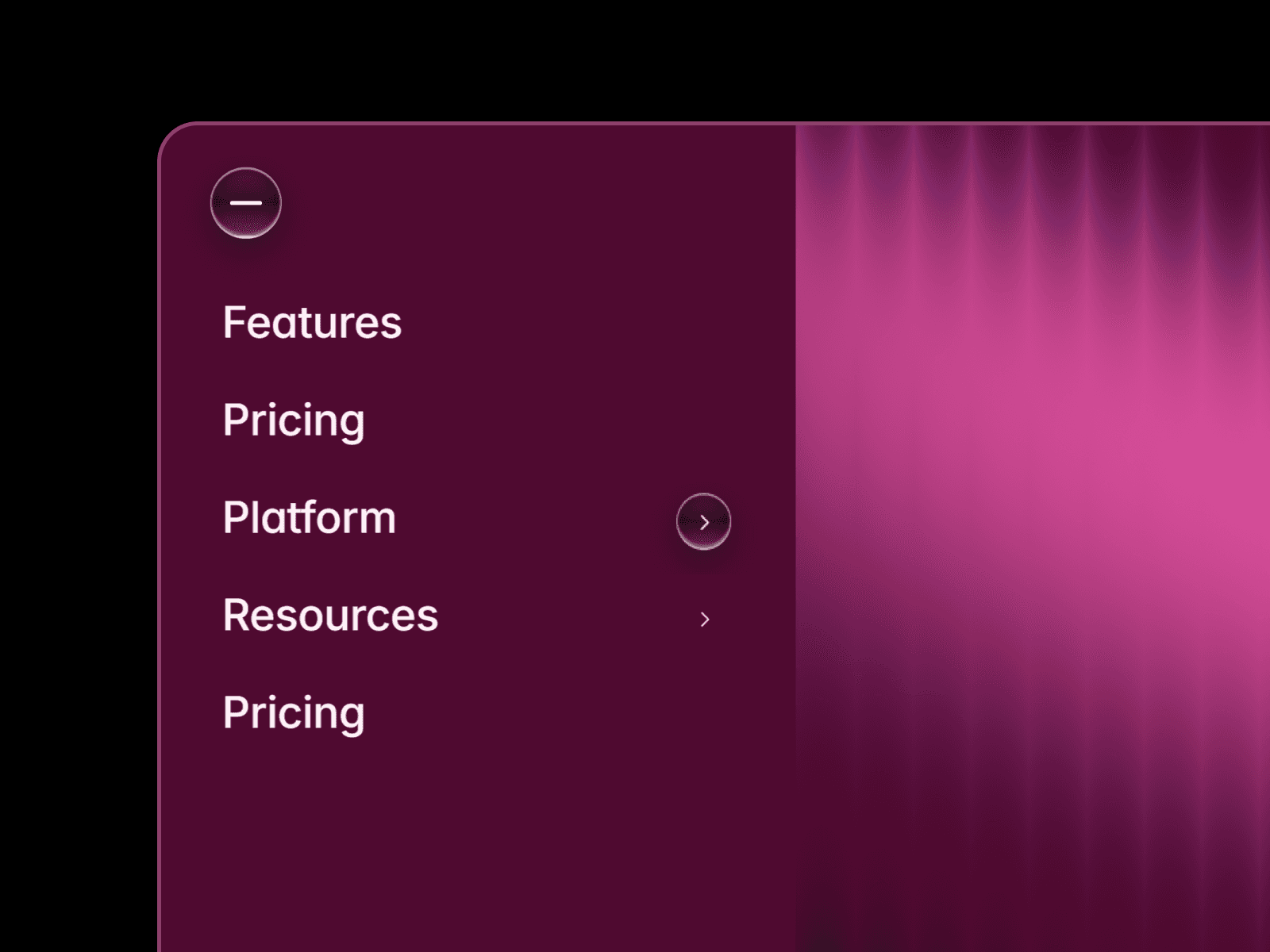
Built for effortless customization without touching internal layers.
Drop the drawer onto your canvas and tailor every color, font, link, and interaction directly from the right-hand Properties panel.
Customize
Change the font across the entire component in 1 click (
Global Fontpicker)Edit every surface, pill, toggle, text, and peek-tab accent color
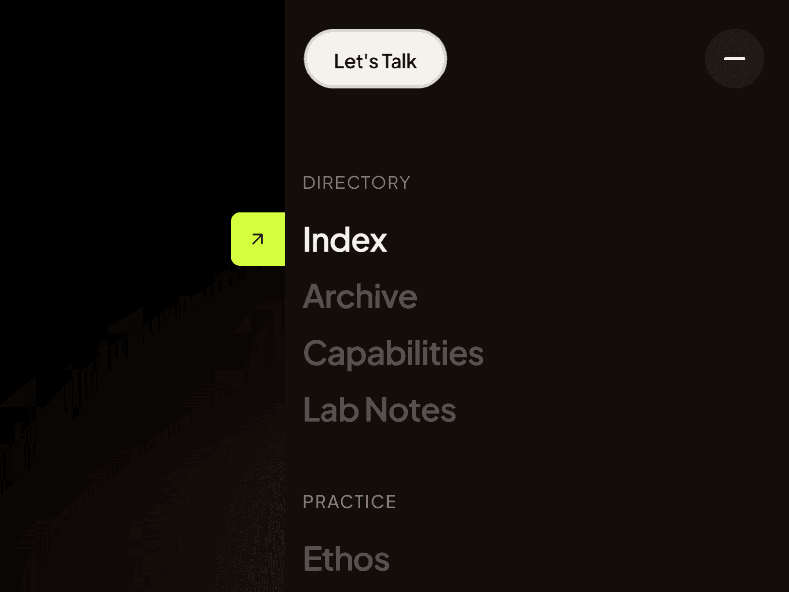
Interactive left-edge
↗peek-out badge that tracks hovered links with spring physicsSibling spotlight hover effect that highlights the active link while dimming surrounding links
Morphing top-right trigger cluster (CTA pill +
≡to—circular menu toggle)Toggle optional sections on or off (
CTA Button,Peek Tab,Group 2,Social Footer)Custom icon & URL support for the bottom social channels bar
Who is this for?
Design studios & creative agencies
Personal portfolios & case study archives
SaaS & startup landing pages
Modern Framer templates
Architecture, editorial & brand showcases
Mobile-ready by design. Set the component width and height to 100% (Fill) or pin it (Position: Fixed, Inset: 0) so the top-right trigger and slide-over drawer scale cleanly across Desktop, Tablet, and Mobile screens while keeping the underlying page 100% clickable when closed.
Share your build If you build something cool with Peek Drawer Slider, I'd love to see it! Feel free to share it on X and tag me @heyshrinath.
Need help? Questions, feedback, or feature requests? Reach out anytime on X @heyshrinath.