About Practical Ui Cards
Overview
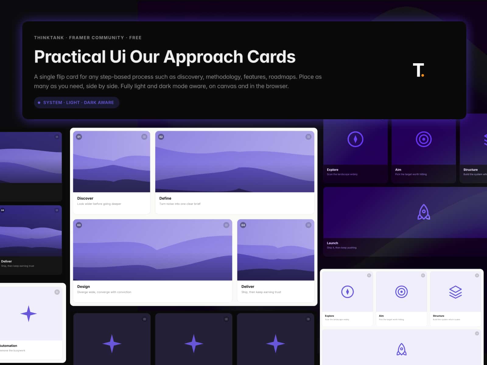
Practical Ui Card is a structured project/case-study card for portfolios, agencies, and studio sites. It adapts to light and dark mode automatically and includes a configurable hover effect.
Features
Full and Compact layouts
Automatic light/dark mode, or manual override
Configurable hover lift, shadow, and press effect
Three CTA styles with custom icon, color, and radius
Cover image, GIF, or video support
Fully unlocked — detach and edit anytime
How to use
Drag Practical Ui Card from Assets
Choose Full or Compact variant
Add your title, tags, and content
Set your CTA and theme
Adjust hover effects to match your brand
Best practices
Keep Challenge / Approach / Outcome text short and scannable
Set the Dark shadow separately from Light for real contrast
Match Hover Lift and Shadow to your site's existing motion style
Check both Light and Dark before publishing
Use cases
Portfolio case studies
Agency project pages
Studio work grids
Client showcase sections
Need help Facing any issue?
Email: tankchaitanya23@gmail.com