About Prism Service Card
Explore the best Framer components ↗
About
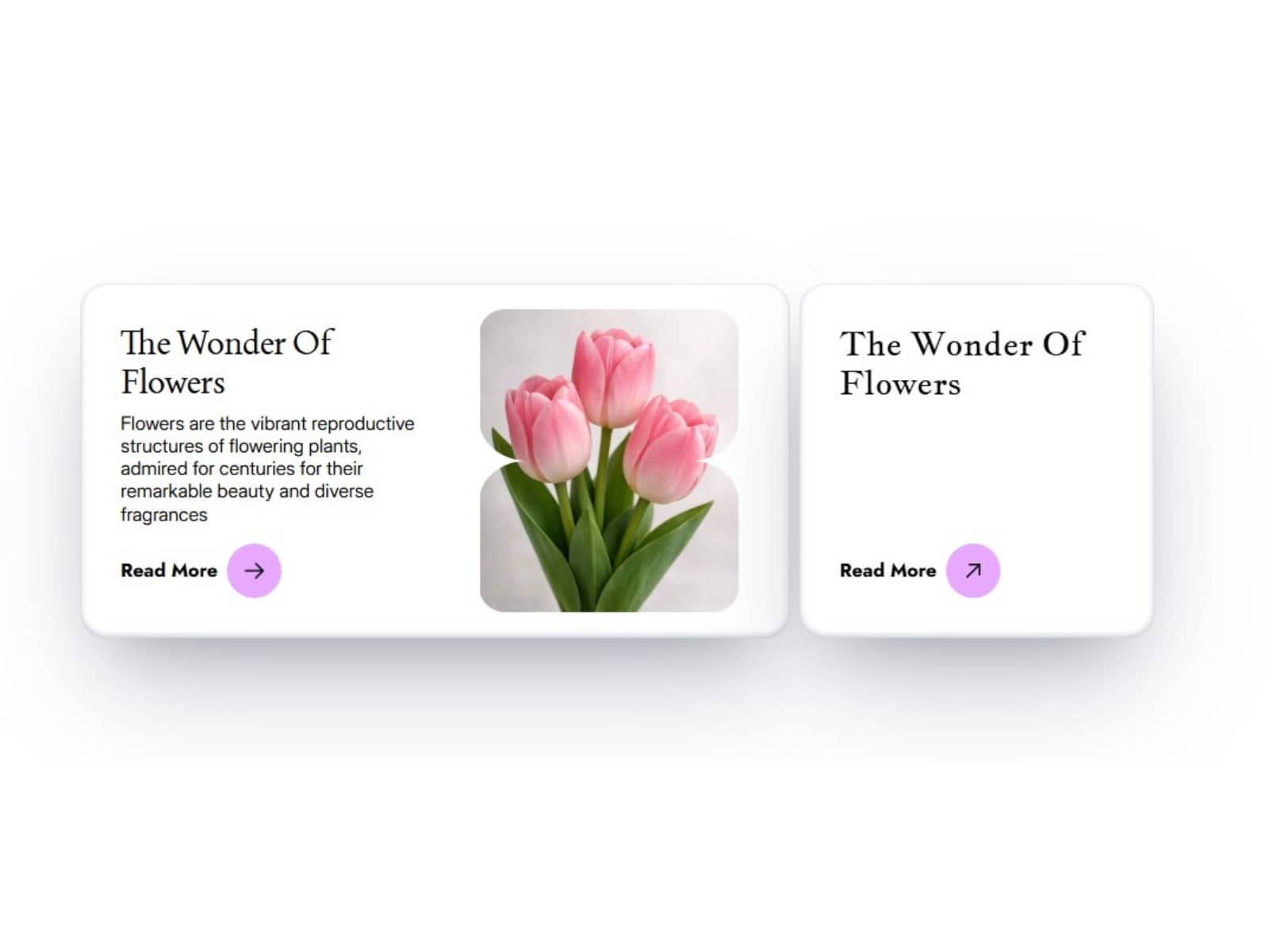
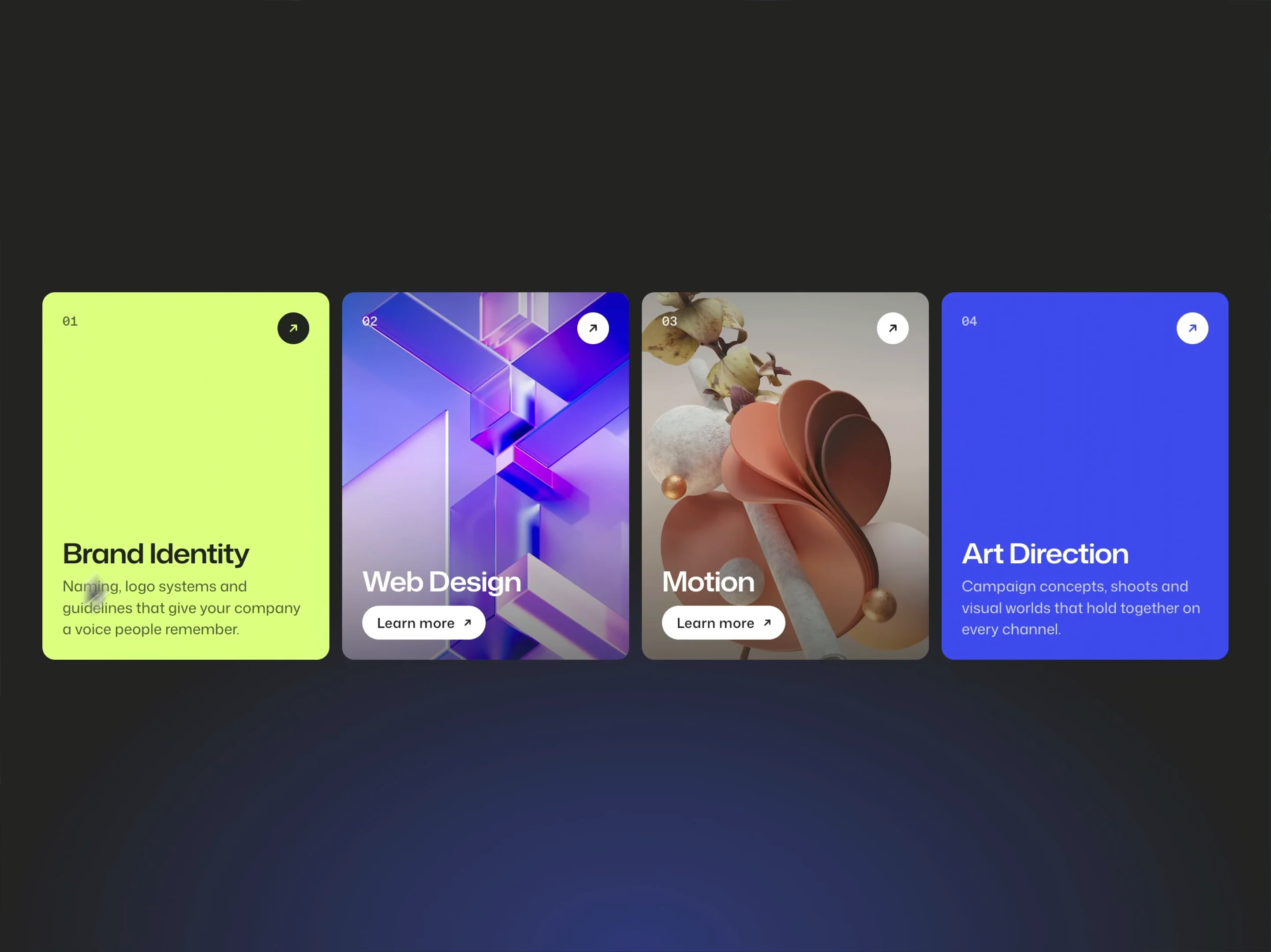
Prism Service Card is an interactive service card grid for Framer. Each card turns like a classic prism billboard, revealing an image or color in a wave of rotating panels. Use it to introduce your services, projects or capabilities with a memorable hover interaction.
Cards can link to their own pages. An optional entrance animation introduces them as they come into view, while autoplay brings movement to the grid until a visitor interacts.
What you can customize
Make the cards your own with imagery, colors, copy and motion that fit your brand. Add up to 12 services, each with a title, description, image, color, resting side and link. Set your own action label and show or hide card numbers.
Shape the layout with columns, minimum card width, spacing, aspect ratio, corners and shadows. Fine-tune the prism count, wave direction, stagger, speed, bounce and shading. Adjust the hover lift, choose an optional sound and set its volume, or turn it off. On touch devices, choose an in-view reveal or tap interaction.
The responsive grid adapts to available space, while reduced-motion settings keep the experience comfortable.
Great for (examples)
A few ways to bring your content to life:
Creative agencies, branding and design studios
Freelancers, consultants and personal portfolios
Service pages, capabilities and expertise sections
Project categories, case studies and creative work
Product features, solutions and landing pages
Architecture, interiors and photography showcases
Need help?
Questions or feedback? Reach me anytime: matthias@lmvision.de or on X @Matthias_Oel.
Need a matching component?
Complete your site with more interactive details: