About ProductShowcase
A modern, interactive Product Showcase Component designed to highlight product features in a visually engaging way. Combine a dynamic gradient background, product images, and interactive hotspot dots that reveal detailed feature cards on hover.
Built for flexibility and performance, this component allows designers to create rich product storytelling experiences directly inside Framer—without writing additional code.
✨ Features
Gradient Background
Smooth, customizable multi-color gradient with adjustable colors for brand consistency.
Product Image Frame
Keep your product perfectly positioned while the layout remains responsive across all screen sizes.
Interactive Hotspot Dots
Place multiple dots anywhere on the product to highlight key features with precision.
Smart Feature Popups
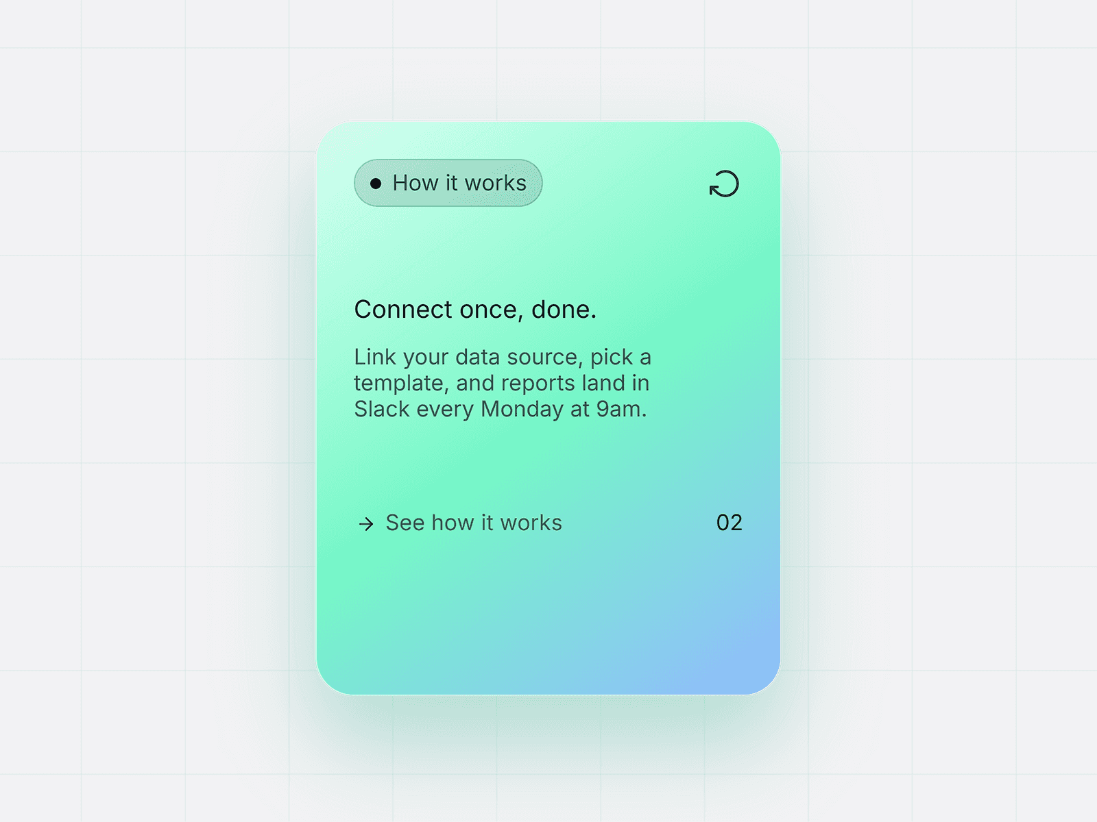
Hover on dots to reveal animated popup cards with:
Feature image
Title
Description
Popups intelligently stay within the viewport for better UX.
Dark Mode Support
Toggle between light and dark popup styles for better visual integration.
Fully Customizable Controls
Easily edit from the Framer property panel:
Product image
Dot positions
Feature content (image, text)
Typography
Button styles
Colors
Native Framer Link Support
Buttons support both internal page navigation and external links.
📱 Fully Responsive
Optimized for all screen sizes while maintaining accurate dot positioning relative to the product.
How to Use in Framer
Add the component to your canvas
Upload your product image
Add and position feature dots using X/Y controls
For each dot:
Add a feature image
Enter title & description
Customize:
Gradient colors
Text content
Button styles & link
Preview and adjust for responsiveness
Who This Is For
Product Designers
Showcase product features in a clear, interactive way.
🚀 Startup & SaaS Teams
Create landing pages that explain product value quickly and visually.
🧑🎨 Framer Creators
Build high-quality, reusable components for client projects or templates.
🏪 E-commerce Brands
Highlight product details like materials, features, and benefits directly on the image.
💡 Use Cases
Product landing pages
Feature breakdown sections
App or device showcases
Marketing pages
Portfolio presentations