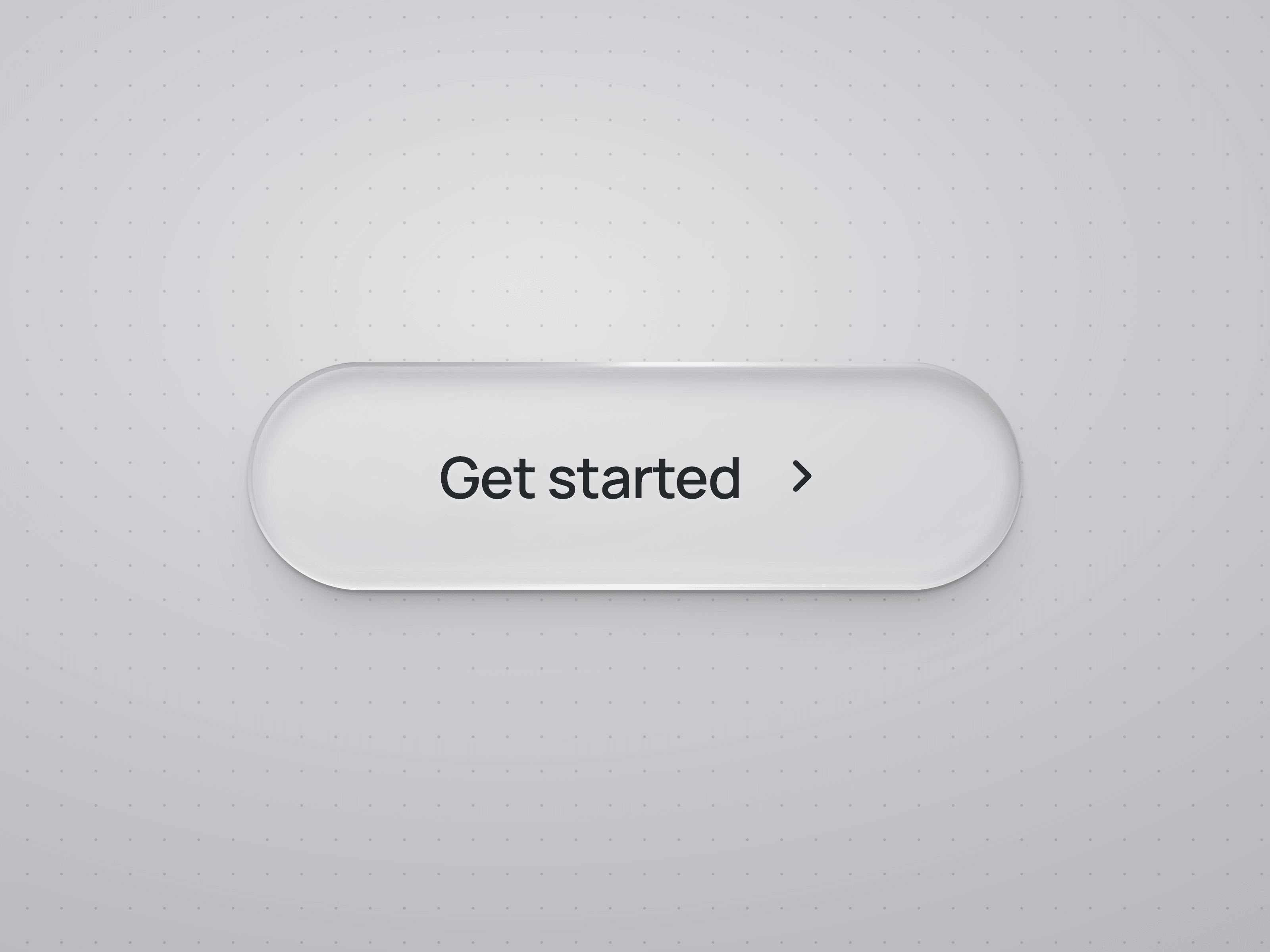
About Liquid Glass Buttons
About
Liquid Glass Button is a customizable Framer code component for transparent CTAs, navigation links and interface actions. Choose Clear, Frosted or Tinted glass with background blur, reflective edges and layered depth. On mouse hover, reflections follow the pointer with a subtle tilt and lift; pressing gently compresses the surface. Manually choose On Light or On Dark to match your background.
What you can customize
Use Framer property controls to edit the label, link, typography, colors, padding, corners and icon placement. Choose a built-in icon or connect your own icon or layer. Adjust blur, glass depth, refraction, hover timing and pointer lighting. Includes On Tap events, disabled states, visible keyboard focus and reduced-motion support. No code editing needed.
Enhanced refraction is available in supported Chromium browsers outside iOS/iPadOS. Other browsers use CSS glass, with an opaque fallback when background blur is unavailable.
Great for (examples)
Just a few ideas, use it anywhere a transparent action fits your design:
Hero CTAs over photography and textured backgrounds
SaaS landing pages, product demos and feature links
Portfolio navigation and project case-study links
Creative studios, agency sites and contact CTAs
App landing pages and download links
Hospitality, travel and destination booking links
Product launches, waitlists and promotional pages
Interface actions and connected Framer interactions
Share your build
If you ship something cool with it, post it on X and tag me @Matthias_Oel, or send it over. I’d love to see what you create.
Need help?
Questions or feedback? Reach me anytime: matthias@lmvision.de or on X @Matthias_Oel.
Need a matching component?
Pair it with more glass and reflective details: