About RulerNav
Not your usual section navigation.
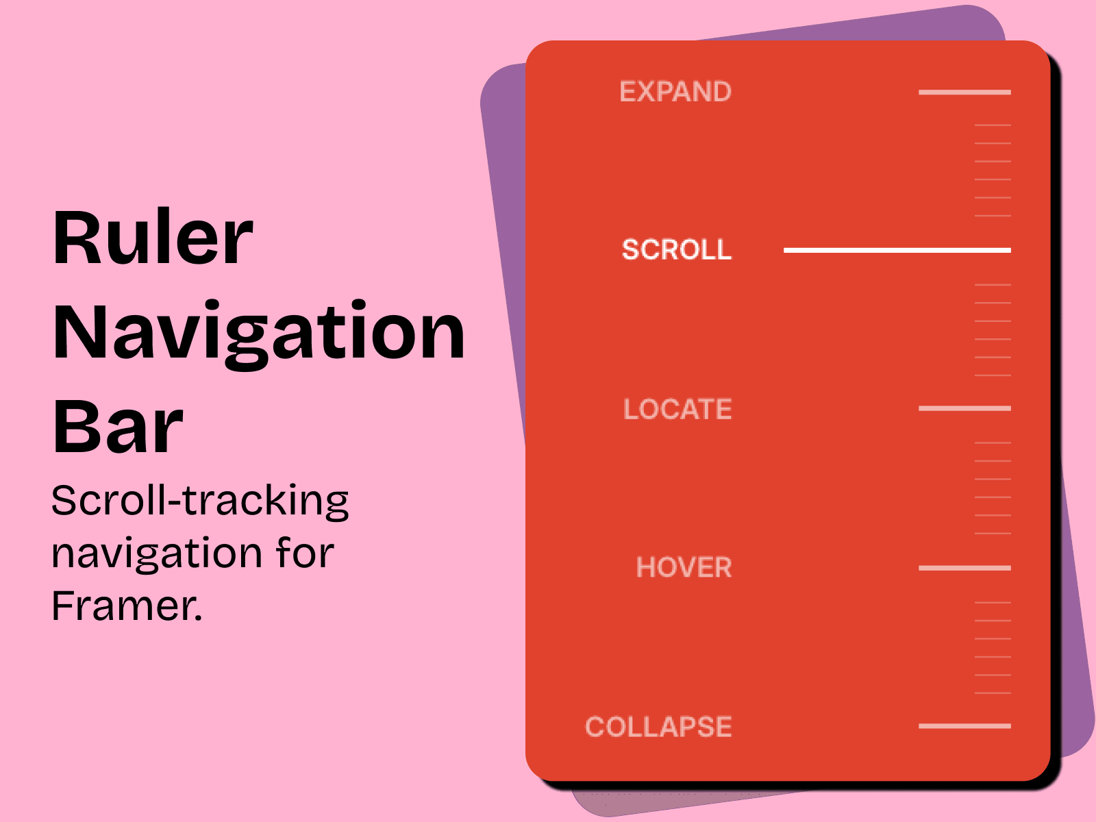
Ruler Nav tracks where you are and shows it, live, with a tick line that stretches out and reveals its label as you scroll.
How it works
As the visitor scrolls, the component tracks which section is in view and updates the active tick on its own, no clicking needed. Clicking still works too, and scrolls smoothly to that section with custom easing rather than the browser's default jump. If someone scrolls by hand mid-animation, the scroll stops instantly. At the bottom of the page, the last section is always marked active, even if it's too short to trigger naturally.
Links use Framer's native Link picker, so pointing a tick at a page, an external URL, or a section takes one click. A manual Section field is also available for matching a layer name directly.
Two menu modes: Always open, the classic sidebar, or Collapsible, which folds into a compact stack of lines that acts as its own toggle. Tap to open or close, with escape and outside-tap support, and choose whether it auto-closes after a link is tapped.
Lines, marks and sizing Independent controls for resting and active line length, line thickness, and the measuring marks between links (count, length, weight). One size multiplier scales the whole component at once, so resizing for a new breakpoint takes one adjustment instead of a dozen.
Colors, text and panel styling: Separate colors for link, active, and mark lines. Full font control plus label spacing. Closed and open (collapsible) states each get independent background, box shadow, padding, and radius, with a frosted-glass blur option behind the open panel.
Logo and behavior: Optional logo with adjustable size and spacing. Scroll offset for sticky headers, independently tunable scroll/hover/open speeds, reduced-motion support, and proper aria attributes for accessibility.
Questions or custom requests? Reach out anytime: contact@gazenova.com