About Cards
Scattered Media Cards
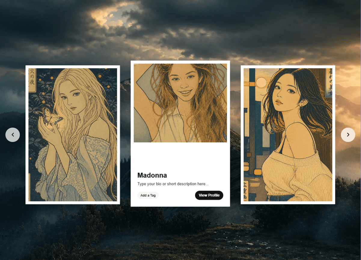
Interactive draggable media cards scattered across your canvas. Drop photos and videos onto a free-form layout where visitors can pick up, move, and spin cards like playing cards on a table.
✨ Features
Drag & Drop — Cards can be freely dragged anywhere within the container
Edge Spin — Grab a card from its edges to rotate it interactively (optional)
Media Support — Each card supports images (JPG, PNG, GIF, WebP) and videos (MP4, WebM, MOV)
Per-Card Links — Attach a URL to any card — clicking navigates to that link
Per-Card Sizing — Make individual cards larger or smaller independently
Per-Card Rotation — Set a fixed rotation angle for each card
Random Scatter — Cards spread automatically with randomized positions and rotations
Configurable Shadows — Full shadow control (color, blur, offset) matching your design
🎛️ Controls
Cards (Per-Card Settings)
Media — Upload an image or video file for this card
Link — URL to navigate to when the card is clicked
Size — Scale of this specific card (30%–300%, default 100%)
Rotation — Fixed rotation angle for this card (0°–360°)
Container
Container Width — Width of the area where cards are scattered (300–1600px)
Container Height — Height of the area where cards are scattered (200–1200px)
Card Defaults
Card Width — Base width for all cards (80–500px)
Card Height — Base height for all cards (80–600px)
Corner Radius — Border radius of the cards (0–60px)
Scatter
Scatter — How randomly cards are spread out (0% = grid, 100% = fully random)
Random Rotation — Range of random rotation applied to cards (0°–180°)
Interaction
Enable Spin — When ON, grabbing a card from its edges lets you rotate it by moving the cursor. Grabbing from the center still moves the card normally
Spin Edge — How large the edge zone is for spin detection (10%–50%). Only visible when Enable Spin is ON
Elasticity — How much cards can be dragged beyond the container bounds before bouncing back (0 = strict, 1 = loose)
Momentum — When ON, cards keep sliding after you release them based on drag velocity
New Tab — When ON, card links open in a new browser tab instead of the current one
Shadow
Shadow Color — Color of the card shadow
Shadow Blur — Blur radius of the shadow (0–60px)
Shadow X — Horizontal shadow offset (-40 to 40px)
Shadow Y — Vertical shadow offset (-40 to 40px)
🎮 How It Works
Add cards using the Cards array in the properties panel
Upload media (photo or video) to each card
Optionally add links — visitors will navigate there on click
Adjust scatter to control how randomly cards are positioned
Enable Spin to let visitors rotate cards by grabbing the edges
Cards are fully draggable — visitors can rearrange them freely on the page
Tip: Set Scatter to 0% for a clean grid layout, or crank it up to 100% for a messy, organic look like cards tossed on a table.
Refund Policy
Digital Products (Framer Components)
All purchases of Framer components are final. Due to the digital nature of these products and immediate access upon purchase, no refunds, returns, or exchanges are accepted once a component has been purchased and delivered.
ExceptionsRefunds may be considered only in the following limited cases:
The component is demonstrably defective and does not function as described.
You are unable to access the purchased component due to a technical issue on our side.
In such cases, you must contact support within 7 days of purchase and provide clear details of the issue. If verified, we may offer a fix or replacement. Refunds are not guaranteed.
Non-Refundable Cases
Change of mind.
Lack of compatibility with your project, tools, or third-party plugins.
Failure to read the product description or requirements before purchase.
By completing a purchase, you acknowledge and agree to this Refund Policy.