About Scroll Curve Cards
How to Use the Scroll Curve Cards Component
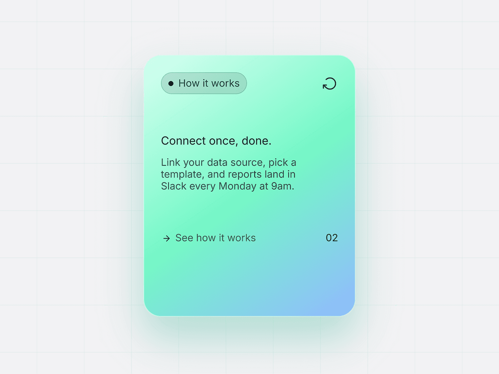
This component creates a connected step-by-step process layout with alternating cards and a dynamic scroll curve. It is designed for Framer sites and supports fully editable content, styling, and layout.
Adding Steps
Select the main Scroll Curve Cards component.
Inside the cards stack, duplicate a Card wrapper to add a new step.
Edit the card properties:
Step number
Title
Description
The curve and spacing automatically adapt to the new step.
Editing Content
Each card exposes:
Step number
Title text
Description text
Card colors
Number badge colors
You can customize each step independently or apply shared colors from the main component.
Customizing Colors
The main component controls shared styling:
Card background
Card hover color
Number badge fill
Number text color
Hover number colors
Scroll curve colors
This allows consistent styling across all steps.
Adjusting Layout
The section spacing and curve flow are controlled by the layout stack and curve settings:
Duplicate or remove cards to change step count
Adjust vertical spacing between cards
Modify curve width and waves in the curve component
Layout automatically alternates card alignment
Responsive Behavior
The component includes desktop, tablet, and mobile variants.Cards and curve automatically adapt across breakpoints.
Best Use Cases
How-it-works sections
Process steps
Timelines
Feature walkthroughs
Storytelling layouts