About Shop-Card
A folder card that begs to be clicked
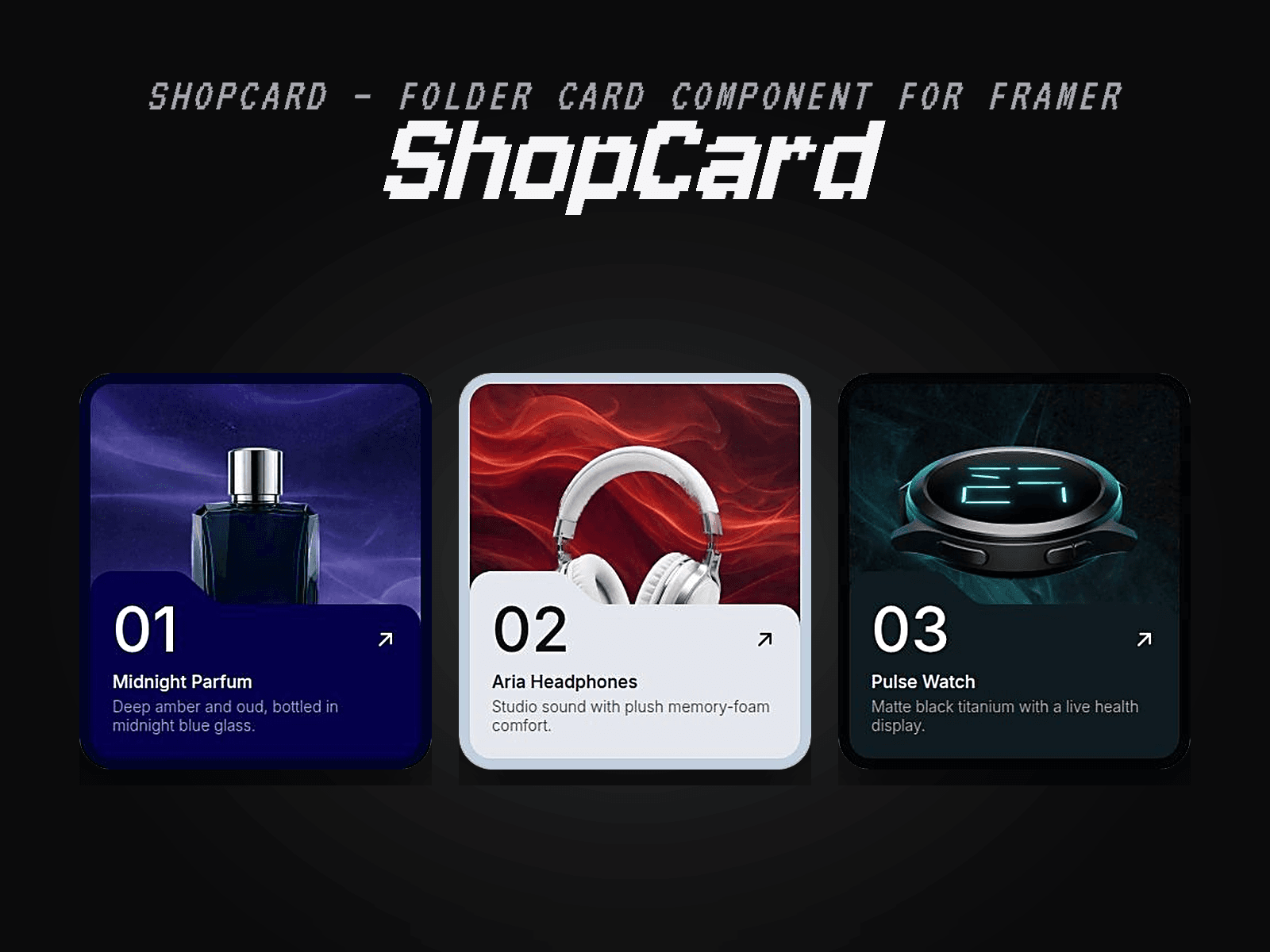
ShopCard is a folder-style card for Framer with a tabbed folder front, a big index number and a product image tucked inside. At rest the product peeks over the folder's edge; on hover the background grows, the product lifts a full 91px out of the folder and the folder front slides open — a small moment that earns the click.
It's ONE reusable component, not a fixed row: drop in a single card or build a whole row in a stack. Made for e-commerce and product pages that sell on perception — the card makes a product feel premium before a single word is read.
Key features
• 3 colourways — Navy, White, Black — each with Default + Hover variants
• The full hover reveal: background zoom, 91px product lift, folder slide-down, spring motion (no code, pure Framer variants)
• 10 editable properties: Background Image, Product Image (PNG cutout), Panel Color, Title Color, Description Color, Number, Title, Description, Link, plus the Variant picker
• Works with your own .jpeg / .png images — swap in any product cutout
• Cards are real links (open in a new tab) with proper image alt text
• Fully native Framer — no code, no embeds
How to use
After purchase you'll receive the Component URL by email — paste it into your Framer project to install ShopCard.
Swap the images, number, title and description from the properties panel, pick a colourway, point the Link anywhere.
Publish — the hover reveal is built in.