About SmoothTabs
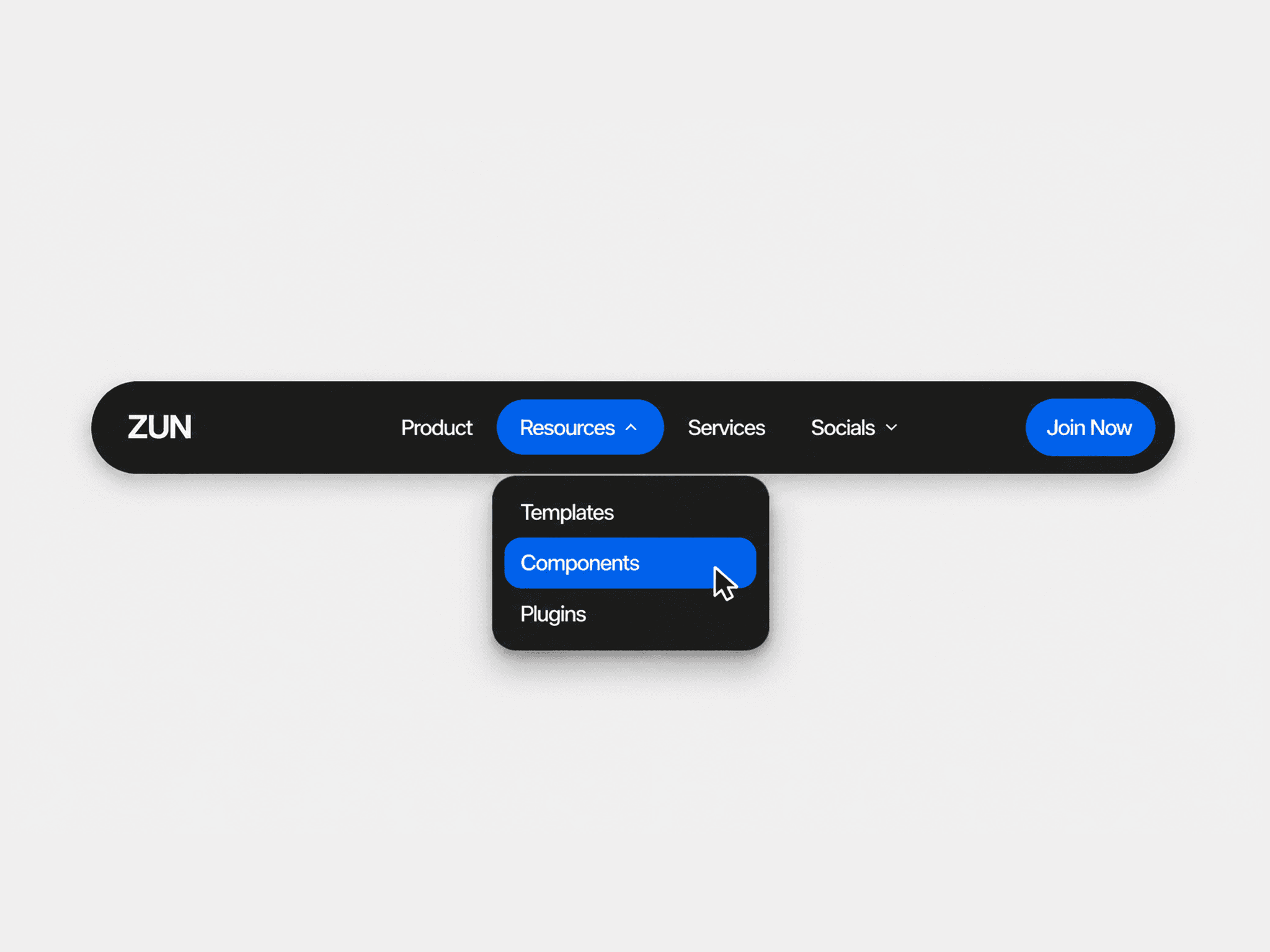
SmoothTabs component features a spring-driven highlight pill, true Hug/Fill layouts, horizontal overflow scrolling, and canvas-connected panels that always size to the container.
Use cases
FAQ sections, documentation, and feature switchers
Pricing or plan comparisons inside a single frame
Dashboards or settings with multiple categories
Product pages with “Details / Specs / Reviews” tabs
Onboarding flows and step-by-step content
Benefits
Responsive by default: tabs scroll on overflow; panels auto-fill width & height
Fast to build: drop in, connect panels, pick Fill/Hug, go
Polished motion: smooth pill animation with Transition control
Flexible styling: Bar & Tabs style groups, extended Font, shadows & radius
Accessible & robust: proper tab roles, instance-safe layout scope