About SplitScreenCarousel
About
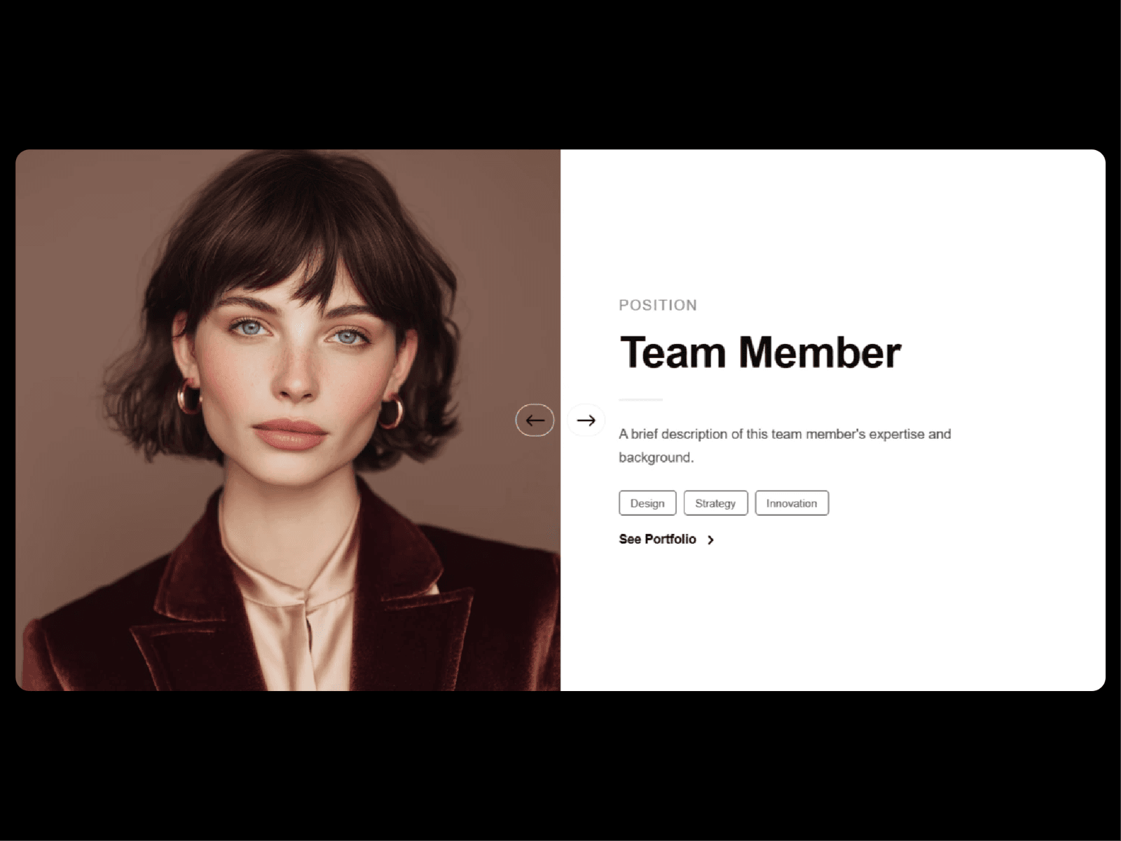
SplitSide brings an elegant, highly interactive team showcase layout straight into your Framer projects. Perfect for landing pages, about sections, or portfolio screens, this component splits imagery and typography into a perfectly balanced, responsive layout.
What it does
It renders a dynamic split screen grid that beautifully pairs team member imagery with contextual text, bios, and links. The component handles custom image column widths, adjusts text alignments, and includes built in navigation arrows and progress tracking indicators.
What you can customize
Layout & Spacing: Adjust member counts, individual profile items, panel padding (horizontal and vertical), and custom text max widths to perfectly align with your grid.
Image Controls: Toggle photos to the left, right, or alternating layouts. Fine tune the image column width percentage, component height, and select image fitting options like cover.
Typography: Fully customize font sizes, line heights, letter spacing, and weights for names, roles, and bios. You can even force roles to uppercase for a cleaner aesthetic.
Animations: Switch up photo transitions (like slide) and text transitions (like fade up). Fine tune the transition duration and text stagger speeds, and toggle direction aware movement on or off.
Navigation & Extras: Show or hide progress bars, configure progress bar positions (top or bottom), and align arrows perfectly with customizable styles, sizes, and layout options.
Styling & Tags: Toggle skills or department tags with outline styles, control tag sizes, and fully customize color palettes for backgrounds, names, roles, bios, accents, dividers, and buttons.
Great for
Agency about pages
Corporate team spotlights
Founder and speaker profiles
Portfolio creative retrospectives
High end studio showcase sections
Need help?
Questions or feedback? Reach me anytime: dulajdilshan766@gmail.com or on X @Dulajweb