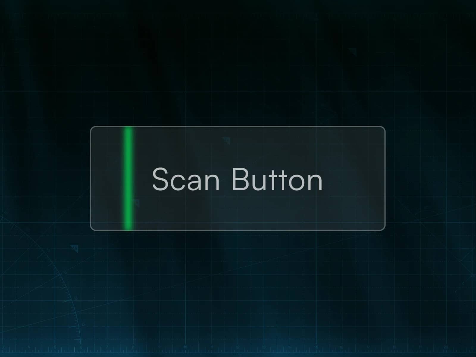
About Flash Sweep Button
Overview
This is a dark-themed navigation link button made for fullscreen menus. On hover, the background fills, the text slides right, and an arrow appears, creating a clean, directional interaction that fits dark portfolio and agency layouts.
Features
Works on both dark and light backgrounds, just adjust the colors accordingly.
100% Framer native: Built entirely without code
Property Controls:
Variant: switch between available animation variants (There are also Tablet and Phone variants; switch to the appropriate variant on each breakpoint.)
Index: the bracketed label (e.g. [01])
Title: the link label text
Color: controls the index, title, and arrow color
Hover Fill Color: the background fill color on hover
Hover Fill Opacity: controls the opacity of the fill color on hover, don't go above 0.3, use only on "Flash Sweep" and "Flash Only" variants.
Link: attach a URL or page link
New Tab: opens the link in a new tab
Smooth Scroll: enable smooth scrolling behavior
The button width can be set to Fixed and you can enter any value you need. On mobile, switching to Fill is recommended so the button stretches to fit the screen.
ㅤ
© 2026 Azardam Studio. All rights reserved.
ㅤ