About The Mega Menu
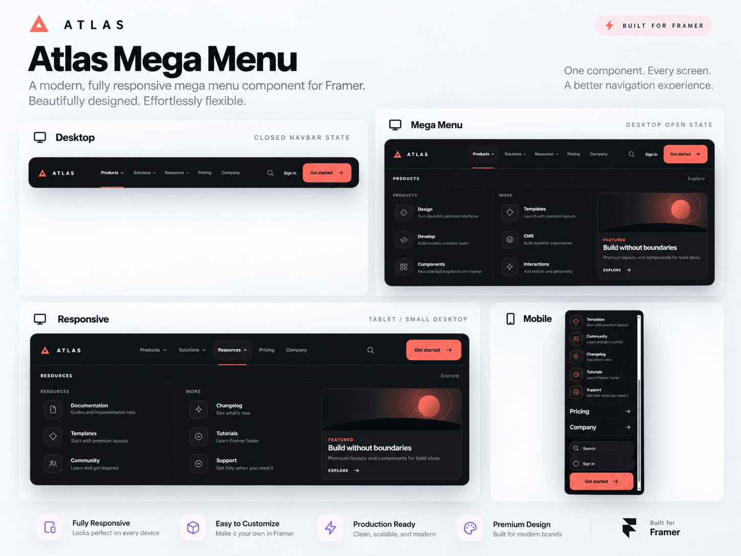
Mega Menu is a premium, fully responsive navigation component for Framer, designed for modern websites that need more than a basic navbar. It combines a clean desktop navigation, animated mega menu panels, featured content, utility actions, and a mobile accordion experience in one flexible component.
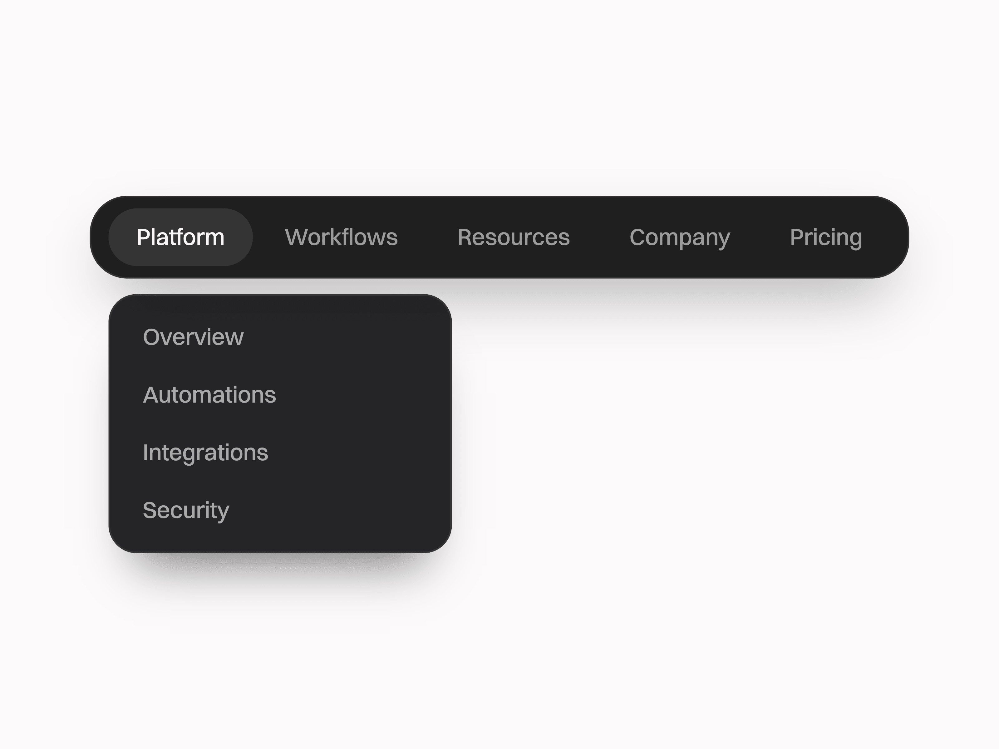
On desktop, menu items such as Products, Solutions, and Resources can open large dropdown panels with multiple link groups, icons, descriptions, and a featured content card. The panel opens smoothly and supports both hover and click interaction.
Key features:
Animated desktop mega menu panels
Multiple link groups with icons and descriptions
Featured content card
Search, Sign In, and CTA options
Active navigation states
Smooth hover and panel transitions
Full-screen mobile menu
Expandable mobile accordion sections
Responsive across desktop, tablet, and mobile
Dedicated static-renderer fallback for Framer
Fully editable in Framer:
Brand name and brand link
Top navigation labels and destinations
Mega menu type for each link
Products, Solutions, and Resources content
Search link
Sign In text and link
CTA text and link
Featured label, title, description, CTA, and destination
Accent color
Navbar and panel colors
Text, muted text, and border colors
Maximum width and navbar height
Navbar and panel corner radius
Top offset, side padding, and link spacing
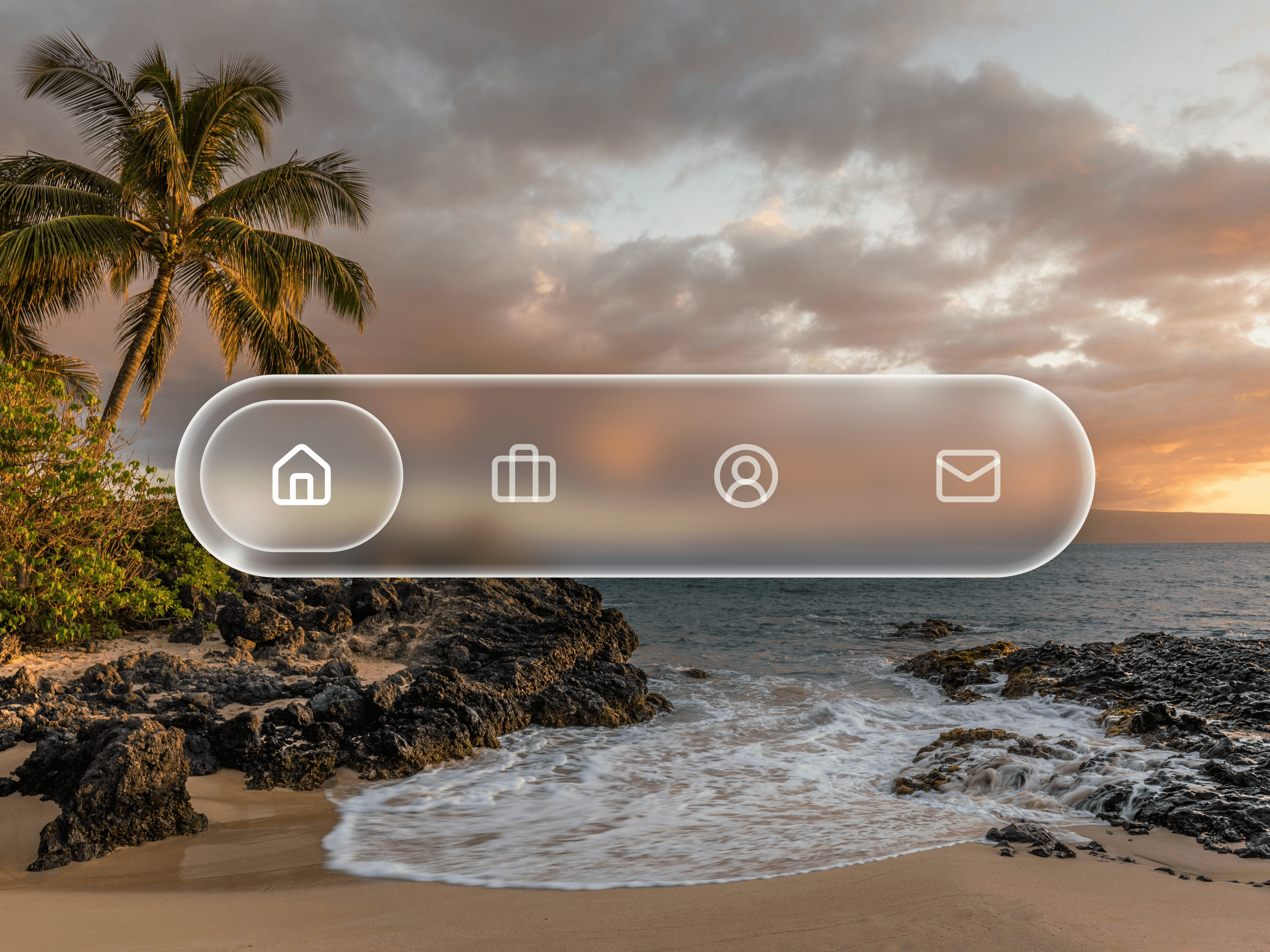
Glass effect and blur amount
Animation speed
Mobile menu label
Mega Menu is ideal for SaaS websites, agencies, startups, portfolios, product websites, and modern business sites that need a more advanced navigation system while keeping everything easy to customize inside Framer.