About Thesaurus Tooltip
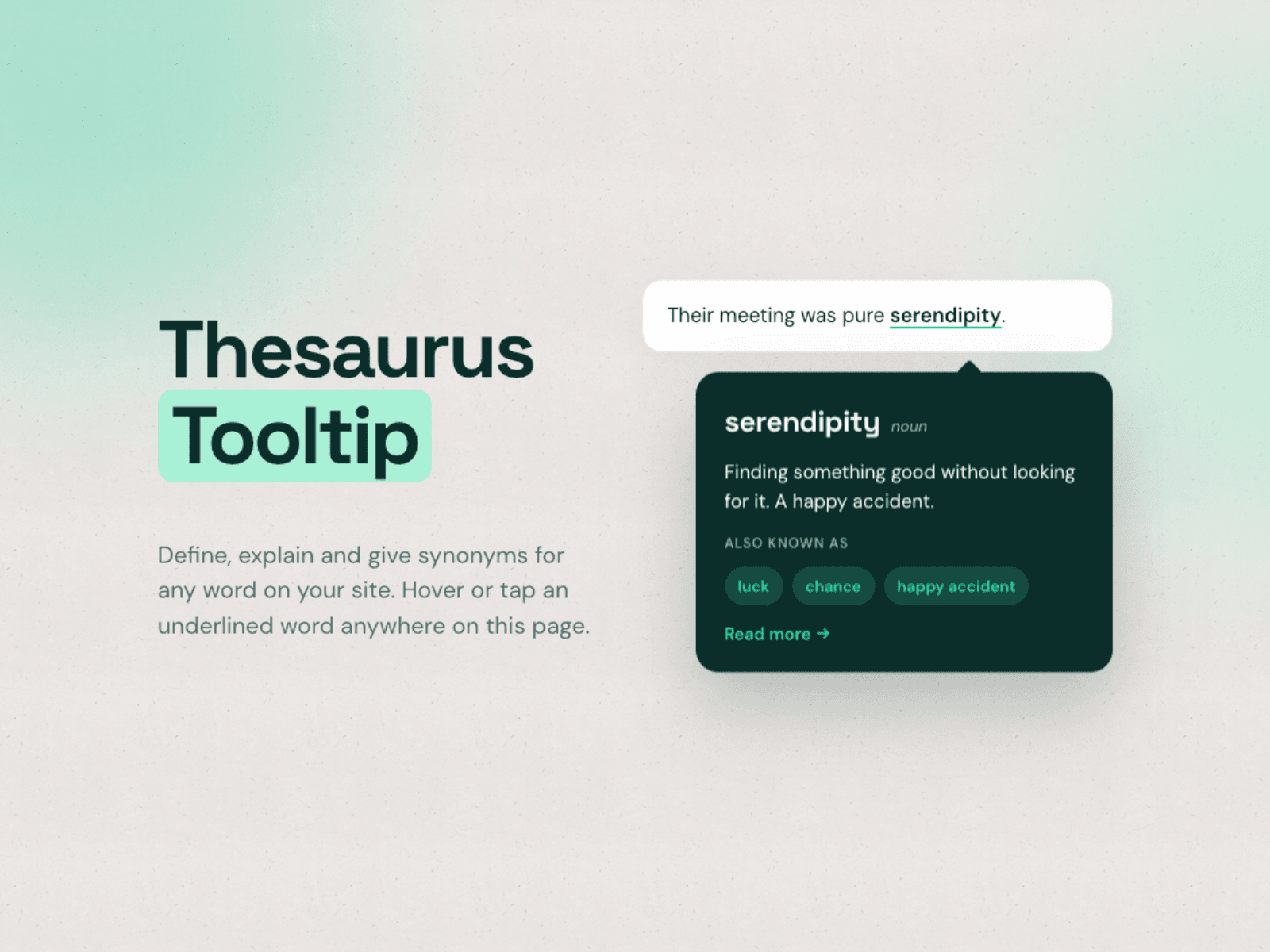
Define, explain and give synonyms for any word on your site. One component, one glossary, every page.
Thesaurus Tooltip turns words into little explainers. Add your terms once in the property panel, and every matching word on the page gets a subtle underline and a tooltip with the definition, an optional word type, synonyms as chips and a learn more link. No plugins, no backend, no extra Framer plan needed.
What it does
You fill a list of terms: the word, alternative spellings, a definition, synonyms and an optional link. The component finds those words in your text and adds the tooltip. It works on a paragraph you type into the component, on any layer you connect to its content slot, or on the whole page, including CMS pages when you place it on the template. Use the include and skip selectors to keep navigation, headings or footers untouched.
Features
Unlimited terms with word, alternative spellings, type, definition, synonyms and a learn more link. Three modes: own text, content slot or whole page. Underline every occurrence or only the first one, with whole word and match case options. Open on hover, tap or click, with keyboard support. Tooltip above, below or automatic, and it flips when there is no room. Word style: dotted, dashed, solid, highlight or none, with color and weight. Fully styleable tooltip: font, size, colors, radius, padding, max width, shadow and arrow. Renders on top of everything, so it also works in overflow hidden sections and sticky headers. Search engines see your original text unchanged. Reduced motion support, no external dependencies, works on every Framer plan.
Who it's for
Designers, writers, agencies, educators and SaaS teams who use jargon, brand names or specialist terms on their Framer site and want visitors to understand them without leaving the page.
License
One-time purchase for unlimited personal and client projects. Technical issue within 14 days? I will fix it or refund you. Questions: info@zo-e.nl