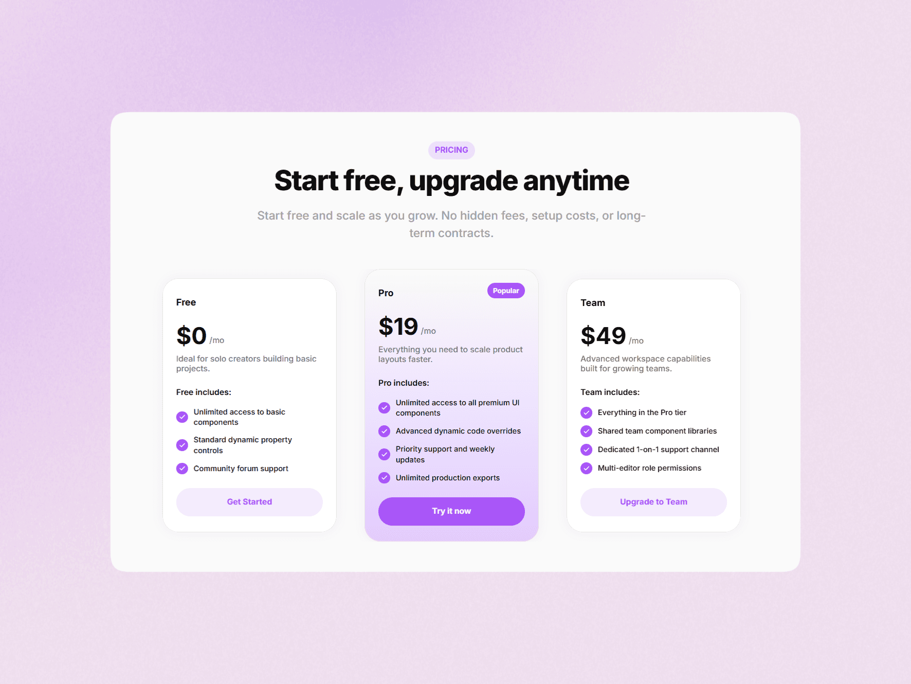
About Toggle Pricing Card
Overview
A single pricing card built for clarity and flexibility. Includes toggle-based pricing, clean layout, and smooth interaction, making it suitable for modern product and service pages.
Getting Started
Add the component to your canvas
Update plan details and pricing
Use the toggle to switch between states
Customize styles as needed
Customization
All text property controls are available on the main pricing card component
Update plan name, description, pricing, and feature list easily
To modify colors and add new features, edit directly inside each item
Adjust layout and styles within the component structure
Maintain consistency across states for a clean look
Property Controls
Use Cases
SaaS pricing sections
Design studio offerings
Subscription plans
Landing pages
Notes
Built using native Framer properties
Includes monthly and yearly toggle states
Designed as a single reusable pricing card
Flexible structure for easy updates
Support
If you have any questions or need custom components, feel free to reach out at s.senthil2206@gmail.com