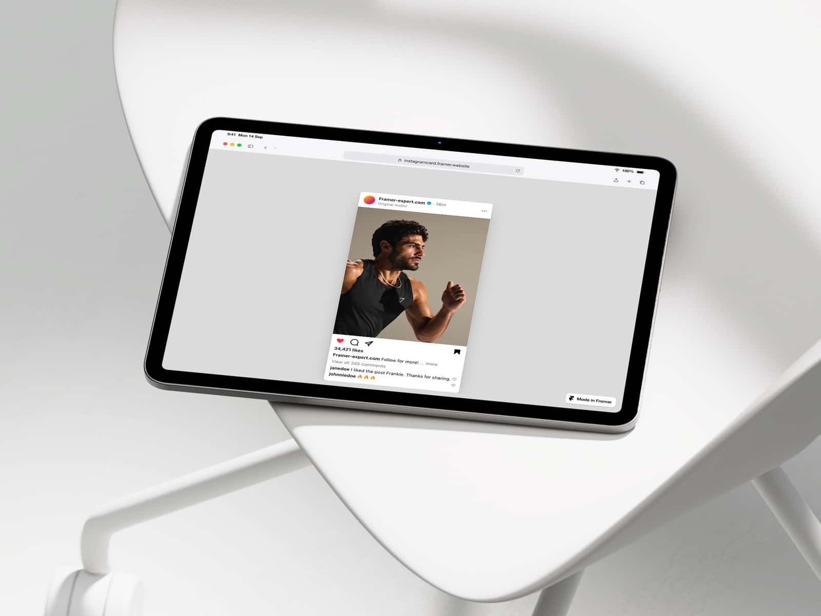
About Velora Card Stack
Velora Card Stack
Draggable stacked cards component for Framer
Velora Card Stack is a sleek, interactive card stack component designed to bring motion and depth to your Framer projects. Cards are layered in a stylish stack and can be smoothly dragged or swiped, creating a tactile, app-like experience for users.
Perfect for modern landing pages, portfolios, product showcases, or storytelling interfaces, Velora adds a playful yet polished interaction that immediately grabs attention.
The component is built for designers who want powerful interactions without writing code. Everything is fully customizable directly inside Framer.
Key Features
Draggable Card InteractionUsers can drag or swipe cards naturally, just like in modern mobile apps.
Stacked LayoutCards appear layered in a dynamic stack, giving the interface depth and a sense of motion.
Smooth AnimationsFluid transitions and natural physics make interactions feel responsive and premium.
Image SupportEach card can display an image, making the component perfect for visual content like products, projects, or galleries.
Smart PlaceholderIf no image is added yet, the component shows a clean placeholder container so the layout remains visually structured instead of empty.
Built for FramerWorks natively inside Framer with simple property controls and no coding required.
Fully Customizable
Velora Card Stack was designed to adapt to almost any design style. You can easily customize:
• Card size• Spacing between cards• Corner radius• Shadows• Background color• Images• Link behavior• Hover states
This flexibility makes the component suitable for minimal, modern, editorial, or bold UI styles.
Perfect For
Velora Card Stack works great in many scenarios:
• Product showcases• Portfolio projects• Case studies• App feature highlights• Testimonials• Interactive galleries• Story-based landing sections• Startup websites
Anywhere you want users to explore content through interaction instead of static layouts.