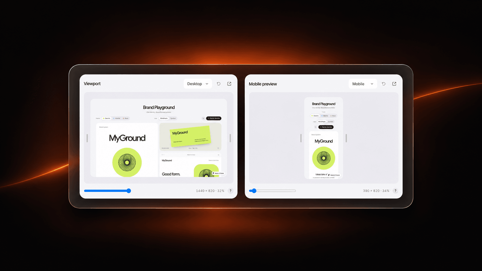
About Viewport
Show your live website at desktop, tablet, and mobile widths—all inside one compact Framer component.
Choose a device preset, drag either edge, or use the width slider to resize the site in real time. Add multiple Viewport instances to compare breakpoints side by side or create a 2×2 responsive showcase.
Set your published website URL and project name in the properties panel. Includes a reload button, an open-site link, adjustable preview height, custom width limits, and an optional canvas poster.
The website must allow iframe embedding. If a site blocks the preview, visitors can still open it directly.