About Handheld
Handheld is a playful, colourful Framer template for designers, photographers, directors and creative studios who want a homepage people remember.
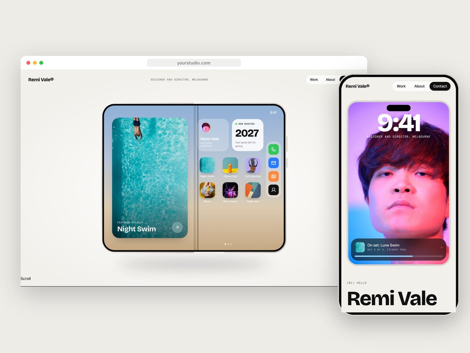
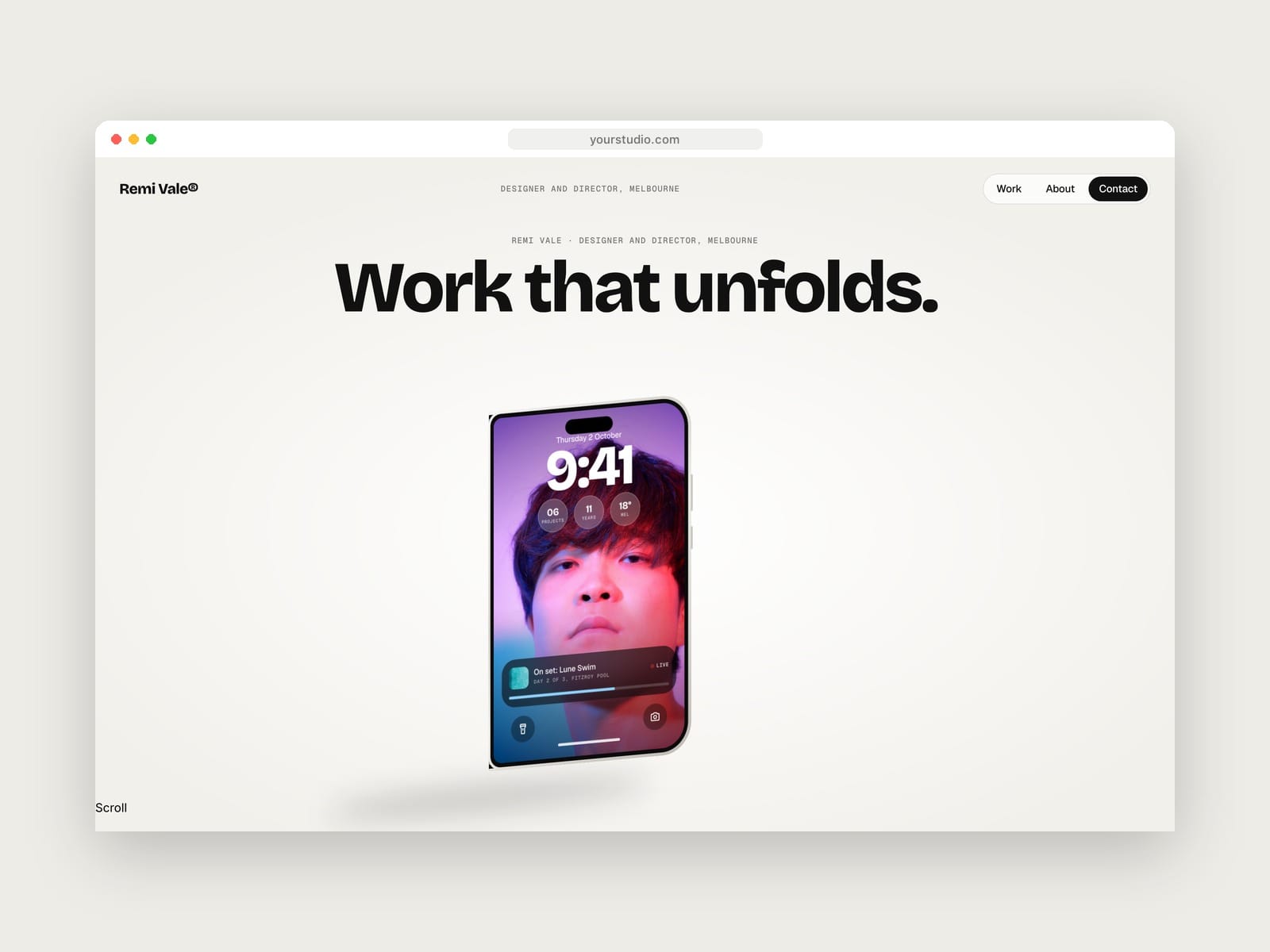
The home page lives inside a foldable phone. It starts closed on a lock screen with your portrait, small widgets and a Live Activity card. As visitors scroll, the phone turns to face them and opens like a book onto a home screen with a featured project, widgets, a dock and an app icon for every project.
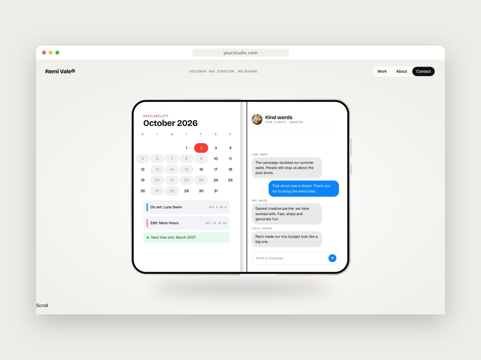
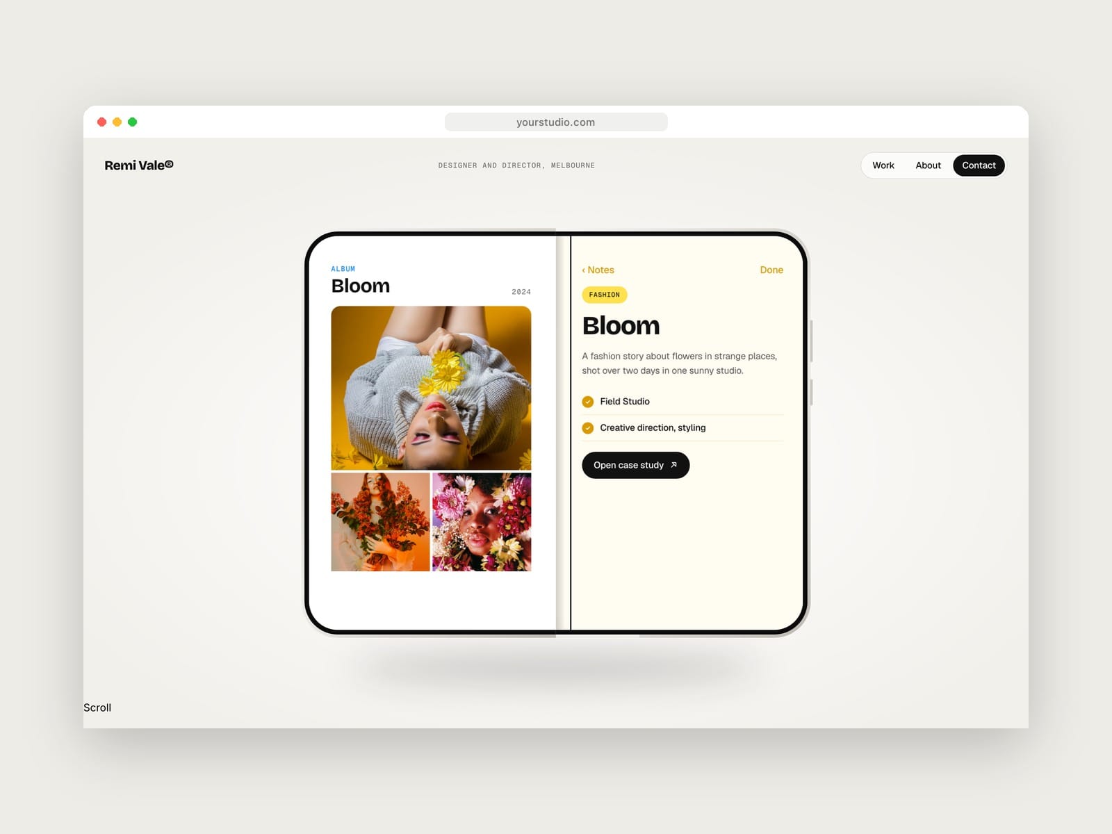
Keep scrolling and the phone becomes your portfolio, one app at a time. A calendar shows when you're free, a message thread holds client testimonials, and each project opens as a photo album beside a notes-style case study. Services sit in a settings list, a music player shows what you're working on, and the tour ends on a ready-to-send email and your contact card.
Projects run on the CMS. Each one appears as an app icon, an album and case study on the phone, a card on the Work page and a full project page. Everything is built with native Framer features, including the fold, so colours, type, content and timing can all be changed without code.
Features
6 pages: Home, Work, Project (CMS), About, Contact and 404
Foldable phone hero that turns in 3D and opens on scroll, built with native scroll effects
The phone tour as a set of apps: home screen, calendar availability, message testimonials, project albums with case study notes, a services settings list, a now-playing card, a mail draft and a contact card
Projects CMS with a custom colour, category, client, role, year, cover, three gallery images and a rich-text story
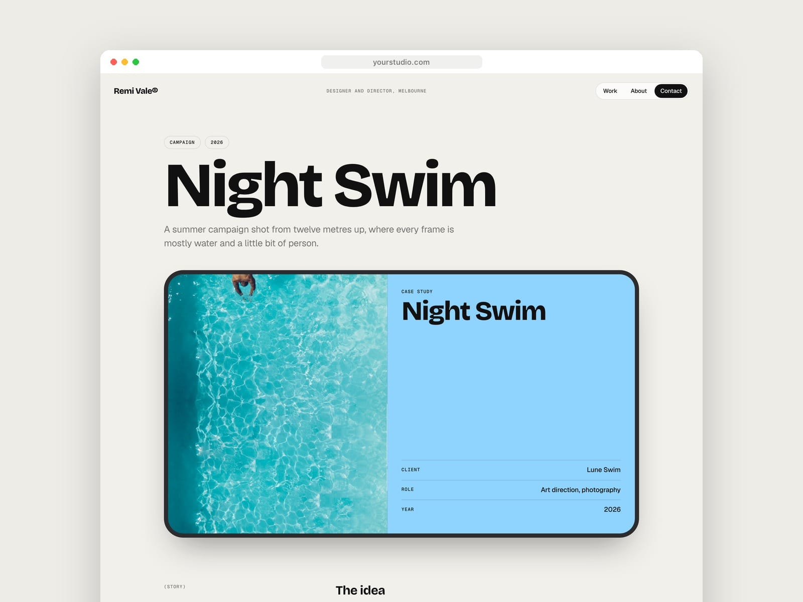
Project pages with a device-style spread, facts, story, gallery and an automatic next-project card in the next project's colour
Work page with tilting project cards
Contact form with project type and budget dropdowns, plus sending, sent and error states
Fully responsive. On tablet and phone the home page becomes a stacked layout with a lock screen card, testimonials, project cards and a request card